
There is a structural problem with almost all advice about redesigning a book cover: nearly all of it is published by people who sell cover redesigns. That doesn't make it dishonest, but it does mean it starts from a conclusion. Read the top results and you will find seven signs, six reasons, four benefits — and every list terminates at the same recommendation.
The question that comes before all of them is skipped: is the cover actually the problem?
That question deserves an honest answer even though we also sell covers. Low sales have several causes that look identical from where the author is standing, and most of them are cheaper to fix. This guide is a diagnosis first, and a redesign guide second.
First: Rule Out the Cheaper Causes
A cover converts browsers into clicks. That is its whole job. So before blaming it, establish that browsing is actually happening and that everything downstream of the click is working.
| Symptom | Could be the cover | But check first |
|---|---|---|
| Almost no page views at all | No | No traffic source — no ads, no list, no visibility in any browse path |
| Views but almost no clicks from browse | Yes — this is the cover's job | Also check that your thumbnail isn't cut off in the category grid |
| Clicks but no purchases | No | The blurb, the price, the look-inside opening pages, review count |
| Sold well, then stopped | Maybe | Category rank decay, a competitor launch, an expired promo, seasonality |
| Never sold from launch | Maybe | Categories and keywords — a mis-categorized book is invisible to the readers it's for |
The distinction that matters is views versus clicks. If people are not reaching the listing, the cover has not failed — it has not been tested. Redesigning it changes nothing, because the problem is upstream. Only the second row in that table is a cover problem, and it is diagnosable: high impressions, low click-through, in a category where other books are getting clicks.
This is also the cheapest possible ordering. Blurb, categories, keywords, and price are free to change and take an afternoon. A redesign costs money and a re-review cycle. Run the free experiments first, and you will either fix the problem for nothing or arrive at the cover with much better evidence.
Where That Data Actually Comes From
Here is the awkward part, and most redesign advice skips it: KDP does not show you impressions or click-through rate. Your KDP Reports dashboard gives units sold, KENP page reads, and royalties. Nothing in it tells you how many people saw your cover in a browse grid and scrolled past.
So for most authors, the diagnostic above is not directly runnable — which is exactly why "sales are down, must be the cover" persists as folk wisdom. There is no readily available number to contradict it.
There are three ways to get the missing signal, in ascending order of cost:
- Free, weak signal — sales rank behavior. Your Amazon Best Sellers Rank moves with sales, not views, so it can't isolate the cover. But it does separate "never had visibility" from "had visibility and lost it," which distinguishes rows one and four in the table above.
- Free, better signal — the shelf test. Open your subcategory's top-100 grid on a phone and find your book among its actual neighbors. You are not judging beauty; you are checking whether your cover is visually doing the same kind of thing as the books around it. Details in the next two sections.
- ~$20–50, the real signal — buy the data. A small Amazon Ads or BookBub Ads campaign reports impressions and clicks, which is the one place that number exists. Run it for a few days purely as an instrument, not as a marketing campaign. You are not trying to sell books with $20; you are trying to learn whether people who see the cover click it.
That last option is the same tool used for comparing two candidate covers later in this guide. Worth knowing up front: the ad spend is the diagnostic, not just the test. Buying a few hundred impressions to find out whether a redesign is warranted is dramatically cheaper than commissioning one to find out.
The Objective Test: Does Your Cover Speak Your Genre?
Once you have established the cover is the constraint, the next failure is judging it aesthetically. "Does it look professional" is unanswerable and every author answers it about their own cover with a bias. Replace it with a structural comparison against what measurably sells in your category.
Here is what that looks like with real data. Across Amazon's romance bestsellers:
Those are not style opinions — they are countable properties. Which turns "is my cover any good" into a checklist you can actually run:
- Is your title the dominant element, or is the artwork? (70% of the category leads with type.)
- Is your cover illustrated or photographic? (78% illustrated. A photographic couple cover in most romance subgenres now reads as dated — it clusters in sports romance specifically.)
- Is your title set in a chunky serif, or a geometric sans? (66% serif; geometric sans is effectively absent at 4%.)
- Is there one ornamental focal object, or a busy scene? (64% center on a single symbol.)
- Is your background a flat color block? (56%, with dark-solid the single most common treatment.)
A cover that answers differently from its category on four of five points is not "bad." It is signalling a different genre than the one it is shelved in — which is precisely the failure that produces impressions without clicks. The reader scanning the grid is pattern-matching, and your book is not matching the pattern they are scanning for.
The Same Test, Different Genre
The checklist is genre-specific, and the differences are large enough that applying the wrong one is its own mistake. Thriller and mystery, the other dominant indie category, measures out almost inversely to romance:
Run the same five questions against those numbers and notice what flipped. Type dominance holds — 79% here against romance's 70%, so leading with the title is close to universal across both. Everything else diverges: near-monochrome palettes at 71%, a single silhouette or doorway rather than an ornamental symbol at 64%, and the type axis inverts outright — 58% of thrillers set the title in a heavy condensed sans or slab and avoid a soft serif, while 66% of romance covers do the opposite and reach for a chunky serif.
That inversion is the practical point. A cover that would read as correctly-branded thriller — cold monochrome, condensed sans, a lone figure — is the same cover that reads as off-convention romance, and vice versa. If your book sits in a genre other than these two, the genre convention guides carry the equivalent checklists for fantasy, children's, and cookbook, and the romance cover conventions page goes deeper on that category specifically.
"But I Already Paid a Designer for This Cover"
This is the most common objection to everything above, and it deserves a real answer rather than a dodge — especially from a site that sells covers.
A professionally made cover can still fail the test in the previous section, because "professional" and "genre-correct" are two different axes. A designer is accountable for craft: composition, typography, contrast, technical delivery. Whether the finished cover matches the visual conventions of the exact subcategory the book is shelved in is a brief problem, not a craft problem — and the brief is written by the author.
That distinction matters because of how authors naturally brief. Asked to describe their book, an author describes the story: the setting, the protagonist, the pivotal scene, the mood they were going for. All of that is about content. Almost none of it is about category convention. A skilled designer given a content brief produces a beautiful, technically excellent cover of that content — which is a different thing from a cover that pattern-matches what buyers in that category are scanning for.
So the honest reading of "I paid a professional and it didn't sell" is usually not that you were overcharged or badly served. It is that the cover was optimized for accuracy to the book and nobody in the process was optimizing for legibility to the category. Those two goals overlap, but they are not the same goal, and only one of them is what the browse grid rewards.
Two practical consequences:
- If you commission again, brief the category, not the plot. Hand the designer the convention checklist from the section above and the top-20 grid from your subcategory, then let them solve the craft problem. That is the input most redesign briefs are missing.
- Test the direction before you buy it. The reason the cost question is hard is that a redesign runs anywhere from roughly $10–35 at the service tier to $500 and up for custom illustration (the full 2026 cost ladder is here). Deciding at that price point without knowing whether convention-matching is even your problem is the expensive way round.
Then: Check It at the Size Buyers Actually See It
The second diagnosable defect is legibility at browse size. Almost every cover is designed at full size and encountered at thumbnail size, and the gap between those two experiences is where most weak covers actually fail.
The test takes a minute: shrink your cover to roughly the width of your thumb, and put it next to the current top sellers in your subcategory on a phone screen. You are looking for two specific failures — the title stops resolving into readable words, or the cover visually merges with its neighbors instead of separating from them.
Both are concrete, and both are fixable without necessarily starting over. A title that fails at thumbnail is usually a type-weight and contrast problem, not a concept problem.
Testing Two Directions Without Fooling Yourself
If you get as far as having two candidate covers, resist the instinct to poll your newsletter or your author group. Those people already like your book. They are measuring loyalty; you need to measure acquisition.
The credible method is showing both covers to people who don't know you and comparing click-through, keeping every other variable fixed. Writing for BookBub, NYT bestselling author Tricia O'Malley documented running exactly this on her Althea Rose cozy mystery series — five rounds of paid tests at $40 to $120 each, targeting readers of comparable authors rather than her own list.
What makes her write-up worth reading is that it isn't a clean success story. Some rounds were statistical ties — 2.94% click-through for the original against 2.97% for the new design. Others were decisive: 3.12% against 2.85% in one round, and 1.21% against 0.58% in another. After launching the new covers she reported a 40% increase in free downloads of the series' first book.
The transferable lesson is the shape of the exercise, not those specific figures: a real cover test costs a few hundred dollars, runs several rounds, and some of those rounds will tell you nothing. That is still dramatically cheaper than redesigning a series on a hunch.
Decide What Carries Over Before You Decide What Changes
The most common redesign mistake has nothing to do with design quality. It is treating an established book as a blank canvas.
If your book has a readership, it has accumulated recognition — an author-name treatment, a series color, a recurring symbol, a layout your returning readers scan for. That is equity. A redesign should fix the specific signal that is misfiring while preserving it.
- ✕01
Redesigning before ruling out the free fixes
Blurb, categories, keywords, and price cost nothing to change and produce the same symptom as a weak cover. Spending on art before testing those is paying to solve a problem you have not located yet.
- ✕02
Judging the cover at full size on a desktop
Buyers meet it as a thumbnail in a grid, on a phone. A cover that is beautiful at 100% and illegible at browse size is failing at the only size that matters, and no amount of full-size polish fixes that.
- ✕03
Polling existing readers
Your newsletter and your author friends already like your book and are, by definition, not the audience you failed to convert. Their vote measures loyalty, not acquisition, and it reliably favors the cover they already recognize.
- ✕04
Redesigning one book in a series
A mixed set reads as two different products, and it breaks continuity exactly where read-through happens — the moment a reader who finished book one looks for book two.
- ✕05
Treating the redesign as a fresh start
Discarding the author typeface, series color, or recurring symbol throws away recognition you already paid to build. A repositioning fixes the misfiring signal and keeps the rest.
- ✕06
Chasing a design trend instead of a genre convention
Trends move faster than a backlist can follow, and a cover built on this year's aesthetic dates on the same schedule. Category conventions move much more slowly, which is what makes them a safer target.
- ✕07
Publishing a new edition instead of updating in place
A new edition is a separate listing. When your goal is a new cover on the book you already have, the in-place update is the correct path — not a re-publish.
How to Swap the Cover on a Live KDP Book
The mechanics are simpler than most authors expect, and worth knowing before you commission anything, because they affect timing.
From your KDP Bookshelf, click the ellipsis button next to the title, choose Edit content, scroll to the Cover section, and either launch Cover Creator or upload your own file. Verify it in the Previewer, click Save and Continue, then Publish at the bottom of the Pricing page. Amazon reviews the book again against its content guidelines after you submit.
Three things worth planning around:
- This is an update, not a new edition. KDP separates changes you can make inside your existing title setup from changes that require publishing a new edition — and a new edition is a different listing. A cover swap is the former.
- KDP does not publish a guaranteed turnaround. Its own help page points to a general timelines resource rather than a number, so treat the re-review as a window, not a scheduled event. Don't stack a promotion against the assumption it goes live the same day.
- Print is a separate file. If your book is also in paperback, the wrap is its own file sized to your trim, page count, and paper stock — updating the ebook cover does nothing to it. The dimensions guide covers that math.
The Redesign Sequence
- 01
Rule out the cheaper causes first
Before spending anything on art, check the four things that produce the same symptom as a bad cover and cost nothing to fix — a blurb that opens with a summary instead of a hook, categories that put you in the wrong browse path, a price outside your genre's norm, and zero traffic reaching the page at all. A cover cannot fail at converting visitors you never had.
- 02
Test the cover against your genre's measured conventions
Pull up the current top sellers in your exact subcategory and compare structurally, not aesthetically. Is your title the dominant element or is the artwork? Is your palette in the same family as theirs? Illustrated or photographic? These are answerable yes-or-no questions, unlike "does it look professional," and a cover that answers differently from most of its category is signalling the wrong genre.
- 03
Check it at the size buyers actually see it
Shrink your cover to roughly thumbnail width and look at it beside the category's other thumbnails on a phone. Most covers that read as weak are legible at full size and collapse at browse size. If the title stops resolving or the cover merges into its neighbors, you have found a concrete defect rather than a vague feeling.
- 04
Decide what carries over before you decide what changes
A redesign for an established book is not a blank canvas. Series recognition, an author-brand typeface, a recurring symbol, or a color readers already associate with you are equity worth preserving. Write down what stays before briefing anything new, or you will pay for a cover that looks better and sells to a different audience than the one you already have.
- 05
Test two directions against strangers, not friends
Reader polls in your own newsletter measure loyalty, not acquisition — your existing readers already like your book. Running both covers as ads to people who do not know you, and comparing click-through, is the only comparison that reflects the browse decision you are trying to win. Keep every other variable identical between the two.
- 06
Swap it in place on KDP rather than republishing as a new edition
KDP lets you update a cover on a live book from the Bookshelf — the ellipsis menu, then Edit content, then the Cover section, then Publish. Amazon re-reviews the book against its content guidelines after you submit. This is an in-place update, not a new edition, which matters because a new edition is a different listing.
Try a Convention-Matched Direction Before You Commission One
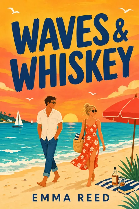
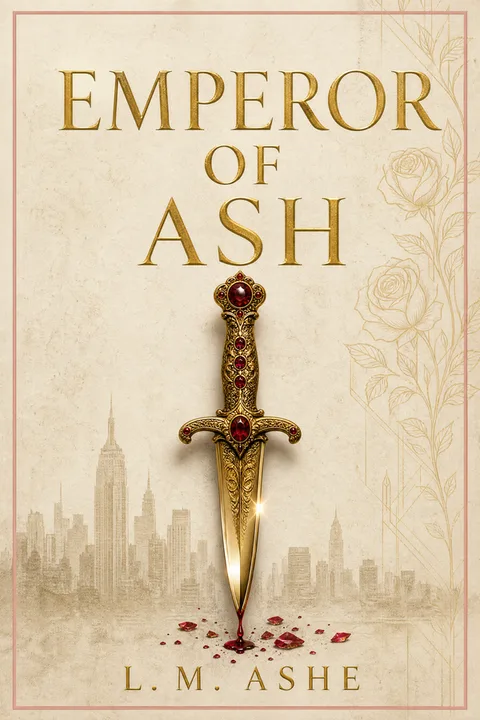
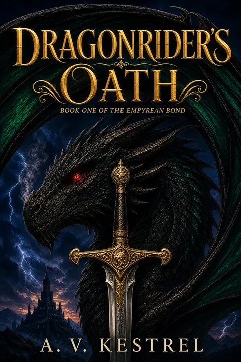
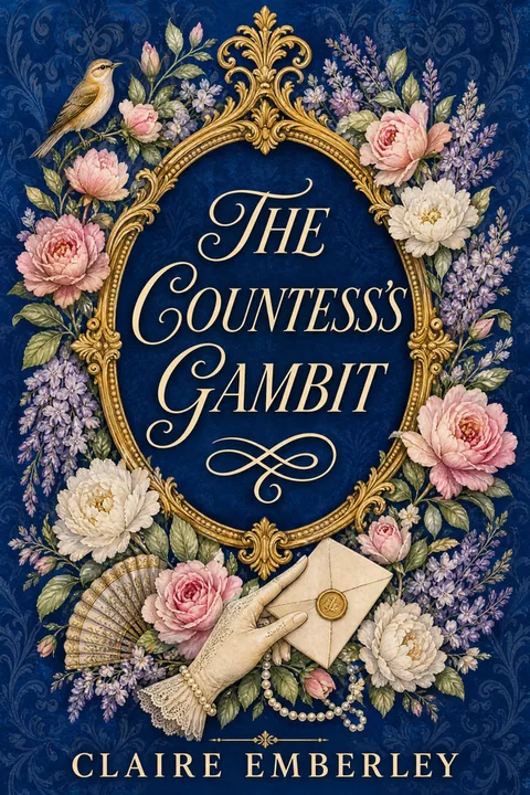
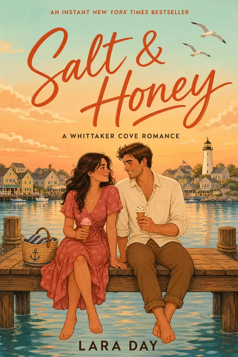
If the diagnosis above pointed at genre mismatch, the cheapest next step is not a brief to a designer — it is looking at what a convention-matched cover for your genre would even look like, so you can judge whether that's the direction you want.

Related Reading
- Book cover ideas that actually sell — the genre conventions for the categories not covered above.
- How to make a book cover — the production routes and what each realistically costs in 2026.
- Book cover dimensions — the file specs, including the paperback wrap a cover swap doesn't touch.
- Free KDP tools — the calculators for the print side of a redesign.
Diagnose First, Then Rebuild
A redesign is worth doing when you can name the specific signal that's misfiring. It is worth not doing when "the cover" is standing in for "I don't know why this isn't working."
01How do I know if my book cover is the reason my book isn't selling?
You mostly don't, until you rule out the alternatives — which is why "sales are down, redesign the cover" is bad advice on its own. Low sales have at least four cheaper causes that produce the identical symptom: a blurb that opens with a plot summary instead of a hook, categories that place the book in a browse path its readers don't use, a price outside the genre's normal band, and simply no traffic reaching the listing. The useful diagnostic question is not "is my cover good" but "of the people who see my cover, how many click" — and if almost nobody is seeing it in the first place, the cover is not yet the constraint. Fix the free things first, then judge the cover on the traffic that follows.
02Does changing my book cover on Amazon delete my reviews or reset my ranking?
Not when you update the existing listing rather than publishing a new edition. KDP draws a clear line between the two: some changes can be made inside your existing title setup, while others require publishing a new edition — which is a separate listing. A cover swap falls in the first category. You upload the new file through the Bookshelf, Amazon re-reviews the book against its content guidelines, and the listing carries on. The one thing worth knowing is that readers who already bought your ebook keep the version they downloaded; republishing does not push the update to them automatically.
03How do I actually replace the cover on a book that's already published?
From your KDP Bookshelf, click the ellipsis button next to the title, choose Edit content, scroll to the Cover section, and either launch Cover Creator or upload your own file. Check it in the Previewer, click Save and Continue, then Publish at the bottom of the Pricing page. Amazon reviews the book again after submission. KDP does not publish a guaranteed turnaround figure for this, so plan the change around a window rather than a launch date. If your book is also in print, the paperback wrap is a separate file sized to your trim and page count — updating the ebook cover does not update it.
04Should I redesign one book or the whole series at once?
The whole series, in almost every case. A series whose first book has a new cover and whose later books don't reads as two different products, and the visual break lands exactly where you most need continuity — at the point a reader who finished book one decides whether book two is by the same author. The counterargument is cost, which is real. If you genuinely cannot do all of them at once, the sequence that damages least is to redesign the whole set at once but stagger the upload over a short window, rather than leaving a mixed set live indefinitely.
05Is it worth A/B testing covers, and how do people actually do it?
Yes, and the method matters more than the tool. Polling your newsletter measures what loyal readers think, which is close to useless for a decision about attracting strangers. The credible version is running both covers as ads to people unfamiliar with you and comparing click-through. Writing for BookBub, NYT bestselling author Tricia O'Malley documented exactly this on her Althea Rose cozy mystery series, running five rounds at $40–$120 each. Some rounds were near ties (2.94% versus 2.97% click-through); others were decisive (3.12% versus 2.85%, and in one round 1.21% versus 0.58%). She reported a 40% increase in free downloads of the series' first book after switching. The useful lesson is not the specific numbers but the shape: a real test costs a few hundred dollars, and some rounds tell you nothing.
06What should I keep when I redesign?
Anything readers already use to recognize you. That usually means an author-name typeface, a series color or symbol, and any layout convention consistent across your backlist. A redesign for an established book is a repositioning, not a fresh start — the goal is to fix the specific signal that is misfiring, most often genre mismatch or thumbnail illegibility, while keeping whatever equity the book has accumulated. Authors who treat a redesign as a blank canvas routinely end up with a better-looking cover that speaks to a different audience than the one they already earned.
Evan Kane is the founder of MakeMyBookCover and runs the cover-archetype research behind the product — coding category bestseller lists by hand for every genre in the Bestseller Cover Visual DNA Index, and re-coding them as the lists move, to keep the genre-signal models honest.