Why Every "Book Cover Ideas" Article Fails You
Search "book cover ideas" and you get the same thing every time: a wall of beautiful covers with a one-line caption, and a button to start a free trial. Pinterest boards. Designer portfolios. "42 ideas," "54 ideas," "179 ideas." Infinite inspiration, zero rationale.
That is not an idea problem. It is a decision problem. Authors browsing those galleries do not lack images — they lack a way to know which direction is right for their book, and a method to get from "I have a manuscript" to "I have a cover concept." The galleries assume you already know your direction. If you did, you would not be searching.
This article is the opposite of a mood board. It gives you three things no gallery does:
- The measured conventions — what bestselling covers in your genre actually do, as numbers, not adjectives.
- A concept-generation method — how to derive a cover idea from your own manuscript without copying anyone.
- An objective amateur-tell checklist — concrete, checkable signals for "does this look self-published."
Everything below is built from real bestseller data or labeled clearly as a practitioner field guide. Where we have measured a genre, you will see the numbers. Where we have not, we say so. The entire value here is that the rules are real.
The Idea Is the Easy Part — Genre Fit Is the Job
Here is the uncomfortable truth experienced indie authors keep repeating to newcomers, in their own words: "Romance covers all look the same because that's what's proven to work." "If they aren't fantasy covers, they won't sell fantasy. It's as easy as that."
A cover has one job: communicate genre in under two seconds at roughly 160 pixels wide — its size in an Amazon search result. At that size and speed, the only question it can answer is "is this the kind of book I'm looking for?" Not the plot. Not the theme. Just the shelf it belongs on.
This is why "be original" is bad cover advice. Originality at the genre-signal level does not read as fresh — it reads as wrong, because readers trained on thousands of covers have learned to read conventions as signals. A cover that breaks them is not distinctive; it is mis-shelved in the reader's mind before they read the title.
So the real work is not generating a novel idea. It is nailing genre fit, then changing exactly one variable — the iconic element from your own story. The next section quantifies what "genre fit" actually means, per genre, with numbers no other article on this topic provides.
What Bestselling Covers Actually Do — The Data
This is the gap every incumbent leaves wide open. They all say "match your genre" — and none of them tell you what that means in measurable terms. Below are three genres we have coded from real bestseller samples. Read each chart as a checklist: every convention you break is a genre signal you are choosing not to send.
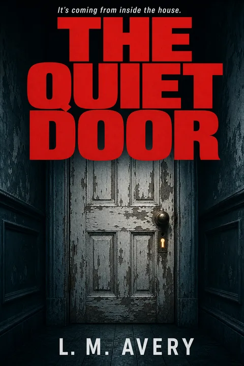
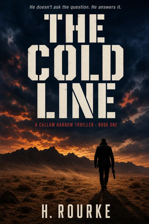
Thriller & Mystery
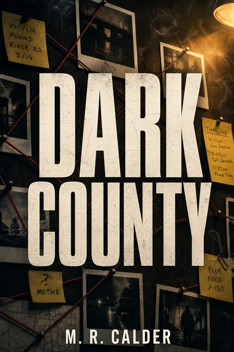
Thriller is the clearest case of type as the cover. The single biggest idea here is not an image at all — it is a large, dominant title set in a heavy condensed sans or slab, against a near-monochrome dark field, with one tense focal element (a doorway, a window, a lone silhouette). If your thriller cover idea starts with "a detailed scene," you are already off-convention. Start with the title treatment and one ominous object.
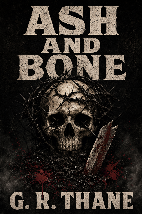
Fantasy
Fantasy inverts thriller's priority: here illustrated art and a single iconic element lead, with a dark ground and a warm metallic accent doing the genre work. The recurring failure is a busy narrative scene — three characters, a castle, a dragon, an artifact — which is gorgeous at full size and unreadable noise at 160px. One icon on a dark field reads at any size. (For the full fantasy walkthrough, see How to Make a Fantasy Book Cover.)
Children's Picture Books
Children's covers run on a different engine entirely: one oversized character, warm-saturated color, hand-lettered or chunky type placed high so it survives Amazon's even smaller ~90px thumbnail. A cool palette or a thin sans-serif here reads as "not for kids" to a browsing parent in exactly the way a light background reads as "not fantasy."
Notice what these three have in common despite looking nothing alike: each genre converges hard on a small set of conventions, and each penalizes the same generic mistake — a busy composition with no single dominant element and type that dies at thumbnail scale. That is the universal law. The genre-specific numbers tell you which direction to point it.
How to Turn Your Story Into a Cover Idea — Step by Step
This is the part the galleries skip entirely. The single most common pain among first-time authors is not "I have no taste" — it is "I have no idea where to start." Here is the repeatable derivation, from manuscript to concept, that replaces staring at Pinterest.
- 01
Pin down your exact subgenre, not your genre
Readers do not browse 'thriller' — they browse 'domestic thriller' or 'cozy mystery,' and each speaks a different visual dialect. Search your precise subgenre on Amazon and screenshot the top 20 covers. You are not looking for ideas to copy; you are looking for the convention pattern: background value, art style (illustrated vs photographic), focal-element count, and title type class. Write those four down as your constraints before you think about your own book.
- 02
Extract one literal element from your manuscript
Do not look for a metaphor or a 'theme that represents the book.' Look for the single most iconic concrete thing a reader could photograph: an object (a ring, a knife, a key), a place (a doorway, a lighthouse, a ballroom), or a silhouette (a lone figure, a creature). Authors who chase a clever conceptual metaphor almost always end up with a cover that reads as nothing. One literal, story-specific element is the entire creative payload of the cover.
- 03
Drop your one element into the genre's container
Now combine: take the convention constraints from step 1 and place your one element from step 2 inside them. A thriller about a haunted house becomes a dominant title plus one ominous door on a near-black field — not a rendered scene of the house. A fantasy about a sea-witch becomes one iconic element with a warm accent on a dark ground. The genre is the container; your story supplies exactly one variable. That single-variable discipline is what makes the cover both on-genre and yours.
- 04
Decide the production route honestly
DIY, AI-generated, premade, or commissioned — pick based on budget and series plans, not on fear of looking amateur. A configured AI or premade cover that nails the conventions beats an expensive custom cover that ignores them. Lock the concept first; the route is a separate, lower-stakes decision covered later in this article.
- 05
Proof at 160px before you fall in love with it
Resize your concept to 160 pixels wide and look at it at screen resolution — this is the Amazon thumbnail and where the buying decision happens. Ask three questions: does it read as the right genre, does the one element read clearly, is the title legible? If any answer is no, the concept is wrong — not the thumbnail. Most cover ideas die here, and finding that out now costs nothing.
Subgenre Cover Conventions — A Practitioner Field Guide
The charts above measure whole genres. But you write a subgenre, and each one speaks its own dialect. The table below is a practitioner field guide drawn from established cover conventions — not a statistical study — to help you calibrate direction before you commit to a single element. (Where a row says "data forthcoming," we have not yet coded a bestseller sample for that genre and are deliberately not inventing numbers.)
| Subgenre | Focal idea | Palette direction | Type direction | Figure treatment |
|---|---|---|---|---|
| Domestic thriller | Ordinary object made sinister (door, swing, phone) | Near-monochrome, one cold accent | Huge condensed sans, title dominant | Absent or distant silhouette |
| Psychological thriller | Single uneasy element, negative space | Desaturated, off-balance | Heavy slab, off-center | Obscured or partial figure |
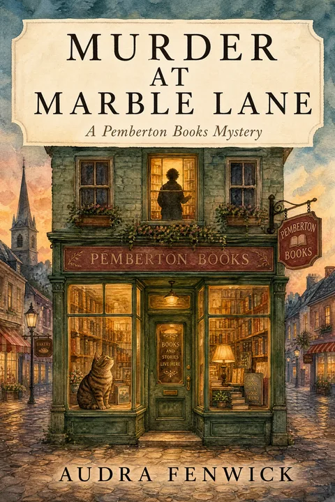
| Cozy mystery | Charming scene with a small wrong detail | Warm, inviting, slightly muted | Friendly serif or hand-lettered | Animal or absent; never menacing |
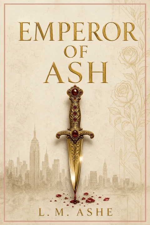
| Epic / high fantasy | Sword, crown, wing, or symbolic artifact | Deep crimson, navy, charcoal | Large classic or calligraphic serif | Silhouette or absent |
| Romantasy | Entwined figures, ornate filigree, or crown | Jewel tones or warm luminous bloom | Tall elegant serif with flourishes | Visible faces; couple prominent |
| Cozy fantasy | Cottage, lantern, animal familiar | Warm amber, sage, dusty rose | Rounded or playful serif | Friendly or absent figure |
| Contemporary romance | Illustrated couple or single object | Bright, often pastel | Bold script or rounded sans | Stylized couple, faces optional |
| Dark romance | Single charged object on near-black | High-contrast black with one accent | Sharp serif or stark sans | Object-led; figure often absent |
| Children's picture book | One oversized friendly character | Warm-saturated primaries | Chunky hand-lettered, placed high | Single big character, center frame |
Romance is the highest-demand, lowest-data-coverage genre on this list, and we are coding a bestseller sample for it now — this guide will gain measured romance numbers in a future refresh rather than carry invented ones. Truthfulness is the entire point of this exercise; a fabricated statistic would destroy it.
Match your subgenre's dialect before optimizing anything else. A cover that nails whole-genre conventions but misreads its subgenre still looks out of place next to its closest competitors.
Does It Look Self-Published? An Objective Checklist
"It just screams amateur" is the most common — and most useless — feedback an indie author gets. It is useless because it is stated as a vibe. But the amateur look is not a vibe; it is a stack of concrete, checkable signals. Run your concept against each. Most "amateur-looking" covers fail two or three of these, not one.
- ✕01
A 'Written by' line on the front cover
Professional covers never say 'Written by.' The author name stands alone, sized to the author's profile (small for a debut, large for an established name). 'Written by [Name]' is one of the single most reliable amateur tells, repeatedly flagged by experienced authors reviewing newcomers' covers. Remove it entirely.
- ✕02
A background value that breaks the genre convention
If 68% of bestselling fantasy covers use a dark background and yours is white, it does not read as 'different' — it reads as 'not fantasy,' and it is visually isolated on a search page full of dark covers. The fix is not subtlety; it is matching the dominant value of your subgenre. This is the highest-impact single correction available.
- ✕03
Title type that fights the genre
A thin geometric sans-serif on a fantasy cover, or a soft decorative serif on a thriller, is a direct genre-mismatch signal. Thriller bestsellers run on heavy condensed sans/slab; fantasy and children's run on serif or display/hand-lettered. Using the wrong type class is the typographic equivalent of the wrong background — instantly legible as 'off.'
- ✕04
No single element dominating at thumbnail size
A composition where three or four elements compete equally has no focal point at 160px — it reads as visual mush. Bestsellers anchor on one dominant element (one icon, or one large title). If you cannot say in one phrase what the eye lands on first, the cover has no idea, just contents.
- ✕05
A stock photo with a recognizable or generic model
A widely-used stock model that other covers also use, or a photo that obviously came from a free stock site, breaks the spell — readers have seen that exact face. Beyond the look, there is a real KDP licensing risk: any photo of an identifiable person needs a model release for use on a for-sale cover, and search-found images carry no license at all. The amateur tell and the legal risk travel together.
- ✕06
Designed at full resolution, never proofed at thumbnail
The deepest cause of the amateur look is designing on a big screen and never shrinking the result to 160px until it is too late. Every decision — type size, contrast, element count — looks different at thumbnail scale. A cover that is beautiful at 2000px and illegible at 160px has failed its only job. Proof small, early, and often.
Which Production Route — DIY, AI, Premade, or Commission?
Once the concept is locked, the route is a separate and lower-stakes decision. The numbers below are indie community and market consensus, not our data — but the principle is firm: no route is inherently amateur, and no route rescues a concept that ignores genre conventions.
| Route | Typical time | Typical cost | Best for |
|---|---|---|---|
| DIY in a design tool | Days to weeks (learning curve) | ~$0–$20/mo tool subscription | Authors with design skill or minimal budget |
| AI-generated (configured for genre) | Minutes to hours | ~$0–$30 per cover | First books, testing concepts, tight budgets |
| Premade cover | Hours (searching + customizing) | ~$50–$150 (community consensus) | A polished result without starting from zero |
| Custom freelance (mid-tier) | 2–6 weeks | ~$300–$750 (community consensus) | A series with a growing readership |
| Custom top-tier / illustrated | 3–6+ months (often booked out) | ~$2,000+ | Established authors, major series launches |
The decision that actually moves copies is not which row you pick — it is whether the cover, on whatever budget, matches the measured conventions of its subgenre. A $0 AI cover that nails the thriller conventions outsells a $700 custom cover that puts a soft serif on a busy scene. Spend should track your series investment, not your anxiety.
Cover Ideas You Can Generate Right Now
Below are published thriller cover styles available in the wizard. Each is built on the conventions in the chart above — title-dominant, near-monochrome, single tense focal element. Click any cover to open the wizard locked to that style and supply your own title and one story element.

The same convention-first approach is built into every genre the wizard supports. If you are writing in another genre, start from its conventions: the thriller & mystery cover styles and children's book cover styles pages break the patterns down genre by genre, and the AI book cover generator applies them across all of them.
The Shortcut Is the Method, Not the Gallery
The universal advice authors give each other — "go scroll forty covers and build a collection" — is correct, and it takes hours, and most people never finish it. This article is that work, already done: the conventions extracted, the numbers measured, the derivation method written down.
A cover idea is not a flash of inspiration you wait for. It is the output of a process: nail the subgenre conventions, change exactly one variable from your own story, proof it at thumbnail size, then pick a production route. The galleries sell you the feeling of having ideas. The method gives you a cover that sells.
When you're ready to generate, the wizard applies this directly — pick your genre, enter your title, and the conventions are configured by default and adjustable by you. Start with thriller, fantasy, romance, or children's.
Three covers free, no card required.
01How do I come up with a book cover idea if I have no idea where to start?
Do not start from a blank page or a mood board — start from your genre's measured conventions, then your story. The reliable method is a four-step derivation. First, identify your exact subgenre and look up what its bestselling covers actually do (this article quantifies that for thriller, fantasy, and children's). Second, pick the single most iconic concrete object, place, or silhouette in your manuscript — not a metaphor, a literal thing a reader could photograph. Third, place that one element against the background value your subgenre expects (for example, 79% of thriller bestsellers are title-dominant on a near-monochrome dark field). Fourth, test it at thumbnail size before adding anything else. The blank-page paralysis comes from trying to invent a concept; the working method is to constrain hard to genre convention first and let your single story element be the only variable.
02What makes a good book cover?
A good book cover answers one question — is this the kind of book I'm looking for? — in under two seconds at roughly 160 pixels wide, which is its size in Amazon search results. That means it is not judged as art; it is judged as a genre signal. Concretely, a good cover matches its subgenre's measured visual conventions rather than trying to be original at the signal level, anchors on a single dominant element instead of a busy scene, uses type that is legible at thumbnail scale, and survives compression — it still reads correctly when shrunk to a 160px wide image. Beauty at full resolution is irrelevant if the thumbnail fails any of these.
03Can AI design a good book cover?
AI can produce a cover that is indistinguishable from a mid-tier human-made cover at thumbnail scale — which is where roughly 90% of purchase decisions are made — provided it is configured with accurate genre parameters. The technology is not the bottleneck; genre-fit and execution are. An AI cover generated with the wrong conventions (a light background on a thriller, a thin sans-serif on a fantasy) looks amateur for the same reason a human-made one would. Where AI still trails is hyper-specific character portraiture and licensed-IP aesthetics. For the conventions that actually move copies on KDP, a well-configured AI workflow closes most of the gap. Reader perception in a few subgenres (literary fiction, some romantasy) still favors hand-crafted art.
04How do I know if my book cover looks self-published or amateur?
Looking self-published is not a vague feeling — it is a set of concrete, checkable signals. The most common tells, drawn from what experienced indie authors repeatedly flag, are a Written-by line on the front cover, the author name set far larger than a debut author's name warrants, a background value that breaks the genre convention (a light background where the genre is overwhelmingly dark), a thin or geometric sans-serif title in a genre that uses serif or display type, a stock photo with a recognizable model or visible watermark, and multiple focal elements competing so nothing dominates at thumbnail size. Each of these is binary — you can check it in a minute. The amateur look is almost always a stack of two or three of these, not one fatal flaw.
05Should I just copy the bestselling covers in my genre?
You should copy the conventions, not the composition. The advice authors give each other — look at the top 20 and replicate the template — is correct in spirit but unfalsifiable in practice, because nobody quantifies the template. The conventions are the measurable patterns: background value, art style, focal-element count, type class, the presence of series labelling. Copy those — they are the genre's shared language and originality there is a liability. Do not copy a specific cover's exact layout, palette, or illustration; that is both a legal risk and a discoverability problem (you want to belong to the shelf, not be mistaken for one specific competitor). The single variable you change is the iconic element drawn from your own story.
06How much should a book cover cost?
Based on indie community and market consensus, the realistic tiers are roughly as follows. DIY in a design tool is about $0–$20/month for the tool; AI-generated and configured for genre is about $0–$30 per cover; a premade cover is about $50–$150; a mid-tier custom freelance cover is about $300–$750; and a top-tier illustrated commission is $2,000 and up. None of these tiers is inherently amateur — a configured AI or premade cover that nails genre conventions outperforms an expensive custom cover that ignores them. Spend should track your series investment and marketing budget, not your anxiety about looking professional. The genre-fit of the cover matters far more than the price paid for it.
Evan Kane is the founder of MakeMyBookCover and runs the cover-archetype research program behind the product — auditing the Amazon US Top-50 covers across romance, thriller, fantasy, children, and nonfiction every quarter to keep the genre-signal models honest.