For fantasy, romantasy, epic, grimdark & LitRPG authors

Fantasy Book Cover Designcovers that signal subgenre, not just 'fantasy'.

Fantasy isn't one shelf — it's eight. Romantasy reads as romance with a sword; epic reads as architecture; LitRPG reads as a game UI. Every cover we generate is constrained to your specific subgenre's current Amazon bestseller patterns, not a generic 'fantasy' template.

  • 3 free covers, no card
  • No watermark · full commercial rights
  • KDP-ready: ebook + 300 DPI print

Pre-tuned to Fantasy · change any time

Genre · required
Subgenre · optional

Generated in 60 seconds · No charge until you download · First 2 free

Or try a demo
The honest part

A generic fantasy cover gets read as the wrong subgenre.

A romantasy cover that looks like classic epic fantasy reads as 90s paperback and dies on BookTok. An epic fantasy cover that leans into romantasy's gold-on-black gets miscategorized as PNR and never reaches the epic shelf. LitRPG without the stat-bar / game-UI grammar invisible inside the subgenre. Indie authors lose the algorithm signal the moment the cover misses the subgenre dialect — and on the current Amazon Top-30 fantasy chart, the subgenre dialects have measurably diverged.

Pillar 0 · Visual DNA

What today's bestselling fantasy covers actually do

Not opinion. Pattern-counted across every cover in the top tier — refreshed quarterly so what works this season is what your cover follows.

Source / Amazon Fantasy Bestsellers Top 30 + Goodreads Best Epic Fantasy Top 8
● Refreshed 2026-Q2
01
73%
use illustrated or digital-painting art rather than photography or photo-compositing.
0%of top tier100%
02
68%
set imagery against a dark or near-black background, using contrast to make the focal element pop.
0%of top tier100%
03
66%
carry explicit series name and book-number labelling in a secondary type band, visible even at thumbnail scale.
0%of top tier100%
04
61%
anchor the composition around a single iconic element — a wing, sword, snake, or silhouette — rather than a narrative scene.
0%of top tier100%
05
57%
set the title in a large serif or decorative display face; thin geometric sans-serifs are essentially absent.
0%of top tier100%
06
53%
introduce at least one gold, fire-orange, or metallic warm accent against the dark ground.
0%of top tier100%
Method · manual visual coding of every cover in tier, by two raters
Every cover we generate in this genre is constrained to these patterns by default — so yours looks like it belongs on the shelf, not like it wandered in from a generic AI prompt box.
Know your sub-type

Which fantasy subgenre are you designing for?
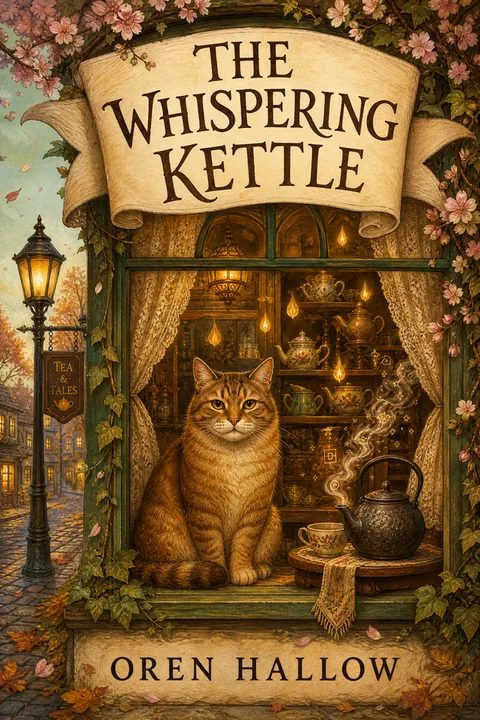
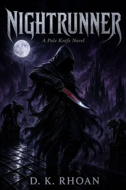
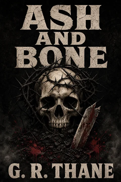
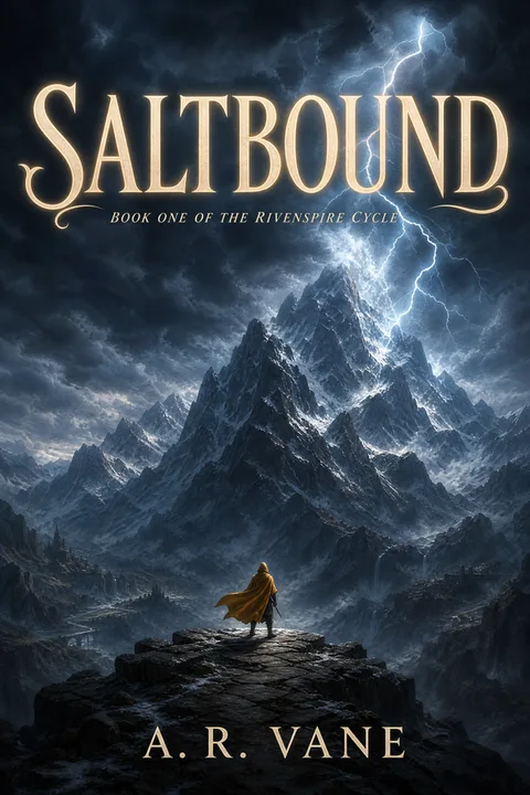
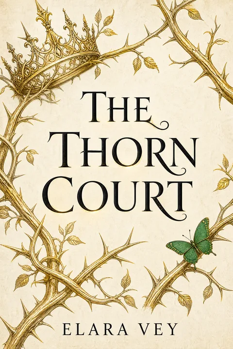
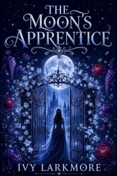
Epic / high fantasyUse this style →
Architectural symbolism (sword, crown, tower, rune), dark ground (crimson, navy, charcoal), large decorative serif. The Stormlight / Sanderson / classical-epic lane.
Romantasy / fantasy romanceUse this style →
Black-and-gold with celestial motifs (moons, stars, suns), a single weapon-or-floral icon — often combined, like a dagger wrapped in roses or a sword through a wreath — and NO human face on the front. Character art, if any, lives inside the book under the dust jacket. Title in an ornate serif paired with a script subtitle; series numbers go large (Iron Flame's '2' runs nearly full-edge). Print editions increasingly use sprayed or painted edges and gold foil. The 2024-2026 BookTok-driven grammar — Fourth Wing, Iron Flame, Throne of Glass paperback editions, Belladonna, Hurricane Wars.
Grimdark / dark fantasyUse this style →
Desaturated near-black with muted earth tones, weapon or skull motif, distressed condensed serif, close-cropped or obscured figure. Heaviest darkness in the genre.
LitRPG / Progression FantasyUse this style →
Character in battle stance, hyper-saturated palette (electric blue, hot orange, vivid green), heavy slab or display sans, optional stat bar or UI element. "Real art, not anime AI" is the genre's explicit ask.
Cozy fantasyUse this style →
Warm amber / sage / dusty rose ground, cottage or animal companion or botanicals, rounded or hand-lettered serif. Friendly figure or no character; the Legends-and-Lattes lane.
Urban fantasyUse this style →
City skyline or neon sigil, cool teal / purple / grey with one electric accent, bold condensed sans, front-facing protagonist pose. The nighttime-urban-glow palette.
YA fantasyUse this style →
Symbolic object or elemental magic, gradient skies or jewel tones, bold decorative serif with slight playful weight. Protagonist figure central and often visible.
Dark academiaUse this style →
Books, candles, ink, or architectural motif, sepia / burgundy / aged-parchment palette, old-style serif. Warmly dark; candlelit quality.
What sinks a cover

The five mistakes that read “self-published”

Putting a sexy figure on a romantasy cover — reader threads explicit: "anytime I see a hot or well-endowed woman, I pass — it's going to be terrible"
Shipping an anime-style AI fantasy cover — the genre has a higher AI-detection bar than any other, and "Real art, not AI" is the literal r/litrpg top reply
Using an epic-fantasy template for a romantasy book — readers and the Amazon algorithm both misshelve it; the romantasy dialect (black-gold + celestial + no face) is documented
Skipping series labelling on book 2+ — 66% of bestselling fantasy covers carry a visible series mark; readers tracking a series need it
A light or white background on epic or grimdark — 68% of bestsellers in those subgenres use a dark ground; the cover gets visually isolated in search-results thumbnails
Letting an AI render a sword or weapon as the focal element — the hilt-to-blade junction is the single most-spotted AI tell in fantasy; use a silhouette or symbolic icon instead
Accepting an AI-generated chain-mail or scale-mail texture as background detail — readers spot the repeating-tile artifact instantly; swap for cloak / cape / figure-in-shadow archetypes
Skipping KDP's AI disclosure checkbox — Amazon requires it on AI-generated covers in 2026; missed disclosure has triggered title-page warnings

Every cover we generate is constrained away from these by default — that’s the whole point of anchoring to what already sells.

How it works

01

Tell us about your book.

Title, author, subtitle. No prompt engineering, no AI vocabulary.

02

Pick a fantasy archetype.

Pre-tuned to the patterns in the Pillar 0 exhibit above — you can't accidentally pick a non-fantasy look.

03

Download your KDP-ready file.

1600 × 2560 ebook PNG + 300 DPI print at 1792 × 2688. Full commercial rights.

KDP specs

Exact KDP dimensions, so you never re-export

6 × 9 is the epic-fantasy / LitRPG standard; 5 × 8 is the romantasy and YA-fantasy standard. The artwork survives the Amazon thumbnail when the focal element is single and the title type is heavy. Every cover we export is already sized to this — no calculator, no re-do.

Ebook (Kindle)
1600 × 2560 px
Print trim
5 × 8 in · 6 × 9 in · 5.5 × 8.5 in
Bleed
0.125 in all sides
Safe zone
text 0.25 in inside trim
Resolution
300 DPI
Calculating spine width or full wrap? KDP Cover Size Calculator →
What it costs

Illustrator, designer, premade — or this

Fantasy covers span the widest price range of any KDP genre — from $35 service-tier all the way up to a verified $7,000–$9,000 Reedsy commission (real 2026 r/selfpublish report, not a typo). The middle is where the real decision happens. Here's the realistic 2026 landscape — and where our free 3 + 1 HD sits.

Top-tier name illustrator
$1,500–$3,000+
months · often booked · the Stormlight / Brandon-Sanderson-tier
Reedsy boutique quote
$7,000–$9,000
verified 2026 r/selfpublish report — not a typo · "the fine I'll do it" tier
Mid-tier indie fantasy designer
$300–$750
2–6 weeks · the working-market reference price
Mid-tier stock-based (MiblArt)
$250–$400
5–7 days · honestly disclosed as stock-based
Premade fantasy cover
$50–$350
fixed art · non-exclusive at base tier · same art may sell to others
Budget service-tier (GetCovers)
$35+
cheapest credible path · "extra fingers" risk on AI-assisted output
DIY tools (Canva / Adobe Express)
$0–$279/yr
templates · subgenre-blind · Canva Pro stock = KDP risk (see /canva-book-cover-alternative)
MakeMyBookCover
Free 3 + 1 HD · $14 / $29 one-time
subgenre-anchored · 60s · full rights, no watermark
Design My Fantasy Cover — free
3free covers·
1HD download·
0watermarks·
$0card required
Design My Fantasy Cover
FAQ · 9 questions

Questions fantasy authors ask.

Romantasy and epic fantasy now occupy near-opposite visual lanes on Amazon, despite living next to each other in the catalogue. Romantasy 2024-2026 grammar (Fourth Wing, Throne of Glass paperback editions, Belladonna, Hurricane Wars) is black-and-gold with celestial motifs — moons, stars, suns — and a single weapon or floral icon, with NO human face on the front. Epic fantasy (Wind and Truth, The Way of Kings, dragon-tier titles) leads with architectural symbolism — towers, swords, runes, large-scale figure silhouettes — and a heavy decorative serif. Cross the lanes and you get misshelved.

Fantasy is the genre where readers detect AI most aggressively — the telltales are warped weapons (hilt fused to blade, bowstrings missing the nock), melted or six-fingered hands, generic anime-style faces, chain-mail rendered as a repeating tile pattern, asymmetric pupils or eight-figure noses, and the over-rendered 'wallpaper' look with no focal hierarchy. Five operational fixes we apply by default: (1) the focal element is a silhouette or symbolic icon, not a rendered weapon portrait — bypasses the hilt-to-blade tell; (2) figures are hooded, from behind, or face-obscured — bypasses face tells; (3) hands are tucked, gloved, or absent — bypasses hand tells; (4) chain-mail backgrounds replaced with cloak / fog / shadow textures; (5) title set as real editable type on a separate layer, never image-generated. Result: the cover reads as a designed fantasy cover, not an AI render. KDP allows AI covers with disclosure; reader perception is the live risk in fantasy and that's what the anchoring is for.

The market in 2026 is wider than people realize. Top-tier illustrated commissions from name fantasy artists run $1,500–$3,000+, with a real ceiling at $7,000–$9,000 (verified Reedsy quote from a 2026 r/selfpublish thread — not a typo). Mid-tier indie fantasy designers run $300–$750. Mid-tier stock-based providers like MiblArt are $250–$400. Budget service tier (GetCovers) starts at $35. Premades are $50–$350 (and the same art may be sold to other authors). MakeMyBookCover is free 3 + 1 HD, plus $14 / $29 one-time paid plans, with full commercial rights and no watermark.

Yes — and series-cover continuity is the single highest-leverage decision in fantasy because 66% of bestselling fantasy covers carry a visible series mark. The operational rule is lock four, vary two. Lock these four across every book: typeface (same exact serif for the series title), title-block geometry (same vertical zone and width on the cover), accent color (one warm metallic that recurs), and series-name band style. Vary these two: the single iconic focal element (book 1 a sword, book 2 a crown, book 3 a dragon — same illustration style, different subject) and the dominant ground color (the ACOTAR / Throne of Glass repaint path — book 1 sapphire, book 2 emerald, book 3 ruby — keeps each book recognisable in a stack while still signaling 'series entry'). On the spine, lock the typography and let only the color and series number change. The series-name + book-number fields in the wizard are designed for exactly this workflow.

68% of fantasy bestsellers use a dark or near-black ground — that's the aggregate truth. But a real counter-trend exists in the celestial-romantasy and cozy-fantasy tiers: titles like Emily Wilde, Daughter of No Worlds, and Stars Are Dying use cream / blush / parchment grounds with gold-or-bronze accents and perform well. The rule is: dark is the default for epic / grimdark / LitRPG / dark romantasy, but if you're shipping cozy fantasy or celestial romantasy, the warm-light ground is a legitimate variation — provided the title type stays heavy enough to read at thumbnail size.

5 × 8 in and 6 × 9 in are the indie-fantasy standards (5.5 × 8.5 also common for thicker books). Ebook is 1600 × 2560 px; print is a single wrap file (back cover + spine + front cover) at 300 DPI with 0.125 in bleed and text kept 0.25 in inside the trim. The exact wrap dimensions depend on trim size + paper type + page count — use KDP's print cover calculator at kdp.amazon.com/cover-calculator before designing the wrap. Our paid plans output the wrap to the calculator's exact spec so it passes KDP wrap validation on the first review.

Yes. KDP does not blanket-ban AI covers. Their guidance asks for three things: you hold the rights to the output, the cover meets their quality bar, and you self-identify AI-generated content during the title-setup flow (a checkbox, not a barrier). MakeMyBookCover grants you full commercial rights to every cover on any paid plan, no watermark, no per-use license. The reader-perception bar is higher in fantasy than in most genres — see the AI-tells FAQ above — and the entire point of the bestseller anchoring is to clear that bar.

Premades are a legitimate path at $50–$350 and a perfectly good outcome for many indie launches. The trade-offs: (1) the exact same art may be sold to other authors in the same subgenre (premades aren't exclusive unless you pay the exclusive tier, which is often 3–5× the base price), (2) you can't move the focal element, swap the palette, or restructure the type without a designer round on top, (3) series continuity is hard because you're picking from a static catalogue, not generating to spec. A constrained generator gets you a unique cover inside the bestseller envelope, with series-consistent variations, at a lower price point.

KDP's content-creation step in 2026 asks whether the cover image is AI-generated and, if yes, whether your edits were minimal or extensive. Honest answer for one of our covers: tick 'AI-generated' for the cover image, and tick 'minimal edits' if you accepted the output without significant overpainting. You do NOT need to disclose AI use for the title typography — title, subtitle, series name and author name are set as real editable type by you, not generated by the image model. The disclosure is a checkbox, not a barrier — KDP allows AI covers; their two requirements are (a) honest disclosure and (b) you hold commercial rights to the output, both of which are satisfied here.

Start free · No card

Your first three covers
are free.

Fantasy Book Cover Design · 60 seconds · 1600 × 2560 PNG · full commercial rights.

Design My Fantasy Cover