Book Cover Thumbnail Tester
Most readers first meet your book at 90–160 pixels wide, not full screen. Check title legibility at browse size, test Kindle E-ink grayscale, and compare beside covers in your genre — free, with nothing uploaded.
PNG, JPG or WebP up to 25 MB — stays in your browser

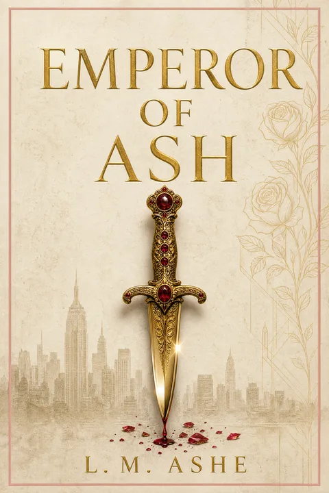
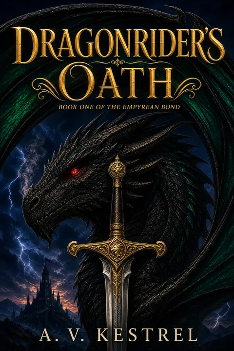

Spot a weak title contrast or need a fresh genre direction?
Why cover readability fails between the artboard and the store grid
Almost every front cover looks clear while you are editing it at 1600 pixels tall on a bright desktop monitor. Readers rarely see it that way first: Amazon search rows on a phone render thumbnails around 90 pixels wide, desktop category grids sit around 160 pixels wide, and E-ink Kindles strip every hue down to grayscale.
Two failures happen in that shrinkage. First, thin display serifs, low-weight subtitles, and low-contrast colour pairs collapse into the background art even when the full-size image is sharp. Second, a cover designed in isolation can lose the visual grammar of its category when placed directly between five genre peers.
This tester inspects only the pixel dimensions (comparing against Amazon's published 1600 × 2560 recommendation and 1000 px minimum longest side, verified 2026-08-27) and samples tonal separation locally via canvas luminance ratios. It does not run OCR or predict KDP review approval — use it to catch contrast, hierarchy, and browse-size legibility problems before launch.
Transcribed from Amazon KDP’s published Kindle eBook front-cover image guidelines, US store (kdp.amazon.com). Last verified 27 August 2026.
Frequently asked
Are my cover files uploaded to a server?
No. Your image is read via an in-browser object URL and sampled locally on an HTML5 canvas. Nothing leaves your device.
What thumbnail sizes do Amazon search results actually show?
On mobile browse and search lists, cover thumbnails typically sit near 85–100 px wide beside title, author and review metadata. Desktop category and search shelves commonly show covers around 150–180 px wide. Testing at both 90 px and 160 px exposes titles that work on desktop but vanish on phones.
Why test a colour ebook cover in grayscale?
Red-on-dark-green or bright-gold-on-cream palettes can separate well in full colour and collapse into nearly identical mid-greys on E-ink Kindles and monochrome screens. Switching to grayscale tells you immediately whether your title relies purely on hue rather than lightness contrast.
What does the tonal contrast score measure?
It samples lightness percentiles across the upper title area and full image using WCAG relative luminance ratios. Strong separation (4.5:1 or higher) means distinct brights and darks exist; low separation warns that highlights and shadows sit close together. It is a tonal measurement, not a substitute for reading the title with your own eyes.
What dimensions does Amazon recommend for Kindle ebook covers?
Amazon recommends an ideal front-cover ratio of 1:1.6 at 1600 × 2560 pixels, with at least 1000 pixels on the longest side. If your tested front cover already works and you now need a print cover, our /ebook-cover-to-paperback converter adds the spine, bleed and back cover for paperback.
What should I change if my title disappears at 90 px?
Usually you do not need a new illustration — increase title scale so it spans more of the cover width, switch thin serif or light sans weights to a heavier face, or darken/quiet the zone behind the text. If the composition itself fails to signal your genre beside peers, start a new direction in /wizard.