This guide is for authors publishing on Amazon KDP or another retail book platform. Google serves both this query and the "wrap a physical textbook in paper for school" query — if you came here for the school version, you want a craft tutorial, not the publishing workflow below.
The honest summary of making a book cover in 2026 is that the steps everyone writes about — pick a focal image, set a title, export at the right size — are the easy part. The hard part is everything that surrounds those steps: deciding what your cover should actually look like for your genre, picking which of five very different production routes fits your book, navigating the Canva and AI-art licensing rules that quietly suspend KDP accounts, and clearing KDP's named rejection failure modes before they cost you a week. This guide goes deep on those four — because the seven-step listicles already cover the easy part.
The Decision Tree Comes Before the Steps
Every other "how to make a book cover" guide opens with a numbered list. They are not wrong, they are just out of order. The route you take depends on three variables, and committing to the wrong route is more expensive than picking the wrong typeface.
The three variables that decide the route:
- Your realistic sales tier for this book. Debut with no audience and no marketing plan is one situation. Launching with a built mailing list and a paid promo plan is a different situation. An established series with a growing readership is a third. The right spend on a cover scales with the expected revenue, not with what feels emotionally appropriate.
- Your design skill, honestly self-assessed. Working knowledge of layout, typography hierarchy and color theory is a real asset and changes the calculus. No design background means a route that comes with a designer attached is the safer bet, even at a higher price.
- Your genre's competitive intensity. Hyper-competitive categories — romance, romantasy, thriller — have a higher cover quality floor than non-competitive categories. The same $200 cover that survives in cozy mystery gets buried in dark romance.
Run those three through the table below before you open Canva.
| Route | Typical cost (2026) | Time to delivery | What you get | Best fit |
|---|---|---|---|---|
| AI generation (configured for your genre) | $0–$30 per cover | Minutes | Cover designed inside genre conventions; type rendered as real editable text; KDP-sized files | Debut with no audience; concept exploration; tight budget; experimenting on covers before commit |
| Budget service tier (GetCovers and similar) | $10–$35 ebook · $20–$60 print | 24–72 hours | Template-derived custom cover from a designer; limited revisions; KDP-sized; community-reported "extra fingers" risk on some outputs | Side project; debut on a strict budget; you want a person in the loop but cannot pay for it |
| Mid-tier stock-based (MiblArt and similar) | $220 ebook · $390 illustration tier · plus wrap | 5–7 business days | Stock-image composition with custom typography; multiple revisions; KDP-ready files; honestly disclosed as stock-based | Mid-tier launch; established backlist; need fast turnaround with a real designer attached |
| Custom indie freelance (named portfolio designer) | $300–$1,200 | 2–6 weeks (some waitlisted) | Original composition; full rights; print wrap with computed spine; series-cover continuity | Launch with marketing plan and a built audience; first book of a planned series |
| Design contest (99designs and similar) | $299 floor + winner bonus | 7–14 days | Multiple competing concepts; one winner; rights transferred at contract close | Authors who want options and can articulate a clear brief; not for ambiguous direction |
| Top-tier illustrated commission | $2,000–$10,000+ | 3–6+ months (often booked) | Name illustrator original art; hardcover-tier quality | Established author; major series launch; six-figure budget |
| KDP Cover Creator (Amazon's built-in tool) | Free | Same session | Few fixed layouts; passes KDP validation; visibly templated | Last resort only; the templated look signals self-published instantly |
| DIY in Canva or Adobe Express | $0–$279/yr tool subscription | Days to weeks (learning curve) | Whatever you can design; full rights to your own images; licensing caveats on platform stock | You have working design knowledge; you are building a series identity yourself |
The decision rule indie author forums converge on — if the book has a real marketing plan and an expected sales tier above 100 copies, the cheapest route that still produces a credible cover is a $200+ designer, not a free Canva attempt. If the book is a side project or an audience-less debut, a well-configured AI cover or a $35 service-tier cover beats both a $0 amateur Canva and a $250 Fiverr commission that may come back as AI-generated anyway.
Why Genre Signal Is the Whole Game
Before you commit to a route, internalize this: the cover's job is not to be beautiful in isolation. The cover's job is to communicate genre to a stranger in under two seconds at 160 pixels wide. That is the size of a thumbnail in Amazon search and the time a browsing reader gives you before they scroll past.
A cover that nails the genre convention at thumbnail scale outperforms a beautiful cover that misses the convention. The opposite is also true — a stunning thriller cover that reads as romance at thumbnail scale will draw the wrong readers, get DNF reviews from people the book was never for, and lose the algorithm signal that would have surfaced it to the right audience.
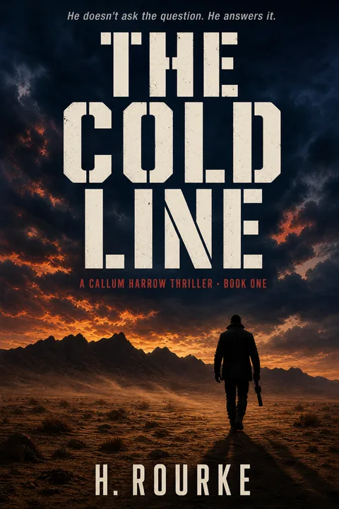
Thriller is the cleanest worked example of how strongly genre conventions converge at the bestseller tier, because thriller's conventions are unusually visual and unusually consistent. The chart below codes Amazon's Thrillers and Mysteries Top 100, refreshed for the current quarter.
The pattern repeats across every commercial genre, with the specific conventions varying. Romance bestsellers converge on a different set of patterns (illustrated, title-dominant, single ornamental object, dark or saturated solid ground); fantasy bestsellers on yet another (dark ground, illustrated, single iconic element, decorative serif title, warm metallic accent). The point is not the specific list — the point is that there is a list, and the bestseller tier of every commercial genre has converged on it, and your cover needs to satisfy the list before it tries to be original.
The Genre Signal Codex
The fastest empirical method to identify your subgenre's specific conventions is to open Amazon, sort by bestseller and screenshot the top 20 covers in your subgenre, then look for the five things that repeat. That exercise is still worth doing for your specific niche. The table below is a starting point for the five biggest KDP genres so you do not start from zero.
| Genre | Background | Focal element | Typography | Figure treatment | Accent |
|---|---|---|---|---|---|
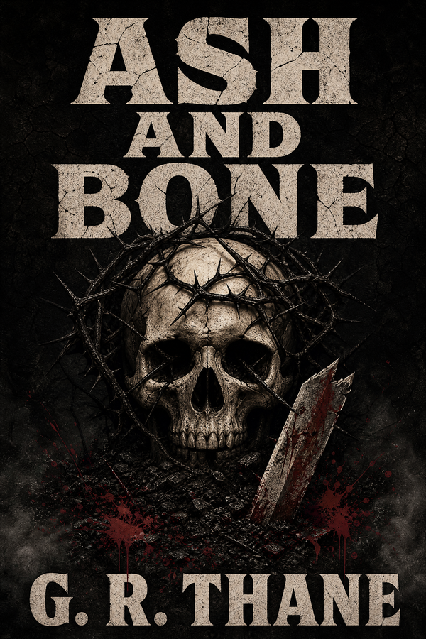
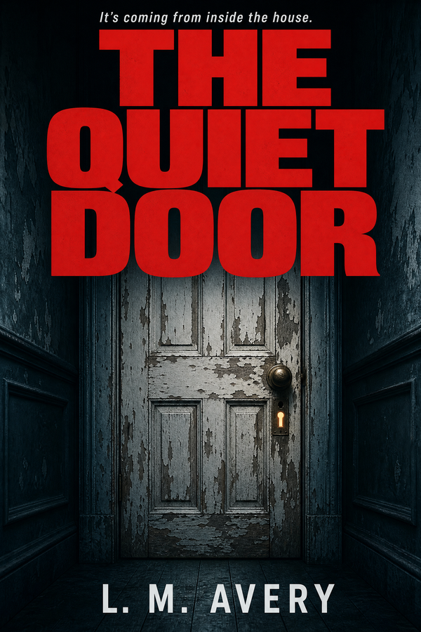
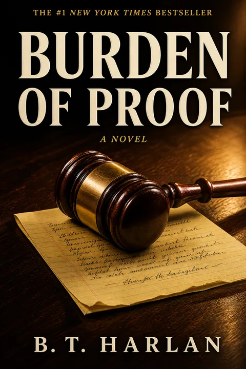
| Thriller / mystery | Near-monochrome (one accent on deep navy, charcoal or black) | Silhouette, doorway, lone window — a single tense focal | Heavy condensed sans or slab; built like a road sign | Silhouetted or absent; menace is implied, not shown | One restrained accent (warning yellow, blood red) on near-monochrome |
| Romance | Solid color block — dark for dark romance, saturated pastel for contemporary | Single ornamental object (ring, dagger, apple, crown) or chunky illustrated couple | Chunky modern serif; rarely sans | Object-led; photographic couples now code as pre-2018 | One dominant accent on the ground (blood red, metallic gold, coral, mint) |
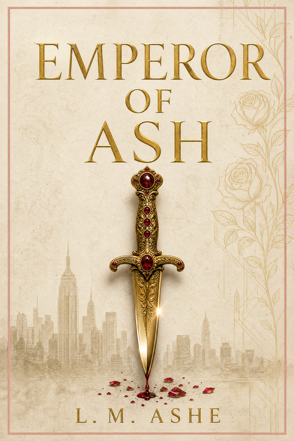
| Fantasy / romantasy | Dark or near-black, contrast-heavy | Single iconic element (wing, sword, snake, silhouette) | Large serif or decorative display | Silhouetted or symbolic; full narrative scenes are rare | Warm metallic (gold, fire-orange, burnished) |
| Children's (picture book → middle grade) | Warm-saturated (yellows, corals, leafy greens) | Single oversized character, anchored center-frame | Hand-lettered or chunky serif; never thin sans | Friendly faces; avoid synthetic AI faces in this genre above all | Textural background (paper, watercolor, gouache) |
| Nonfiction | Restrained (one color, often muted) | One conceptual mark or symbol; bold confident type as the hero | Heavy sans or slab; the title itself is the cover's visual centerpiece | Often no figure at all | One color block or single accent against the type |
Two operational notes on the codex. First — the codex is the genre baseline, not a subgenre fingerprint. A cozy mystery and a domestic thriller are both inside the thriller row, but they speak near-opposite visual dialects (cozy uses warmth and a hero object; domestic uses cold restraint and a lone figure). Always do the 20-cover screenshot for your specific subgenre after consulting the codex. Second — the codex is descriptive of the bestseller tier, not prescriptive. If your book is intentionally targeting a niche outside the bestseller convention you can break the convention, but you are choosing a smaller audience as the tradeoff.
For deeper subgenre fingerprints with the specific dialects called out, see the deepdive on making a fantasy book cover and the romance bestseller analysis.
How to Make a Book Cover — The Operational Steps
The steps below assume you have already picked your route from the decision table above and identified your subgenre's conventions from the codex.
- 01
Lock the trim size and orientation before you touch any image
Kindle ebook is 1600 × 2560 pixels (2:3 ratio). Print is a single wrap file — back cover + spine + front cover in one image — whose exact dimensions depend on trim size and page count. Run KDP's print cover calculator at kdp.amazon.com/cover-calculator before designing the print wrap. Designing the front cover first then trying to retrofit a spine and back is the single most common production mistake.
- 02
Apply the codex defaults for your subgenre
Pick the row of the genre codex for your category and apply the five defaults — background, focal element, typography, figure treatment, accent — as your starting point. Resist the urge to break a convention 'to stand out'; at thumbnail scale, breaking a convention reads as missing it, which reads as amateur. Variations live inside the bestseller envelope, not against it.
- 03
Choose your focal element and let it dominate
Fill 40–60% of the cover vertical with the focal element. Centered or off-center are both fine — thriller often goes off-center for unease, romance and fantasy typically center. A full narrative scene with multiple characters and architectural detail is unreadable noise at 160 pixels wide. One object, one symbol, one silhouette.
- 04
Set the title type as a real, separate layer
Never let the title be part of an AI image — image-generated text comes back hallucinated, warped or unreadable. Type the title in real editable text on its own layer. Pick a typeface from the codex (heavy condensed sans for thriller, chunky serif for romance, decorative serif for fantasy, hand-lettered for children's). Make the title large — a title under roughly 30% of the cover height vanishes at thumbnail scale.
- 05
Add series labelling if applicable
Series readers track their position through small, consistent series-name and book-number labels — often a band at the top or bottom in a smaller weight than the title. Use the same treatment across every book in the series so the books read as a coherent set on a search-results page. At thumbnail scale the band does not need to be readable; it signals 'series entry' through its presence.
- 06
Audit every visual element for commercial license rights
Before you ship, audit every visual element you did not personally upload or generate. Did you generate it under terms that grant commercial rights for resale on a third-party product (KDP)? Did you license it from a stock provider whose terms cover ebook and print sale? Did you commission it with a contract that transfers commercial rights? If any element fails the audit, replace it — see the asset rights section below for what fails most often.
- 07
Run the KDP rejection failure-mode checklist
Pre-empt KDP rejection by running the file through the named failure modes — text inside 0.375 inches of all edges, trim + bleed dimensions correct to two decimal places, file under 40 MB, CMYK color profile for print, all fonts embedded, spine text on a single line. Each is a real KDP error string. Catching them before upload saves a 24–72 hour review cycle per fix.
- 08
Proof at thumbnail size — three questions
Resize your exported cover to 160 × 256 pixels and view at screen resolution. Three questions: does the focal element read clearly? Is the title legible? Does the cover signal the right subgenre (or could it be mistaken for an adjacent one)? If the answer to any is no, the cover needs revision — not the thumbnail. Designing at full resolution and skipping the thumbnail proof is the single most common cover failure mode.
The Canva and Stock Licensing Rule Nobody Writes Plainly
The most common single cause of KDP cover account warnings in 2024–2026 indie author forums is asset licensing, almost always traced back to Canva Pro stock or to free-stock images used in violation of the platform's terms. Every other guide either ignores this or hedges. The plain version, drawn from the actual reports.
Canva as a layout tool is fine. Using Canva to lay out a cover with images you personally uploaded, with type you set yourself, is not the problem. Canva itself is not on Amazon's bad list.
Canva Pro stock and Canva template elements are the risk. The reported KDP suspensions trace overwhelmingly to Canva's Pro stock images and certain template-bundled elements. The underlying issue is that Canva's licensing terms for those assets have been flagged by Amazon as not clearly covering resale on a third-party product. The free Canva library is somewhat safer but still requires you to read the license for each asset; not all Canva content is equal.
Free-stock sites vary widely. Unsplash grants royalty-free commercial use, so landscape and object photos are generally fine — but any photograph of an identifiable person requires a model release before you can put it on a sales cover, and Unsplash does not automatically include one. Pixabay and Pexels have similar terms with similar caveats.
Pinterest and Google Images search-found art is never safe. Search engines index images; they do not license them. Using a Pinterest or Google Images find on a KDP cover is a takedown and DMCA risk regardless of how obscure the source looks.
Licensed stock (Adobe Stock, Shutterstock, Depositphotos) is the safest paid route. Confirm the license tier covers commercial resale and read the platform's specific resale terms — most do, but the extended license tier is sometimes required for high print-run titles.
Commissioned original art is the cleanest path — provided the contract includes a work-for-hire clause or an explicit commercial rights transfer.
AI-generated covers are legitimate but the rights question is the same. Confirm your generation tool's terms grant you commercial rights to outputs you create. Most do; some do not.
| Source | KDP risk | Practical guidance |
|---|---|---|
| Canva — your own uploaded images | Low | Layout-tool use is fine; the rights are yours |
| Canva Pro stock | Moderate to high | Audit each Pro stock asset's license explicitly; the suspension reports trace here |
| Canva free elements | Low to moderate | Read the asset license; not all free Canva content is equal |
| Unsplash, Pixabay, Pexels (objects, landscapes) | Low | Commercial use granted; safe for non-identifiable subjects |
| Unsplash, Pixabay, Pexels (identifiable people) | Moderate | Commercial use granted but you must also have a model release for the person |
| Pinterest / Google Images search results | High | No license granted; never use |
| Licensed stock (Adobe Stock, Shutterstock, Depositphotos) | Low | Confirm commercial / extended license; read the platform's resale terms |
| Commissioned original art | Lowest | Ensure contract includes a work-for-hire or rights-transfer clause |
| AI-generated (rights-holding tool) | Low | Confirm the tool's terms grant commercial rights to outputs |
The governing principle is simple — you must hold a clear commercial license or ownership right to every visual element on your cover before uploading to KDP. When in doubt, check the license before you design, not after you have built the cover around an asset you cannot use.
Why KDP Keeps Rejecting Your Cover — the Named Failure Modes
Almost every first-time KDP cover rejection falls into one of a handful of named failure modes. None of the top "how to make a book cover" guides enumerate them. Run this checklist before upload and most authors clear the first review.
- ✕01
Text inside the 0.375-inch safe zone (front cover or back cover)
KDP rejects covers with any text — including title, subtitle, author name, or barcode area copy — within 0.375 inches of any edge. This rule applies even when the text bleed is an intentional stylistic choice. There is no workaround. Move all text inward to satisfy the 0.375-inch margin before resubmission.
- ✕02
Trim plus bleed math off by a fraction of an inch
KDP rejects covers whose dimensions do not exactly match the calculator output for your trim size and page count. The math is unforgiving — 0.01-inch differences will fail validation. Use KDP's print cover calculator at kdp.amazon.com/cover-calculator and match the output dimensions exactly. If you are designing in Photoshop or Affinity, set the canvas to the calculator output before importing any artwork.
- ✕03
File over 40 MB
KDP's print cover upload limit is 40 MB. Covers with high-resolution embedded images can exceed this. Flatten layers, compress images at 300 DPI without exceeding the limit, and export as PDF/X with a moderate compression setting. The compressed file should still be at print quality but well under 40 MB.
- ✕04
Print PDF not in CMYK
KDP rejects print covers exported in RGB. Convert to CMYK before export. Some tools (notably Canva) default to RGB and require a manual setting change or a Pro feature to export CMYK. Verify the color profile in the export dialog.
- ✕05
Fonts not embedded in the print PDF
KDP rejects print PDFs with unembedded fonts. Convert text to outlines or ensure the PDF export settings have 'embed all fonts' enabled. Outlining text means the title cannot be edited later — embed instead if the workflow allows.
- ✕06
Spine text wrapping onto two lines or too close to the edge
KDP rejects spine text that wraps onto two lines or sits within 0.0625 inches of the spine edges. If your title is long or your book is thin, abbreviate the spine title (drop the subtitle from the spine) or increase the page count by adjusting interior layout. The spine width is fixed by page count — you cannot shrink type indefinitely.
Where AI Covers Currently Sit on KDP
AI book cover generation is widely used on KDP in 2026 — and widely misunderstood. The honest position has three parts.
Amazon does not blanket-ban AI covers. KDP's current guidance asks for three things — you hold the rights to the output, the cover meets their quality bar, and you self-identify AI-generated content during the title-setup flow. The disclosure is a checkbox, not a barrier; many high-performing KDP books in 2024–2026 ship with AI covers and are not flagged.
Reader perception is the live risk, not Amazon. In genres with high audience expectation for hand-crafted art — literary fantasy, romantasy, children's picture books — readers detect and react to AI covers. The visible telltales are warped title text, melted hands, six-fingered figures, no focal hierarchy, and the "wallpaper" look of detail-everywhere with no centerpiece. A practicing author quoted in the indie forums put it: "I was in the book store the other day and identified several AI covers; my wife could see some of them, but she was blind to others until I pointed it out."
The fix is anchored generation plus separated title type. Two operational defaults make an AI cover indistinguishable from a mid-tier custom cover at thumbnail scale. First, constrain the generation to your genre's bestseller conventions (the codex above) — not an open prompt box. A constrained generator produces covers inside the bestseller envelope; an open prompt box produces averages of everything. Second, never let the AI render the title — type it as real editable text on a separate layer. Almost every "obviously AI cover" complaint traces to the warped-title-text giveaway.
The decision rule on AI for a serious launch — if you are publishing into a high-expectation genre (literary fantasy, romantasy, picture books) on a serious launch with a marketing plan, weigh the reader-perception cost; consider a designer route. If you are publishing into a saturated genre with a tight budget or experimenting with concepts pre-commitment, a properly anchored AI cover is competitive with a $200–$400 designer route at thumbnail scale, and dramatically cheaper. Honesty matters — opting in to AI generation and then trying to hide it is the worst combination.
What Fiverr Looks Like in 2026
The "go hire a $200 Fiverr designer" recommendation common in 2022–2023 cover guides is outdated. Working indie authors in 2024–2026 report two recurring patterns on Fiverr: AI delivery on premium-tier commissions and translation-layer middleman shops that re-route work to anonymous prompt-writers. Indicative quote from a 2025 r/selfpublish post:
The current 2026 indie cover ecosystem mostly looks like — GetCovers (the $10–$35 service tier; community-acknowledged as cheap-but-acceptable, with some "extra fingers" risk on AI-assisted work); MiblArt (mid-tier stock-based, $220 ebook through $390 illustration tier, honest about its stock-based composition); 99designs (the $299-floor contest model, useful when the brief is clear); Reedsy marketplace (vetted designers, mid-to-high tier); named freelancers found via Instagram or DeviantArt with traceable cover portfolios. Fiverr still has working designers but the platform-level signal-to-noise has dropped enough that author-side due diligence (request portfolio, request work-in-progress milestones, time-bounded contract) is the floor of safe practice.
Cover Styles You Can Generate Now
The archetype gallery below shows published thriller cover styles in the wizard. Each is built on the conventions above — type-led, near-monochrome, single tense focal element, heavy condensed title. Click any cover to open the wizard locked to that style.

The wizard also supports romance, fantasy, children's and nonfiction with their own archetype sets — pick a genre on the next screen.
Making Your Cover
The cover that ships and sells is not the cover that wins art-direction awards. It is the cover that signals genre at thumbnail scale, holds rights you can defend, and clears KDP's named failure modes on the first review. The conventions in the codex are not a creativity constraint — they are the genre's language. When your cover speaks the language, it enters the conversation. When it does not, no amount of interior quality saves it from the browse.
When you are ready, the book cover maker applies these conventions directly — pick a genre, the bestseller defaults are pre-configured, the variations live inside the envelope. Three covers free, no card required.
For the genre-specific deepdives, see how to make a fantasy book cover, the romance bestseller analysis, and the thriller and mystery cover design page.
01What is the cheapest way to make a usable book cover for KDP?
The cheapest path that still produces a usable cover is a service-tier ebook design at $10–$35 (GetCovers is the budget reference; MiblArt is the stock-based mid-tier at around $220), or a well-configured AI generation that follows your genre's conventions. The cheapest path that does not produce a usable cover is a $0 amateur Canva design with no genre calibration — it ships but it does not sell. Free is a false economy on KDP because a wrong-signal cover suppresses your category placement and the cost to your launch is much higher than $35.
02Will Amazon KDP ban an AI-generated book cover?
No, Amazon does not blanket-ban AI-generated covers. KDP guidance requires three things — you hold the rights to the output, the cover meets their quality bar, and you self-identify AI-generated content during the title-setup flow (a checkbox, not a barrier). The real risk is reader perception in genres with high audience expectation for hand-crafted art (literary fantasy, romantasy, picture books), and the "obviously AI" telltales of warped title text, melted hands and no focal hierarchy. An AI cover anchored to your genre's bestseller conventions and using real type rendered separately from the image avoids both risks.
03Can I make a KDP book cover in Canva?
Yes, with one important asset-licensing caveat. Canva as a layout tool using your own uploaded images is fine. The risk is Canva Pro stock images and certain Canva template elements — their licensing terms have repeatedly been flagged by Amazon, and the KDP account-suspension reports in indie author forums trace back overwhelmingly to Pro stock. Free Canva content is somewhat safer but still requires you to read the license. The simple rule — if you did not personally upload it or generate it under a license that explicitly covers commercial resale on a third-party product, do not put it on your KDP cover.
04Why does KDP keep rejecting my book cover?
KDP rejection is almost always one of a handful of named failure modes. Text inside the 0.375-inch safe zone (KDP will not accept intentional text bleed — it is treated identically to accidental). Trim plus bleed math off by a fraction of an inch. File over 40 MB. Print PDF not in CMYK. Fonts not embedded. Spine text breaking onto two lines. Each of these has a specific KDP error string and a specific fix. Run the named-modes checklist before upload and most authors clear the first review.
05How long does it take to make a book cover?
The route determines the timeline. AI generation is 60 seconds to a few minutes per cover. A service-tier provider (GetCovers tier) is 24–72 hours. Mid-tier stock-based designers like MiblArt are 5–7 business days. Custom indie freelance designers run 2–6 weeks (and Fiverr top sellers are often waitlisted 1–2 weeks before they even start). Top-tier illustrators for fantasy and children's covers are 3–6+ months and often booked out. Plan backwards from your launch date.
06Can I just use the KDP Cover Creator instead?
You can but most working authors do not. KDP Cover Creator is the built-in Amazon tool. It is free, it is browser-based and the file it produces will pass KDP validation. The problem is the visual quality bar — Cover Creator outputs a small set of fixed layouts that experienced readers recognize as the platform's defaults, which signals self-published in a glance. It is a fine fallback if you have no alternative, but virtually any other route produces a cover that signals the right genre more credibly.
07How do I know what my genre's cover conventions are?
The fastest empirical method — open Amazon to your exact subgenre, set the sort to bestsellers, and screenshot the top 20 covers. Look across the screenshots for the five things that repeat — background palette, focal element type, title typeface weight, character treatment, accent color. Those repeats are the convention. The data-anchored summary in the genre codex section of this guide gives you the answer for the five biggest KDP genres up front so you do not have to do the analysis yourself, but doing the screenshot exercise for your specific subgenre afterward is still worth the 20 minutes.
Evan Kane is the founder of MakeMyBookCover and runs the cover-archetype research program behind the product — auditing the Amazon US Top-50 covers across romance, thriller, fantasy, children, and nonfiction every quarter to keep the genre-signal models honest.