A 'pretty' cover is the kiss of death in thriller.
Thriller readers scroll fast and judge faster. If your cover reads romantic, literary, or — worse — friendly, you've already lost the click. The genre has a precise visual dialect: dark, off-balance, type-led, one tense focal element. Get it wrong and Amazon's algorithm will quietly bury you in the wrong category.
What today's bestselling thrillers actually do
Not opinion. Pattern-counted across every cover in the top tier — refreshed quarterly so what works this season is what your cover follows.
Which thriller / mystery subgenre is yours?
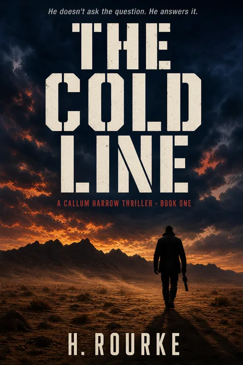
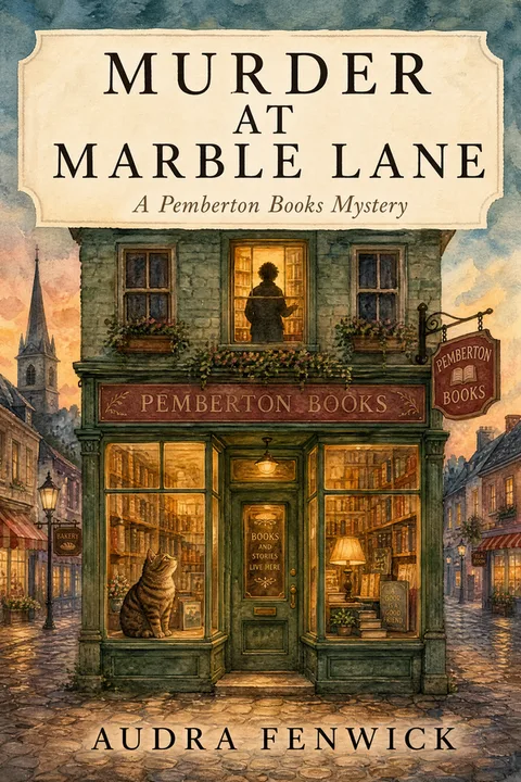
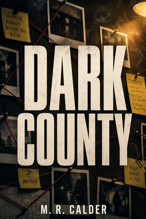
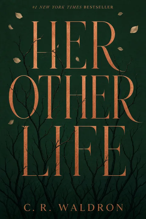
The styles you can pick from today.
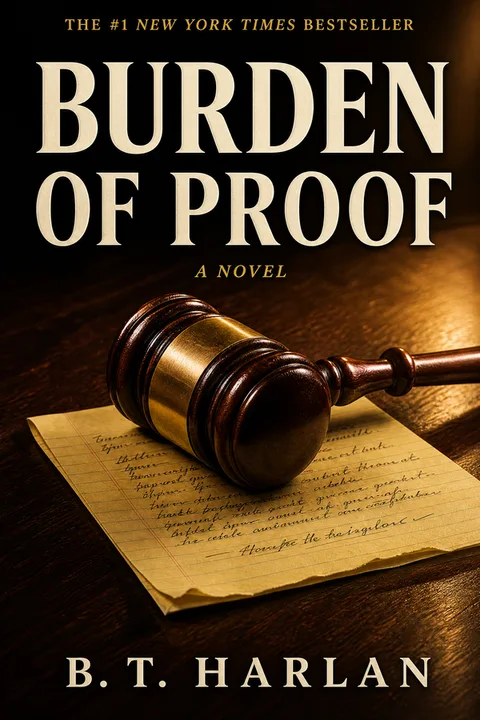
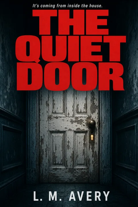
6 archetypes shown · more once you pick a subgenre on the next screen.
The five mistakes that read “self-published”
Every cover we generate is constrained away from these by default — that’s the whole point of anchoring to what already sells.
How it works
Tell us about your book.
Title, author, subtitle. No prompt engineering, no AI vocabulary.
Pick a thriller archetype.
Pre-tuned to the patterns in the Pillar 0 exhibit above — you can't accidentally pick a non-thriller look.
Download your KDP-ready file.
1600 × 2560 ebook PNG + 300 DPI print at 1792 × 2688. Full commercial rights.
Exact KDP dimensions, so you never re-export
6 × 9 is the self-pub thriller standard — the type must stay legible at the 90px Amazon thumbnail. Every cover we export is already sized to this — no calculator, no re-do.
Illustrator, designer, premade — or this
Thriller covers are cheaper to outsource than children's — it's type plus one image, not full illustration.