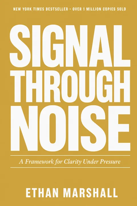
A great recipe behind a clip-art cover still dies in the Amazon thumbnail.
You tested the recipes, shot the food, wrote the headnotes. Then the cover came from a free template and now your book looks like a school fundraiser pamphlet next to the cookbooks readers actually buy. Cookbook browsing is brutal at thumbnail size: a grid of six tiny dishes turns to mush, a dim food photo kills the appetite, a script title over a busy plate stops being legible at 90px. Your cover has about a second to read as "a book I’d cook from" — not "someone’s printout".
What the most-loved cookbook covers actually do
Not opinion. Pattern-counted across every cover in the top tier — refreshed quarterly so what works this season is what your cover follows.
Which kind of cookbook are you publishing?
The styles you can pick from today.
6 archetypes shown · more once you pick a subgenre on the next screen.
The five mistakes that read “self-published”
Every cover we generate is constrained away from these by default — that’s the whole point of anchoring to what already sells.
How it works
Tell us about your book.
Title, author, subtitle. No prompt engineering, no AI vocabulary.
Pick a nonfiction archetype.
Pre-tuned to the patterns in the Pillar 0 exhibit above — you can't accidentally pick a non-nonfiction look.
Download your KDP-ready file.
1600 × 2560 ebook PNG + 300 DPI print at 1792 × 2688. Full commercial rights.
Exact KDP dimensions, so you never re-export
8 × 10 is the cookbook industry standard — large enough for full-bleed food photos, still cheaper per unit than 8.5 × 11. Print photo-heavy cookbooks on KDP color paper so the food reproduces well. Every cover we export is already sized to this — no calculator, no re-do.
Illustrator, designer, premade — or this
Cookbooks carry two costs most genres don’t — food photography and photo-heavy interior formatting — on top of the cover itself. Here’s the 2026 cover-only landscape.