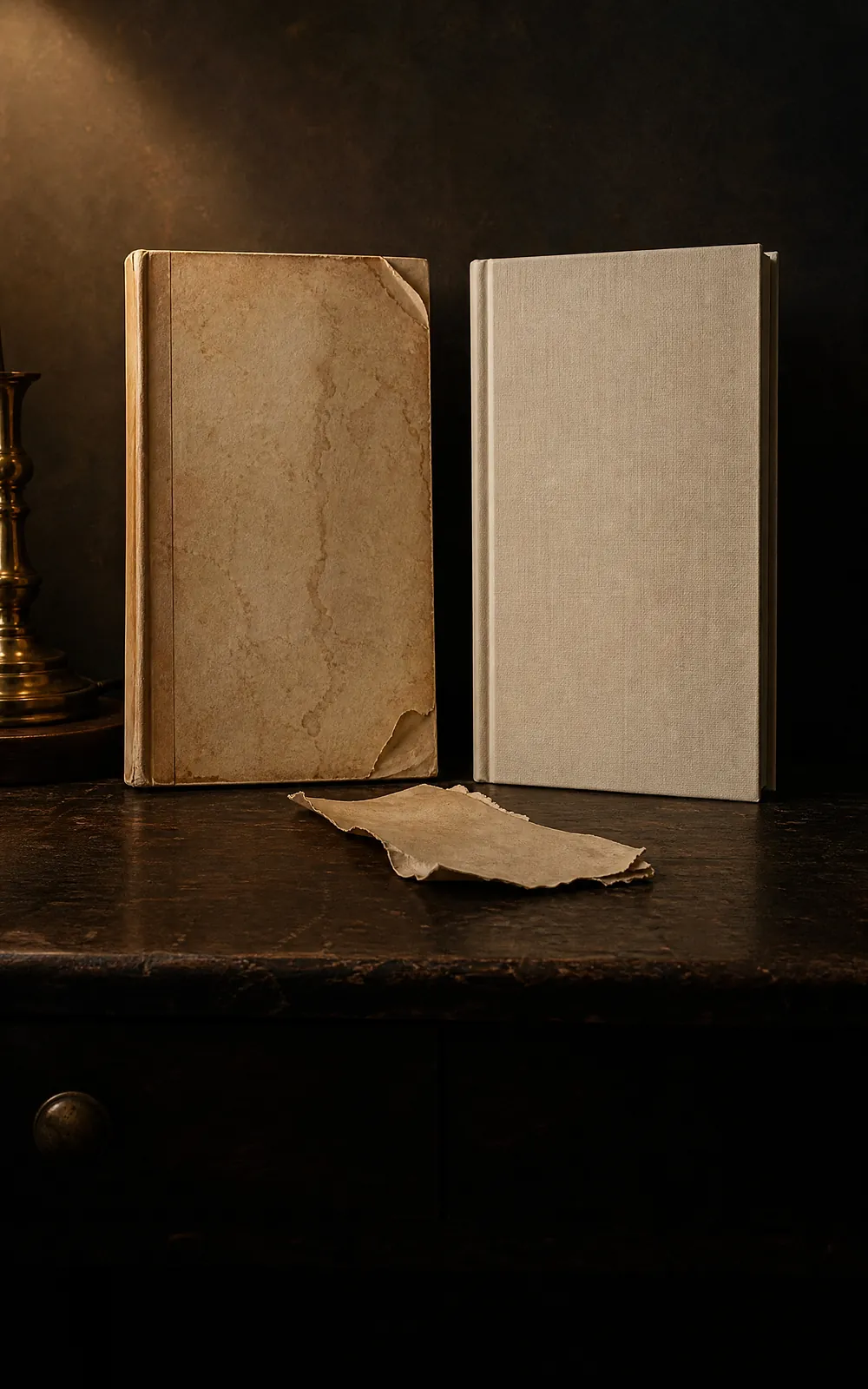
Search "matte vs glossy book cover" and nearly every result repeats the same rule: glossy for romance, fantasy, and commercial fiction; matte for literary fiction and serious nonfiction. It's stated with total confidence and sourced from nowhere.
Amazon's own KDP help page says something close to the opposite.
Quick Answer
If you're staring at the radio button in KDP's print setup right now: fiction of any genre → matte. Nonfiction, textbook, children's book, or a photo-heavy cover → glossy. That's Amazon's own stated default, straight from the source above. It costs nothing either way, and you can change it later without a new edition or a new ISBN. Everything below is the reasoning, the exceptions, and how to switch if you already picked one.
This isn't a case of one source being wrong and the other right — a shelf-convention pattern and a printer's stated default can both be real and still disagree, and it's worth knowing which one you're actually looking at before you pick. Here's what's verifiable, starting with the source that's actually accountable for the answer.
What You're Actually Choosing Between
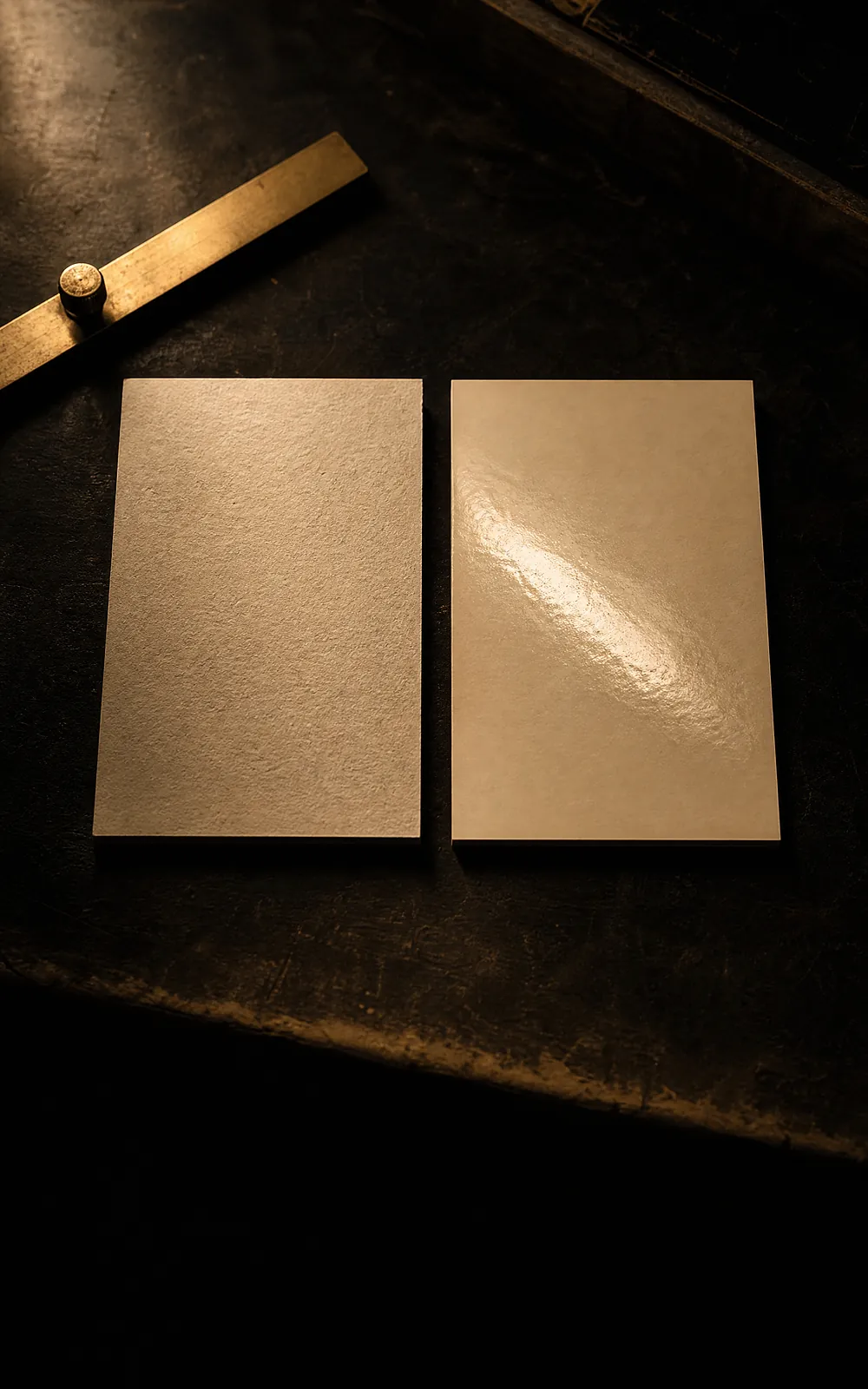
On a paperback, finish is a lamination applied to the printed cover after it comes off the press — the artwork underneath is identical either way. KDP prints paperback covers on 80 lb (220 GSM) white paper stock with either a glossy or matte finish over it.
On a hardcover, the mechanism is different even though the decision feels the same. The cover is printed and then wrapped around a 2 mm solid case board, finished with a glossy or matte lamination over that board — a stiffer, heavier surface than a paperback's coated paper. Amazon's hardcover documentation describes this mechanism but doesn't repeat the genre guidance given for paperbacks specifically.
Ebooks aren't part of this decision at all. A Kindle cover is a digital file with no physical surface — there's no coating to choose.
The Fiction/Nonfiction Split, Straight From KDP
Here is the guidance in full, quoted directly rather than summarized, because the exact wording is the point:
| Finish | What KDP says it's typical for |
|---|---|
| Glossy | "Textbooks, children's books, and nonfiction" |
| Matte | "Novels and other fiction" |
Two things follow from this that most articles skip. First, it's a two-way split, not a genre-by-genre rule — KDP doesn't distinguish romance from thriller from literary fiction, and calling all of it "novels" that default to matte is the entire fiction-side guidance. Second, this directly contradicts the "commercial genre fiction gets glossy" convention that dominates the search results for this exact question. Both can be describing something real: a shelf-level design convention that print shops and cover designers have observed for decades is not the same thing as a specific printer's own stated default, and KDP's is the one governing your actual book.
If you're publishing a novel in any genre, matte is Amazon's stated default. If your book is nonfiction, a children's book, or genuinely photo- or illustration-forward, glossy is.
The binary breaks down at one real edge case: illustrated fiction. A graphic novel, a comic, or a heavily illustrated middle-grade novel is technically fiction, but it's built the same way a photo-led nonfiction cover is — dense, saturated art carrying the whole cover rather than type over a simpler background. KDP's own split doesn't carve out an exception for this, but the physical reasoning in the next section does: if your "novel" reads visually like a children's book rather than a typical text-forward cover, weigh it by what's actually on the cover, not just which shelf the book sits on.
Why the Fiction Default Leans Matte — and Nonfiction Leans Glossy
The physical properties KDP describes explain the split better than genre alone does. Glossy "makes black covers darker and artwork more striking" — it's a finish built to intensify saturated color and high contrast, which is exactly what a photo-led nonfiction cover needs from its printing. Matte "has minimal sheen and a subtle, polished look" and, unlike glossy, doesn't throw glare back at a reader under angled light — a real consideration for a cover meant to be read in hand rather than only browsed on a screen.
This is where the choice connects to what a cover is actually doing visually. Cookbooks are a clean illustration of the glossy side of KDP's split:
Eighty-four percent of bestselling cookbook covers sit on a light or bright background, and seventy-four percent lead with a photograph of food rather than illustration or type. That combination is precisely what glossy is suited to intensify — a photograph of a plated dish gains saturation and pop under a glossy coat in a way a matte finish would soften. It's not a coincidence that KDP's own nonfiction-leans-glossy guidance and a photo-forward genre's actual visual convention point the same direction.
Fiction runs the opposite way for a related reason. A cover carrying dense type, a dark palette, or fine illustrated linework — closer to what dominates most fiction genres — reads more cleanly without glossy's reflective sheen competing for attention, which is consistent with matte being fiction's stated default rather than an arbitrary one.
The practical shortcut: whatever built your cover, you already know which of these two it is. A cover generated to match your genre's actual bestseller conventions comes with that answer built in — a romance or thriller cover matched to its category leans type-dominant and darker, which points to matte; a cookbook cover matched to its category leans photo-forward, which points to glossy. You don't need a separate rule once you know what your specific cover is actually doing.
What This Doesn't Cost You
Bleed settings and cover finish don't affect your printing cost on KDP. Trim size, page count, ink type, and paper type move the number — glossy versus matte doesn't. There is no royalty difference and no price-per-copy difference between the two.
This matters because several popular articles frame the decision as a budget trade-off, implying one option is the "premium" choice. On KDP specifically, that framing is false. Since neither option costs more, the only good reason to pick one is that it suits your specific cover — not that it's the cheaper or fancier option.
Can You Change It Later?
Yes, and more easily than the confident advice elsewhere on this topic implies. Finish is a setting chosen during print setup, separate from your cover artwork file. Updating it on an already-published book follows the same in-place cover-update process KDP uses for any cover change — it does not require publishing a new edition or a new ISBN.
The real-world evidence that this is a genuinely revisitable decision, not a one-shot commitment: "matte vs glossy" is a recurring, years-old thread on KDP's own community forum, with authors describing switching one direction and then back again on the same title. If you're not sure, the switch is not permanent — order a printed proof of your new finish before committing at volume, since a finish that looks right in a product photo can read differently once it's actually in your hands.
Common Mistakes
- ✕01
Copying a genre rule instead of checking KDP's own default
The 'glossy for commercial fiction' convention is widely repeated and rarely sourced. Amazon's own paperback page states the opposite split — matte as fiction's default, glossy for nonfiction and children's books. Start from the source that actually prints your book.
- ✕02
Treating the choice as a cost decision
Bleed and finish don't change your printing cost on KDP. Picking based on which one sounds more premium or budget-friendly is optimizing for something that isn't real on this platform.
- ✕03
Applying the same rule to hardcover and paperback
Paperback finish is a lamination on coated paper; hardcover finish is a lamination on a 2 mm case board. Amazon documents genre guidance for paperback specifically and doesn't repeat it for hardcover — don't assume the fiction/nonfiction split was ever stated for the hardcover mechanism.
- ✕04
Assuming the decision is permanent
Finish is a dashboard setting separate from your cover file, and changing it later follows the same in-place update as any cover swap — no new edition, no new ISBN. Authors second-guess this decision far more than the mechanics actually require.
- ✕05
Deciding without a physical proof
A finish that looks correct in a listing photo or a designer's mockup can read differently once it's an object in your hand, especially for high-contrast or very dark covers. Order a proof before committing to a print run.
The Decision, Step by Step
- 01
Know what you're actually choosing between
On a KDP paperback, finish is a lamination applied to the printed cover — glossy is shiny and reflective, matte has minimal sheen. On a hardcover, the equivalent choice is called lamination over the case board rather than "finish," but it's the same physical decision. Neither option changes your interior pages or your cover artwork file — it changes only the coating applied over the printed result.
- 02
Start from what KDP's own page says, not what blogs repeat
Amazon's paperback cover page states glossy finish is typical for textbooks, children's books, and nonfiction, and matte finish is typical for novels and other fiction. That is close to the reverse of the "glossy for commercial fiction" rule most articles repeat with no source. If your book is a novel, matte is Amazon's own stated default; if it's nonfiction, illustrated, or photo-heavy, glossy is.
- 03
Weigh the physical differences KDP itself describes
Glossy makes black covers darker and artwork more visually striking — it suits high-contrast, photo-led, or illustration-dense covers where saturated color is the point. Matte has a subtle, understated look and reads without glare under angled light, which matters for a cover held and read in person rather than only browsed on a screen.
- 04
Confirm your genre and category norm before defaulting
KDP's guidance is a fiction/nonfiction split, not a per-genre one — it doesn't distinguish romance from thriller from literary fiction, all of which it groups as "novels." Within fiction, finish norms vary more by category convention than by any rule Amazon publishes, so a quick look at your subcategory's current bestsellers tells you more than a blanket recommendation.
- 05
Remember the cost is identical either way
Bleed settings and cover finish don't change your printing cost on KDP — trim size, page count, ink type, and paper type are what move the number. Choosing glossy over matte, or the reverse, costs you nothing extra, so there's no budget reason to default to one.
- 06
Know it's a dashboard setting you can revisit
Finish is selected during the print setup step for a paperback or hardcover, separate from the cover artwork file itself. Updating it later on a live book follows the same in-place cover-update flow KDP uses for any cover change — it does not require publishing a new edition. This is why "the age-old matte vs glossy debate" is a recurring thread on KDP's own community forum rather than a one-time decision authors agonize over forever.
Related Reading
- Book cover dimensions — the trim, bleed, and spine math for the same print file this finish gets applied to.
- Recipe book cover ideas — the photo-led cookbook conventions referenced above, for anyone designing in that category.
- Book cover redesign — if a finish swap is part of a larger relaunch rather than a first-time decision.
- Free KDP tools — the calculators for the rest of your print file spec.
Finish Is the Last Decision, Not the First
If you already have a cover and just needed the answer above, that's the whole decision — pick it in KDP's print setup and move on. Finish is a printing choice; it doesn't change whether the cover itself gets buyers to click.
If you're earlier in the process and the artwork isn't locked yet, that's the part actually worth spending time on — the composition, the type, the genre signal at thumbnail size is what a finish choice can't fix either way.
01Should I choose matte or glossy for my book cover?
Start from what Amazon's own KDP page states, not from a genre rule you've read elsewhere: glossy finish is typical for textbooks, children's books, and nonfiction, and matte finish is typical for novels and other fiction. If you're publishing a novel — in any fiction genre — matte is Amazon's own stated default. If your book is nonfiction, a children's book, or photo- or illustration-heavy, glossy is. Beyond that split, the choice comes down to what a specific cover needs: glossy intensifies saturated color and contrast, matte avoids glare and reads as more understated. Since the cost is identical either way, there's no financial reason to default to one over the other — it's worth actually deciding rather than guessing.
02Do glossy and matte covers cost different amounts to print on KDP?
No. KDP states directly that bleed settings and cover finish don't affect printing cost — trim size, page count, ink type (black or color), and paper type are what determine the number. Choosing glossy over matte, or matte over glossy, changes nothing about what you pay per copy or what royalty you earn. This is worth knowing because several popular articles frame the choice as a budget decision; on KDP specifically, it isn't one.
03Is the matte-or-glossy choice different for hardcover than paperback?
The mechanism is different even though the decision feels the same. A KDP paperback's finish is a lamination applied directly to the printed 80 lb (220 GSM) cover paper. A KDP hardcover's cover is printed and then wrapped around a 2 mm case board, finished with a glossy or matte lamination over that board — a heavier, stiffer surface than a paperback's coated paper. Amazon's hardcover help page does not repeat the genre guidance given for paperbacks, so the fiction/nonfiction split above is documented for paperback specifically, not stated for hardcover.
04Does the glossy-or-matte cover finish affect the ebook version?
No, because the question doesn't apply to it. A Kindle ebook cover is a digital image file with no physical surface — there is no lamination, coating, or print finish involved at all. Finish only exists for the two print formats, paperback and hardcover. If you publish all three formats from one cover design, the finish decision affects only the physical copies a reader can hold.
05Can I change my book's cover finish after it's already published?
Yes. Finish is selected as part of your print setup, separate from the cover artwork file, and updating it on a live book follows the same in-place cover-update process KDP uses for any cover change — it does not require publishing a new edition or a new ISBN. This is a real enough question that "matte vs glossy" is a recurring, multi-year thread on KDP's own community forum, with authors switching one direction and then the other on the same title. Order a physical proof of the new finish before committing at volume; a finish that looks right in a product photo can read differently in hand.
06Why do most articles say glossy suits romance and fantasy when KDP's own page says matte is typical for fiction?
Because most articles are repeating an industry convention that predates — and is broader than — what any single printer states, and few of them cite a source at all. "Glossy for commercial genre fiction, matte for literary and serious nonfiction" is a real pattern you can observe on physical shelves, but it describes a design convention, not a KDP rule. Amazon's own guidance is a simpler fiction-versus-nonfiction split — matte for novels, glossy for textbooks, children's books, and nonfiction — which is close to the opposite framing once you're inside the fiction category specifically. Treat the shelf convention as a design cue worth considering and Amazon's stated default as the baseline when the two disagree.
Evan Kane is the founder of MakeMyBookCover and runs the cover-archetype research behind the product — coding category bestseller lists by hand for every genre in the Bestseller Cover Visual DNA Index, and re-coding them as the lists move, to keep the genre-signal models honest.