Search "book cover mockup" and the results are almost entirely tools — upload here, pick a template there, download a PNG. That is a reasonable answer to "where do I make one," and it is a non-answer to the two questions that actually determine whether the result looks professional: which of the five common mockup styles fits where you are about to use it, and why the render came out soft when the cover file looked sharp on your screen.
This guide covers both, plus the mistake that quietly undermines more author-made mockups than any tool choice does.
What a Mockup Actually Is — and Isn't
A book cover mockup takes your flat, two-dimensional cover design and renders it onto a photorealistic 3D object: a paperback standing upright, a hand holding a hardcover, a stack of books on a desk. The result is a marketing image — something you post, run as an ad, or drop into a website hero — not a file you submit anywhere.
This is worth stating plainly because the dimensions and file specs that govern your actual KDP cover — trim size, bleed, spine width, the full wrap — have nothing to do with a mockup. A mockup can be any size, any format, any resolution you export it at, because no retailer ever receives it. If you have not already sorted out your actual cover file dimensions, that is a separate guide: book cover dimensions covers the KDP-facing spec math; this one covers the marketing image built afterward.
The Five Mockup Styles, and Where Each One Actually Works
Every mockup tool offers some version of the same five presentation styles. What none of them tell you is which one fits which use case — that decision is left to whatever the tool happens to open on by default, which is how a hand-holding mockup ends up as an Amazon A+ module where it loses the title the moment the module renders smaller than expected.
| Style | What it is | Best for | Where it struggles |
|---|---|---|---|
| 3D standing | Book upright at a three-quarter angle, no props | Amazon A+ content, store pages, general-purpose use | Rarely — it's the safe default |
| Hand-holding | A hand holds the book toward the camera | Social posts, author-brand content, human warmth | Ad thumbnails and small placements — the hand eats space the title needs |
| Flat lay | Book photographed from directly above, often with props | Styled Instagram grids, lifestyle feeds | Reads as decorative, not commercial — weak for a direct sales pitch |
| Desk scene | Book among related props (ingredients, tools, plants) | Lifestyle and cookbook genres where props reinforce the subject | Competes with a stripped-down, type-forward genre cover |
| Stack / box set | Multiple books arranged together | Announcing a series or bundle | Reads as clutter for a single standalone title |
The 3D standing render is the closest thing to a universal default — it survives compression and small placements better than the other four, which is why it dominates Amazon's own A+ content examples. Reach for the others when the specific context calls for them, not as a first choice.
The Real Reason Mockups Come Out Blurry
The most common technical complaint about mockups has nothing to do with the mockup tool. A mockup renders your flat cover onto a 3D surface at whatever resolution the source file provides — it cannot invent detail that was never in the file to begin with.
The failure pattern is almost always the same: someone sources the mockup from a screenshot, a watermarked free preview, or a cover image saved off a web page — all of which are compressed well below the pixel count a close-up 3D render needs — and the mockup tool stretches that file to fill its render canvas. The blur, the soft edges, the slightly mosaic look are the visible evidence of that stretch, not a defect in the mockup generator.
The fix is starting from the actual delivered cover file rather than any downstream copy of it. A full-resolution paid export — the clean file you download, not a preview of it — has enough real detail to survive a close-up 3D render cleanly. A 1080-pixel-wide watermarked preview, saved for evaluating a design rather than for production use, does not, and feeding it into a mockup tool just relocates the blur from the preview to the marketing image.
The Cover Still Has to Do the Work
A mockup adds dimension and context. It does not add legibility, contrast, or genre signal that the flat cover was missing — a mockup of a weak cover is a well-lit photograph of a weak cover.
This matters differently by genre, because what "weak" means is genre-specific. Cookbooks are a clear case:
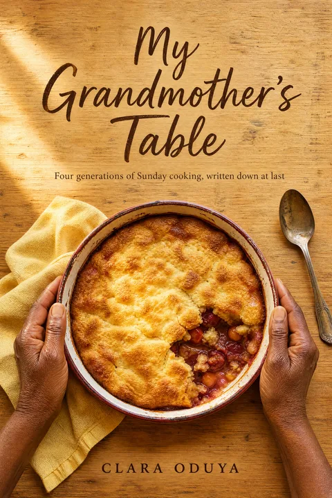
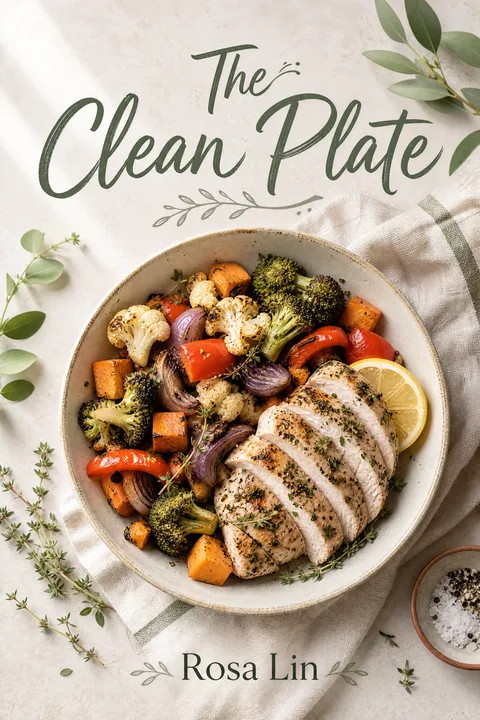
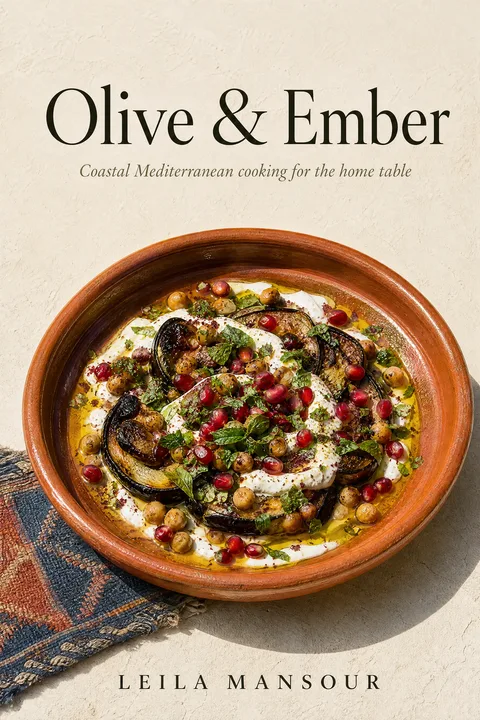
Eighty-four percent of bestselling cookbook covers sit on a light or bright background, and seventy-four percent lead with a photograph rather than illustration or type. That combination has a direct mockup consequence most authors don't anticipate: a light, photo-led cover placed into a busy desk-scene mockup with its own competing props and shadows can visually merge with the backdrop instead of standing apart from it. The inverse genres — dark, illustrated, type-dominant fiction covers — have the opposite problem in the opposite direction: a stark white flat-lay backdrop can drain contrast a dark cover depends on.
Neither is a mockup-tool failure. Both are a mismatch between what the cover is doing and what backdrop the mockup places it against — which is a reason to choose the mockup style deliberately, covered above, rather than accepting whatever a tool opens on by default.



Making One, Step by Step
- 01
Decide where the mockup will actually be seen
An Amazon A+ content module, an Instagram post, a website hero, and a box-set announcement each favor a different style and crop. Pick the placement before picking a tool — it determines which of the five styles above is correct, and picking the style first is how authors end up with a mockup that looks good in the editor and wrong on the page it was made for.
- 02
Source a front cover at real pixel size, not a compressed preview
A mockup renders your flat cover onto a 3D surface at whatever resolution you feed it. A screenshot, a watermarked free preview, or a cover pulled off a web page is already compressed below what the render needs, and no mockup tool can add back detail that was never there. Start from the actual delivered file — the same PNG you would upload as your ebook cover.
- 03
Match the mockup style to what the cover is actually doing
A photo-led, light-background cover (common in cookbooks and lifestyle nonfiction) reads differently in a mockup than a dark, illustrated genre cover. A busy desk-scene backdrop competes with a photo cover's own white space; a plain flat lay undersells a dark illustrated cover's contrast. Choose the backdrop for what your specific cover needs, not the default the tool opens on.
- 04
Generate at full resolution and skip the watermarked export
Most free mockup tools cap resolution or add a watermark unless you sign up or pay. A watermarked mockup is fine for testing a composition; it is not a finished marketing asset — an ad, a website hero, or a press kit image with a third-party logo baked in reads as unfinished before anyone reads the title.
- 05
Check the render at the size it will actually display
A hand-holding mockup can look polished at full size and lose the title entirely once Instagram or an ad platform compresses it into a feed-sized thumbnail. Export, then view the file at the actual display dimensions of its destination before calling it done — the same thumbnail discipline that applies to the cover itself applies to the mockup of the cover.
- 06
Never substitute a mockup for your actual KDP upload files
A 3D mockup is a marketing image, not a cover file. It has no bearing on your KDP trim, bleed, or spine specification, and uploading one to KDP's cover slot will fail or produce a broken print file. Keep the mockup entirely separate from the wrap and ebook files covered in the dimensions guide.
Mistakes That Read as Amateur Before Anyone Reads the Title
- ✕01
Sourcing the mockup from a preview instead of the delivered file
Watermarked previews, screenshots, and web-saved images are compressed for quick viewing, not for a close-up 3D render. The blur this produces looks like a mockup-tool problem and is actually a source-file problem — always start from your full-resolution delivered cover.
- ✕02
Using the watermarked or capped-resolution export as the finished asset
A free tier is fine for proofing a composition. Publishing an ad or website hero with a third-party watermark or visibly soft resolution signals an unfinished asset before the cover design gets any credit at all.
- ✕03
Picking a style for the editor, not the destination
A hand-holding or flat-lay mockup can look great full-size in a tool's preview pane and fail completely once compressed into an ad thumbnail or an A+ module. Check the render at its actual display size, not the size you designed it at.
- ✕04
Placing a photo-led cover against a competing backdrop
A light, photograph-forward cover — the norm in cookbooks and lifestyle nonfiction — can visually merge into a busy desk-scene mockup instead of standing apart from it. Match the backdrop's brightness and business to what the cover itself needs.
- ✕05
Implying a print edition that doesn't exist
A paperback or hardcover mockup for an ebook-only title implies a physical book a buyer cannot actually order. Use a device-based mockup for ebook-only releases and reserve print-object mockups for editions you have genuinely published.
- ✕06
Treating the mockup as a substitute for the actual cover file
A 3D render has no bearing on KDP's trim, bleed, or spine requirements. It is a marketing image, generated after the real cover files are finished — never a replacement for the flat wrap or ebook front cover the platform actually needs.
Where the Rest of the Cover Work Lives
A mockup is the last step, not the first one. Before it's worth making one:
- Book cover dimensions covers the actual KDP file specs — trim, bleed, spine, the numbers a mockup has nothing to do with.
- How to make a book cover covers the design and licensing decisions that determine whether the cover underneath the mockup is any good.
- Recipe book cover ideas goes deeper on the cookbook conventions referenced above, for anyone designing in that genre specifically.
- Browse the free KDP tools for the calculators that handle the print-facing side of the process.
The Mockup Can Only Show Off What's Already There
A mockup adds staging, not substance. If your current cover already survives the thumbnail test, any of the five styles above will do it justice. If it doesn't — and the Pillar 0 data above is a fast way to check — that's worth fixing before the mockup, not after.
01What is a book cover mockup?
A book cover mockup is a rendered image that places your flat, 2D cover design onto a photorealistic 3D object — a paperback standing upright, a hand holding a hardcover, a stack of books on a desk — for use in marketing. It has no functional role in publishing your book; KDP, IngramSpark, and every other retailer still take the flat front cover (and, for print, the flat wrap) as the actual file. A mockup exists purely so a flat design reads as a tangible object in an ad, a social post, a website, or an Amazon A+ content module, where a flat rectangle photographs less convincingly than a dimensional one.
02Do I need a mockup to publish on KDP?
No. KDP's paperback and hardcover uploaders take a flat wrap PDF sized to your exact trim, page count, and paper stock (covered in the [book cover dimensions guide](/blog/book-cover-dimensions)), and the Kindle uploader takes a flat front-cover image. Neither accepts nor expects a 3D rendering — a mockup is exclusively a promotional asset you use after the book is already formatted for its retailers, never a substitute for the actual cover file.
03Which mockup style should I use — flat lay, hand-holding, 3D standing, desk scene, or stack?
Match the style to where it will be seen. A 3D standing mockup — the book upright at a three-quarter angle — is the most versatile default and reads clearly even shrunk to a thumbnail, which makes it the safest choice for an Amazon A+ module or a store page. A hand-holding mockup adds warmth and human scale and suits social posts and author-brand content, but the hand occupies real estate a small ad format cannot spare — it loses legibility fastest when compressed. A flat lay (the book photographed from directly above, often with props) suits a styled Instagram grid but reads as decorative rather than commercial, so it undersells a direct sales pitch. A desk scene, with the book among related props, works for lifestyle and cookbook genres where the props reinforce the subject; it competes with a stripped-down, type-forward genre cover. A stack or box-set render exists specifically to announce a series or bundle and reads as confusing clutter for a single title.
04Why does my book cover mockup look blurry or pixelated?
Almost always because the source file was smaller or more compressed than the mockup's render size, not because of anything the mockup tool did wrong. A mockup renders your flat cover onto a photographic scene at whatever resolution you feed it — a watermarked free preview, a screenshot, or an image saved off a web page is already well below the pixel count a close-up 3D render needs, and stretching it further manufactures the soft, mosaic-like blur. The fix is starting from your actual delivered file: a full-resolution paid export has comfortably enough detail for any standard mockup render, while a 1080-wide watermarked preview does not.
05Are free book cover mockup generators actually free?
Partially, and the limitation is almost always the same one: a watermark, a capped export resolution, or both, until you create an account or pay. That trade-off is fine for testing whether a composition works. It becomes a problem when a watermarked or low-resolution export gets used as the actual marketing asset — a website hero or paid ad with a mockup tool's logo baked into the corner reads as an unfinished asset, not a professional one, before anyone reads the title.
06Is it misleading to show a paperback mockup if my book is ebook-only?
It can be, and it is worth being deliberate about. A 3D mockup implies a physical object exists. If your book is only available as a Kindle ebook, a paperback or hardcover mockup risks implying a print edition a buyer cannot actually order — a source of real reader frustration and occasional refund requests when discovered post-purchase. The straightforward fix is matching the mockup to the edition you sell: use a Kindle-device or tablet mockup for an ebook-only title, and reserve standing, hand-held, or stacked paperback mockups for books you have genuinely formatted and published in print.
07Where do authors actually make these mockups?
Once you know which style you need, several browser-based generators cover the five styles above without any design software — Canva and Mediamodifier both have a free book-mockup template category, and dedicated author tools like Mockey and Placeit specialize in the standing, hand-held, and desk-scene styles specifically. All of them follow the same pattern: upload your front cover, pick a scene, export. The one detail worth checking before you commit to a specific tool is resolution and watermark policy on the free tier, covered above — that is where the free plans actually differ from each other.
08Can AI just generate a mockup-style image directly, instead of using a template tool?
Increasingly, yes, as a rougher alternative — a general-purpose AI image tool can be prompted to render "a hardcover book standing on a wooden table" with your cover pasted onto the front, and modern models handle the perspective and lighting reasonably well. What a purpose-built mockup tool still does better is control: a template keeps your exact cover file undistorted and lets you regenerate the same scene at a different angle or lighting instantly, where a general AI render is a new roll of the dice each time and can subtly warp text or artwork in the process. For a one-off social post either works; for anything going into paid ads or a store listing, a template-based mockup keeps the cover itself intact.
Evan Kane is the founder of MakeMyBookCover and runs the cover-archetype research behind the product — coding category bestseller lists by hand for every genre in the Bestseller Cover Visual DNA Index, and re-coding them as the lists move, to keep the genre-signal models honest.