The One Number Nobody Else Is Writing
Across four bestseller datasets — Amazon US Top 50 covers in romance and children's books, the Amazon Fantasy Top 30 plus a canonical Goodreads epic-fantasy set, and the Amazon Top 100 in thrillers and mysteries — thin geometric sans-serifs are functionally absent from the title slot. Helvetica, Roboto, Lato, Open Sans, Montserrat at light or regular weight: single-digit appearance rates across every chart we coded. The romance number is published at 4%. The other three are "essentially absent" in our visual coding without precise decomposition.
This is the cross-genre finding nobody in the "book cover fonts" SERP writes. Every incumbent article we surveyed gives you a font grab-bag — Cinzel, Cormorant, Bebas Neue, Playfair Display — without saying which fonts dominate which genre at what rate. Most go further and recommend the geometric sans grammar (Gotham, Proxima Nova, Montserrat) as a "modern" or "minimalist" cover treatment. The bestseller data flatly contradicts that recommendation in every commercial fiction genre.
What Bestsellers Actually Set Their Titles In
The four charts below come from a coded visual analysis of Amazon US Best Sellers, sampled in Q2 2026 — Top 50 in romance and children's, the Fantasy Top 30 plus a canonical Goodreads epic-fantasy set, Top 100 in thrillers and mysteries. Each cover was scored against the same six visual dimensions; we surface the typography fact here for cross-genre comparison and link out to each genre's full Pillar 0 analysis below.
Romance — chunky serif
Two-thirds of bestselling romance covers in 2026 set the title in a chunky serif — a heavy slab-or-modified-old-style face with thick stems, often a wedge or bracketed serif, sized large enough to dominate the composition. Subgenre dialects within romance modulate the face: contemporary leans modern chunky (DM Serif Display, Yeseva One), romantasy reaches for tall ornate serifs (Cinzel, Italiana), dark romance prefers a more severe condensed serif with sharp terminals. Geometric sans-serifs sit at 4% — small enough to be statistical noise. The cross-genre lesson is unambiguous: if you write romance, your title is a serif.
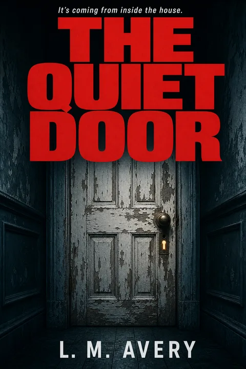
Thriller and mystery — heavy condensed sans or slab
Fifty-eight percent of Top-100 thriller and mystery bestsellers set the title in a heavy condensed sans (Impact, Bebas Neue, Trade Gothic Condensed, DIN Condensed, Oswald) or a severe slab (Rockwell, Alfa Slab One). Soft serifs and decorative scripts are essentially absent from the dominant grammar — they appear almost exclusively in the cozy mystery subset, where the dialect inverts almost every other thriller convention. A psychological thriller, domestic suspense, crime, or legal thriller cover that sets the title in a soft elegant serif codes as literary fiction to a thriller reader, and the cover-typography mismatch is one of the highest-impact failures we see in the indie thriller catalog.
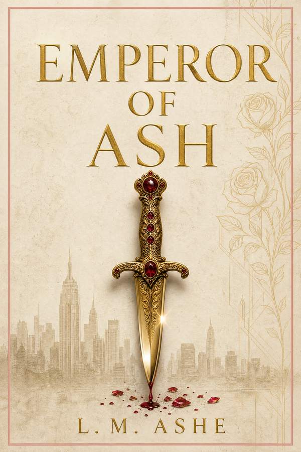
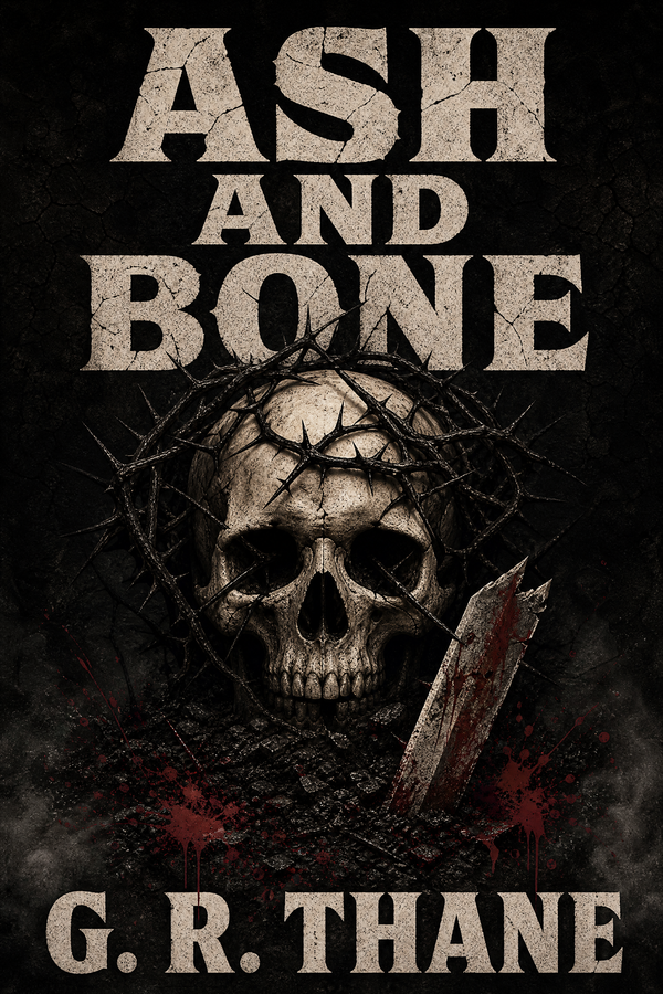
Fantasy — large serif or decorative display
Fifty-seven percent of Amazon Fantasy Top-30-plus-canonical-titles bestsellers set the title in a large serif or decorative display face — classical serifs (Trajan, Cinzel, Cormorant Garamond), calligraphic display (UnifrakturMaguntia and the broader blackletter family for grimdark and dark fantasy), and increasingly tall ornate serifs (Cinzel Decorative, Libre Caslon Display) for romantasy crossover. Thin geometric sans-serifs are essentially absent. The fantasy dialect rewards weight, vertical proportion, and decorative engraved or filigreed treatments — exactly the opposite optimization target from the thriller grammar.
Children's — hand-lettered or chunky serif
Sixty-eight percent of children's picture book bestsellers set the title in a hand-lettered face (Patrick Hand, hand-lettered custom illustration) or a chunky serif (Bowlby One, Fredoka, Lobster). Thin sans-serifs sit at essentially zero — they look corporate, which is the opposite of the warm, approachable signal a children's book cover needs to send. The picture-book reader is a parent making a purchase decision in two seconds at thumbnail size, and the hand-lettered dialect codes "made for children, by someone who likes children" far more reliably than any geometric face.
Why Thin Geometric Sans Is Off Every Chart
It is worth understanding why the cross-genre finding holds, because the reasoning generalizes to font choices the data does not directly cover.
A title typeface on a book cover does three jobs at once. It carries the title text legibly at 160-pixel thumbnail scale. It signals genre at a pre-conscious level — a reader scanning Amazon recognizes the dialect of their genre before they read a word. And it adds visual weight to the composition so the title balances the cover art and survives compression.
Thin geometric sans-serifs fail two of those three jobs in commercial fiction:
-
Legibility under compression: thin geometric strokes lose their distinguishing features when downsampled to the roughly 90-pixel chart-sidebar thumbnails on Amazon's Best Sellers list — smaller still than the 160-pixel search-result thumb. The visual difference between a thin Helvetica
eand a thin Robotoecollapses entirely. A heavy serif's distinguishing feature is the serif itself, which survives compression better than a stem's thickness gradient. -
Genre signal: the reader's visual vocabulary maps thin geometric sans to "tech product UI," "minimal modernist branding," "Apple Keynote slide," or "literary fiction." None of those are romance, thriller, fantasy, or children's signals. A reader scanning a romance results page processes a thin Montserrat title as off-shelf within a single tenth of a second, before any text is read.
The exception that proves the rule is contemporary literary fiction, where a cool restrained typeface is the right genre signal — the dialect inverts because the audience is different. But contemporary literary fiction is not the commercial fiction set this article addresses, and most indie writers operating in commercial fiction will lose readers by borrowing the literary cover grammar.
The face you want for a commercial fiction cover is one that does the three jobs together. A heavy serif gives you legibility plus genre signal in romance, fantasy and children's. A heavy condensed sans or slab gives you legibility plus genre signal in thriller and mystery. The shared feature is weight — the faces that work all carry visual mass. The faces that fail tend to lack it.
Font Picks by Genre Dialect — Google Fonts (KDP-Safe)
The table below lists Google Fonts picks that match each genre dialect and carry the SIL Open Font License or Apache 2.0 license — both permit commercial use on a paid KDP product. Adobe Fonts equivalents exist for each (and a Creative Cloud subscription gives commercial use rights while active), but the Adobe Fonts catalog shifts faster than this article will refresh, so we recommend verifying each pick in the current Adobe Fonts catalog before launch. Canva offers many of these same families, but Canva's licensing for stock photography and templates is a separate question handled in the licensing section below.
| Genre dialect | Title face | Pairing face (subtitle/series/author) | Notes |
|---|---|---|---|
| Romance — chunky serif (contemporary) | DM Serif Display | Inter or Manrope | DM Serif Display reads as a modern chunky modern serif; the pairing face stays quiet so the title dominates. |
| Romance — tall ornate serif (romantasy) | Cinzel | Cormorant Garamond | The romantasy dialect leans tall, engraved-looking, classical. Cinzel is the workhorse; Italiana is a slightly more elegant alternative. |
| Romance — script accent (rare; use sparingly) | Allura or Sacramento | Inter or Karla | Script faces should appear only on author byline or single-word accent; never as the primary title or you sacrifice thumbnail legibility. |
| Thriller — heavy condensed sans (dominant) | Bebas Neue | Inter or Work Sans | Bebas Neue is the genre's de-facto title face; Oswald is its close cousin. Both compress well to thumbnail. |
| Thriller — severe slab (action / crime accent) | Alfa Slab One or Anton | Roboto Mono or Inter | Slab-and-mono pairing reads as cinematic, slightly Western or noir. Anton runs even heavier than Bebas Neue for maximum compression survival. |
| Fantasy — classical serif (epic / high) | Cinzel | EB Garamond or Cormorant Garamond | Cinzel is the genre default for engraved-stone-titled epic fantasy. EB Garamond pairs as a quieter body face. |
| Fantasy — calligraphic / blackletter (dark / grimdark) | UnifrakturMaguntia | EB Garamond | Use blackletter at large sizes and only on dark fantasy or grimdark; on cozy or romantasy it reads as off-tone. |
| Fantasy — ornate display (romantasy crossover) | Libre Caslon Display | Cormorant Garamond | Romantasy reaches across into fantasy; Libre Caslon Display gives you the tall ornate signature without going as severe as Cinzel. |
| Children's — hand-lettered (picture book) | Patrick Hand | Patrick Hand SC or Fredoka | Patrick Hand reads as warm and approachable; for board books and early reader, pair with a quieter rounded sans. |
| Children's — chunky display (middle-grade) | Bowlby One or Fredoka | Lato or Inter | Middle-grade and chapter-book covers reach for chunky display faces with personality but still legibility at thumbnail. Lobster is a third option for warmer subjects. |
On the Adobe Fonts column: Adobe Fonts gives Creative Cloud subscribers commercial use of every font in the catalog while the subscription is active. Catalog availability shifts, so rather than naming specific Adobe equivalents we recommend searching the Adobe Fonts catalog for the genre dialect (e.g. "heavy condensed sans" for thriller) and previewing against your cover layout. If you cancel Creative Cloud, your existing Adobe-Fonts-typeset designs continue to be valid, but you lose access to use that font on future designs — rasterize the title in your final cover export so the published file does not depend on a live font license.
On Canva fonts specifically: many of the Google Fonts above are also available in the Canva editor. Using Canva to typeset a Google-Fonts-derived title onto your own uploaded artwork carries no licensing risk we are aware of. The licensing risk surfaces when Canva stock photography or Canva template artwork ends up on the cover — that is a different question from the font, handled in the licensing section. If you want a Canva-only workflow but are worried about the stock-image question, the Canva book cover alternative walkthrough goes through the indie author community's converged guidance.
How to Set the Title — Five Thumbnail-Survival Rules
Picking the right typeface is half the work. Setting the title so it survives the 160-pixel Amazon thumbnail is the other half. The steps below mirror the operational moves that bestseller covers make, drawn from the visual data above and the indie cover designer community consensus.
- 01
Pick the dialect before picking a typeface
Open Amazon to your exact subgenre and screenshot the top twenty covers. Look at the titles only. Are they overwhelmingly chunky serif (romance), heavy condensed sans or slab (thriller), large decorative serif (fantasy), or hand-lettered (children's)? Match your dialect first; pick the actual typeface second. Subgenre dialect overrides personal preference every time.
- 02
Make the title the second most legible element at 160 pixels wide
Amazon's search-result thumbnail is roughly 160 pixels wide. Resize a draft of your cover to 160 × 256 pixels and view it at screen size. If the title is not legible at that size, the typeface, weight, or hierarchy is wrong — not the thumbnail. Bestseller titles survive this compression because they are set heavy, large, and high-contrast against the background, not because their typefaces are intrinsically magic.
- 03
Use two typefaces maximum — never three
Two-typeface compositions dominate every bestseller chart we sampled. One face for the title, one for the subtitle or series name. A third face — usually an 'elegant' italic script for the author name — is one of the cleanest indie tells. Pair a heavy display face for the title with a quieter geometric or neutral sans for everything else, and stop there.
- 04
Set the title large — not 'tasteful'
Bestseller titles typically fill the upper third to half of the cover. The thumbnail-survival rule is that the title must be visually heavier than any focal element. 'Tasteful' small-title covers code as literary fiction or memoir — fine for those genres, fatal in romance, thriller, fantasy, or children's where the convention is title-as-hero. If the title fits inside a tenth of the cover, it is too small.
- 05
Verify commercial licensing before exporting to KDP
Google Fonts under the SIL Open Font License are unambiguously free for commercial use, including on a paid KDP book cover. Adobe Fonts are licensed per Creative Cloud subscription — fine while active, but rasterize the title before exporting so the cover does not depend on a live font license. System fonts (Word, Pages, Microsoft 365 personal) usually are not licensed for commercial product resale. Canva permits font use but its stock photos and templates carry separate licensing that has tripped KDP suspensions; if you used Canva for anything beyond layout-with-fonts-and-your-own-images, audit every element.
The Common Font Mistakes
These are the failure modes the bestseller data and the indie cover designer community flag most often. They tend to compound — a cover with one of these is recoverable; a cover with three of them is usually a redesign.
- ✕01
Thin geometric sans-serif title on a commercial fiction cover
Helvetica, Roboto, Lato, Open Sans, Montserrat at regular or light weight. The bestseller data across romance, thriller, fantasy and children's says these faces are functionally absent from the title slot. Setting your title in one of them is the cleanest single signal that the cover was designed without reference to the genre's visual grammar.
- ✕02
Three or more typefaces on a single cover
Title in a heavy display serif, subtitle in a clean sans, author name in a flourished italic script. The third face is almost always the problem — usually the script byline. Cap yourself at two faces. Use the same neutral sans for the subtitle, series name, and author byline; let the title face do the genre signaling work alone.
- ✕03
System fonts on a commercial product
Times New Roman, Calibri, Arial, Cambria, Comic Sans, Pages' default Helvetica. Beyond the genre-signal problem, the licensing on many bundled system fonts excludes commercial product resale for personal-tier Office or macOS licenses — Microsoft 365 business and Adobe CC subscriptions are the two routes that do grant commercial rights to bundled fonts. Switch to a Google-Fonts pick from the table above and the licensing question vanishes.
- ✕04
Title set too small to survive the thumbnail
If the title block is set small enough to fit comfortably under a focal illustration, it will lose against the artwork at thumbnail scale. The bestseller convention is title-as-hero — the title fills the upper third to half of the cover and reads heavier than any focal element. Resize to 160 pixels wide and check. If the title is not the first thing your eye lands on, it is too small.
- ✕05
Free font from a directory without license verification
1001fonts, dafont, fontspace, and similar directories include both fully-free fonts and free-for-personal-use-only fonts in the same catalog. A KDP book cover is commercial use. Always click through to the individual font's license page before downloading; the OFL and Apache 2.0 are unambiguous; anything else needs reading. The Google Fonts catalog is the safest single source because its entire library is OFL or Apache.
Licensing Reality — What's Safe for KDP
The font licensing question generates significant confusion in KDP author forums, partly because "free" means different things across sources. The table below summarizes where common font sources stand for a KDP commercial product cover.
| Source | KDP commercial use | What to verify |
|---|---|---|
| Google Fonts (OFL or Apache 2.0) | Yes — unambiguous | Nothing — the entire catalog is commercial-use-permitted |
| Adobe Fonts via Creative Cloud | Yes while subscription is active | Rasterize the title in your final export so the cover does not depend on continued subscription |
| Microsoft 365 personal-tier bundled fonts | Generally no | Switch to a Google Fonts equivalent; or upgrade to Microsoft 365 business |
| Microsoft 365 business / Adobe CC bundled fonts | Yes | Check the specific font's EULA on first use; most bundled fonts grant commercial rights to business subscribers |
| macOS / iOS bundled fonts | Mixed | Apple's bundled fonts generally permit document use; resale-product use is grey for some faces — verify per font |
| Canva editor fonts | Generally yes for the typeface itself | Audit any non-font Canva content (stock photos, template elements) separately — that is where KDP suspension risk lives |
| 1001fonts / dafont / fontspace and similar directories | Depends per font | Click through to each font's individual license page; never assume "free" means "free for commercial use" |
| Paid foundry license (MyFonts, Type Network, Future Fonts) | Yes for the license tier you purchased | Read the EULA — some tiers cap impressions or product-units; commercial book cover use is usually covered but verify |
| Pinterest / Google Images search-found fonts | No license is granted | Never use; image search does not license |
The single highest-leverage move for an indie author with no font budget is to standardize on Google Fonts. The catalog is large enough to cover every genre dialect in this article, the licensing question is settled, and the fonts render reliably across every design tool from Photoshop to Canva to Affinity to Figma.
Where to Apply This
The four genre wizards each ship with archetype sets typeset in genre-correct title faces by default — chunky serif on romance, heavy condensed sans on thriller, large decorative serif on fantasy, hand-lettered or chunky serif on children's. If you want to start with a bestseller-grammar-compliant cover and adjust from there, the genre landing pages below are the right starting points:
- Romance book cover design — chunky serif archetypes
- Thriller and mystery book cover design — condensed sans archetypes
- Fantasy book cover design — decorative display archetypes
- Children's book cover design — hand-lettered archetypes
If you want to skip the design step entirely, the wizard takes a title and a genre and returns a cover in genre-correct typography by default. The fonts in the archetypes are licensed for KDP commercial use through the wizard — you do not need to verify font licensing separately.
For the broader genre conventions beneath the typography — palette, focal element, layout — the per-genre deep dives (romance, thriller, fantasy, children's) cover the rest of the data behind each chart.
The Closing Argument
Cover typography is one of the few design decisions on a KDP launch that you can get correct mechanically, from data, without taste being a meaningful variable. The bestseller charts say what works, and the differences across genres are stable enough that "chunky serif for romance, heavy condensed sans for thriller, large decorative serif for fantasy, hand-lettered for children's" survives as guidance from one quarter to the next.
The non-negotiable across every genre is the absence of thin geometric sans-serifs from the title slot. Helvetica, Roboto, Lato, Open Sans, Montserrat at regular or light weight do not appear at meaningful rates on any commercial fiction bestseller chart we measured. Whatever else you do, do not set your title in one of those.
Match the dialect, set the title heavy and large, cap yourself at two typefaces, verify the license, and proof at 160 pixels wide. That is most of the work.
01What font is best for a book cover?
There is no universal answer because each commercial fiction genre runs its own typographic dialect. Across the four genres whose bestseller sets we coded — Amazon Top 50 in romance and children's, an Amazon Top 30 plus Goodreads canonical set in fantasy, and Top 100 in thrillers and mysteries — the dominant title typeface is a chunky serif in romance (66%), a heavy condensed sans or slab in thriller (58%), a large or decorative serif in fantasy (57%), and a hand-lettered or chunky serif in children's picture books (68%). The right font for your book is the one that matches your specific subgenre's dialect, survives at the 160-pixel Amazon thumbnail, and carries a clean commercial license. The font picks table later in this article lists verified Google Fonts options for each dialect.
02Are Google Fonts free for KDP commercial use?
Yes. The Google Fonts catalog is licensed under either the SIL Open Font License (OFL) or the Apache License 2.0, both of which explicitly permit commercial use, including on the cover of a paid product such as a KDP book. You do not need to pay, register, or credit Google; you can embed the font on your cover, in your interior, and in marketing materials. The license caveat applies to the font binary itself — you can not resell a Google-Fonts-derived font file as a standalone product, but that is irrelevant for a book cover. Every Google Fonts pick in the table below has been verified live in the catalog as of 2026 Q2.
03Are Canva fonts safe to use on a KDP book cover?
Canva fonts in isolation are generally usable for commercial work and indie authors have reported uploading Canva-typeset covers to KDP for years without incident. The risk is not the fonts; it is the rest of the Canva ecosystem. Canva Pro stock photos and certain template elements carry licensing terms that have repeatedly been flagged in KDP account-suspension threads on r/selfpublish and KBoards, with the community guidance settling on "Canva as a layout tool with your own uploaded images is fine; Canva stock photography on a KDP cover sold at scale is a real risk." If you used Canva for fonts and layout only and the imagery is yours or carries an explicit commercial license, you are on safe ground. If any visual element came from Canva's stock library, audit its license before uploading.
04What is the three-font rule?
The "three-font rule" is a design heuristic taught in some graphic design programs — use no more than three typefaces in any single composition. Applied to book covers it is too generous. The data across romance, thriller, fantasy and children's bestseller covers converges on two typefaces — one display face for the title and one neutral face for the subtitle, series name, and author. A third face shows up almost exclusively in the off-shelf indie cover, usually as a flourished script for the author name that does not match either of the other two faces. Set yourself a two-font ceiling, not three.
05Are thin geometric sans-serifs really absent from bestseller charts?
Across the four bestseller datasets we coded, thin geometric sans-serif titles — Helvetica, Roboto, Lato, Open Sans, Montserrat at light or regular weight — appear at single-digit rates. The romance number is explicit at 4%; the thriller, fantasy and children's numbers are "essentially absent" without precise rate decomposition. This is the single most consistent cross-genre finding in the data. The geometric sans grammar codes "tech UI" or "minimal modernist branding" in the reader's pre-existing visual vocabulary, neither of which is a fiction cover signal. The exception is contemporary literary fiction, where cool restraint is the right code — but contemporary literary fiction is outside the commercial fiction set this article addresses.
06Will the wrong font get my KDP book cover rejected?
KDP's automated cover review checks file specs (dimensions, bleed, embedded fonts, file size, color profile) and content policy (no copyright violations, no prohibited content). It does not reject covers for using "the wrong typeface for thriller." A typographically mismatched cover ships to the catalog and then under-performs on click-through and conversion, which suppresses category placement. The cost of getting fonts wrong is not rejection — it is a quiet revenue drag that authors usually do not connect back to typography until they redesign. The two font-related rejection causes that do exist are unembedded fonts in print PDFs (KDP will flag this in its file checks) and demonstrably unlicensed font use that someone reports to KDP's content team.
07What font do traditional publishers prefer?
Traditional publishers do not standardize on a single house typeface for covers — each imprint and each book gets a bespoke typographic treatment from a designer who matches the book to its subgenre's current visual dialect. What traditional publishers do follow with near-uniformity is the dialect itself. Penguin Random House romance imprints set chunky serifs. Bantam thriller imprints set heavy condensed sans. Tor fantasy sets large decorative serifs or calligraphic display. Scholastic children's picture books set hand-lettered or chunky serif. The indie author advantage is not that you have access to different typefaces than the major houses — it is that you can hit the same dialect using free Google Fonts while a major-house designer reaches for Adobe Fonts or a foundry license. The dialect is the differentiator, not the font budget.
Evan Kane is the founder of MakeMyBookCover and runs the cover-archetype research program behind the product — auditing the Amazon US Top-50 covers across romance, thriller, fantasy, children, and nonfiction every quarter to keep the genre-signal models honest.