Children's book cover ideas as a search query is mostly answered by Pinterest boards and tool template pages. None of them tell you the underlying rules — what the Caldecott-shelf books actually do that yours probably doesn't. This article does, anchored to a coded analysis of Amazon's Children's Picture Books Top 50 plus the practical edges (age-tier differences, KDP picture-book trim quirks, the AI tells parents already detect, real 2026 cost ranges) that incumbents skip.
Why "Looks Like a Real Picture Book" Is the Whole Game
A children's book cover does one job at the moment of purchase — convince a parent or grandparent skimming Amazon thumbnails that this book belongs next to the books they already know and love. Picture books in particular are bought largely on cover signal because parents cannot preview the interior the way they can with a novel; the cover IS the product preview for the buyer in that moment.
The bestseller tier has converged on a small set of visual conventions that signal "this is a real picture book, not an AI experiment or a self-published curiosity" within the half-second it takes to scroll past a thumbnail. Miss the conventions and your cover gets pattern-matched to "amateur" and the parent keeps scrolling — regardless of how good your story is.
The good news — the conventions are learnable, replicable and quantifiable. They are not a Pinterest mood; they are five repeatable patterns that show up across the bestseller shelf in measurable percentages.
What Bestselling Children's Covers Actually Do
The chart below codes Amazon's Children's Picture Books Top 50. The five conventions are not abstract advice — every one is counted and refreshed quarterly.
Each convention answers a specific buyer-perception question.
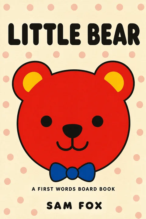
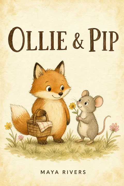
One oversized character anchored center-frame (82%). A scene with multiple characters and architectural detail looks rich at full resolution and reads as noise at 90 pixels. A single oversized character — the protagonist bear, the friend rabbit, the focal creature — reads clearly at any size. This single fact rules out roughly 60% of indie children's cover layouts on sight.
Warm-saturated palette (74%). Yellows, corals, leafy greens, gold-ambers. Cool palettes (icy blue, slate, gray) signal literary or YA. Muted dusty tones signal nostalgia or vintage. Default warm and saturated; adjust only if your specific story requires cool (a winter book, a deep-sea book, a quiet-night book where you may legitimately want the bedtime sub-tier).
Hand-lettered or chunky serif title (68%). Hand-lettering, Cooper Black, Mostra Nuova, Bryant, Sniglet — the bestseller-tier title typography is friendly and chunky, not thin and geometric. Calligraphic script titles fail at thumbnail scale because kids and fast-scrolling parents cannot decode them. Thin geometric sans-serifs are essentially absent from the bestseller list.
Title placed in the upper third (61%). Amazon thumbnails crop tightly. A title in the upper third survives the 90-pixel thumbnail. A title at the bottom is often the first thing to vanish under search-results UI overlays at small sizes.
Textural background (47%). Paper grain, watercolor wash, gouache, fabric, gentle gradient. A flat solid color background signals digital or stock. The texture is one of the strongest signals of "hand-crafted picture book" — the kind of cover Caldecott shelves carry. AI generators default to smooth digital paint and have to be explicitly steered toward texture.
These five together are what distinguishes the bestseller shelf from the indie cluster on the same Amazon category page. Hit four of five and your cover reads as on-shelf. Hit two or fewer and it reads as amateur regardless of how good the story is.
The Age-Tier Visual Rulebook Nobody Publishes
The single biggest gap in published "children's book cover" advice is age-tier specificity. Caldecott picture-book covers and middle-grade adventure covers share almost nothing visually — and most indie author advice handwaves "study your genre" without breaking down what changes across the five tiers.
| Age tier | Trim (KDP common) | Focal element | Palette | Title type | Notable shift |
|---|---|---|---|---|---|
| Board book (0–3) | 7 × 7 in or 6 × 6 in | Single animal, shape, or high-contrast pattern; no narrative scene | Bold high-contrast, primary colors | Chunky display sans or hand-lettered, large | Built for babies to grab — the cover is a tactile object first, narrative second |
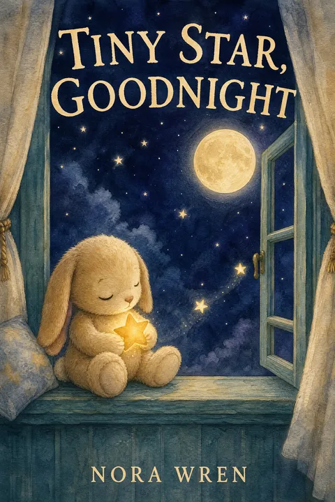
| Picture book (3–7) | 8.5 × 8.5 in (square) | One oversized character, anchored center-frame | Warm-saturated (yellows, corals, greens) | Hand-lettered or chunky serif, upper third | The five-rule baseline applies most strongly here |
| Bedtime picture book | 8.5 × 8.5 in | Quiet character, soft expression | Cool dusk tones, soft ambers (the legitimate exception to the warm-palette default) | Hand-lettered or chunky serif, slightly smaller | Calmer composition signals "wind-down" before the parent reads a word |
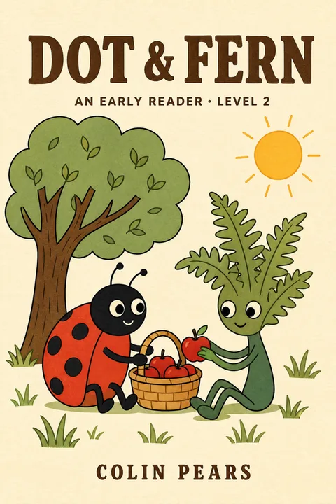
| Early reader (4–7) | 6 × 9 in or 8 × 10 in | Character plus small scene; friendly animal companion common | Warm-saturated | Hand-lettered or chunky serif | Bridges picture-book and chapter-book vocabulary; word-on-cover count rises |
| Chapter book (7–10) | 5 × 8 in or 6 × 9 in | Character plus light scene | Warm but slightly less saturated | Bolder serif or display; series-name band common | Built to read as a series — series typography matters here |
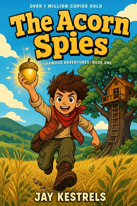
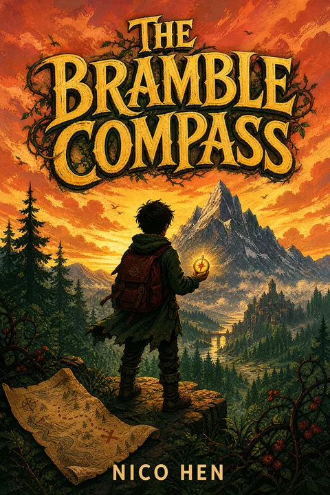
| Middle grade (8–12) | 5 × 8 in or 6 × 9 in | Symbolic hero object OR illustrated character | Moodier palette allowed (darker greens, deeper teals, occasional dark grounds) | Bolder serif or decorative display | The cover can carry more weight than picture-book tiers; nearer to YA visual rules |
Two operational notes. First — picking the wrong age tier for your cover style is the single most common rework cause. A cover that follows picture-book conventions perfectly but is on an 8–12 middle-grade book pulls the wrong audience. The Amazon category and the cover style must match. Second — the age-tier trim mismatch is a real pricing issue. A custom trim size hits roughly a 40% printing premium per copy on KDP versus the standard 8 × 10 or 8.5 × 8.5 trims; designing into a custom trim before checking the printing math costs real money on every copy sold.
How to Make a Children's Book Cover — Step by Step
- 01
Pick the age tier first, not the style
Decide board / picture / early reader / chapter / middle grade before any design choice. The tier determines trim size, palette range, title weight, character-vs-object focal hierarchy, and even whether you need a series-name band. Designing first and trying to retrofit a tier afterward is the single most common indie rework.
- 02
Anchor on one oversized character, center-frame
Resist the urge to put three animals and a scene on the cover. Pick the single character that signals your book in one glance — your bear, your rabbit, your focal creature. Fill 40–60% of the cover vertical. A multi-character scene looks beautiful at full resolution and reads as noise at thumbnail scale.
- 03
Use a warm-saturated palette
Yellows, corals, leafy greens, gold-ambers — the bestseller default. Cool palettes pull literary or YA category readers; muted dusty palettes signal vintage. Bedtime picture books are the legitimate exception (cool dusks are allowed there because the palette signals 'wind-down').
- 04
Set a hand-lettered or chunky serif title
Cooper Black, Mostra Nuova, Bryant, Sniglet, hand-drawn — the bestseller-tier typefaces. Thin geometric sans-serifs are essentially absent. Calligraphic script fails at thumbnail because kids and fast-scrolling parents cannot decode it. Make the title large enough to read at 160 pixels wide.
- 05
Place the title in the upper third
Sixty-one percent of bestsellers do this. Amazon thumbnails crop tightly and search-results UI overlays cover the bottom; the upper third is the safest zone for the most important text on the cover.
- 06
Use a textural background
Paper grain, watercolor wash, gouache, fabric, gentle gradient. Flat solid colors signal digital or stock. Texture is one of the strongest visual signals of hand-crafted picture book art; if you are using AI, explicitly prompt for paper texture and brush marks because the default is smooth digital paint.
- 07
Credit the illustrator on the cover
Bestselling children's books credit the illustrator on the front cover almost universally. Omitting the illustrator credit reads as self-published in a glance. If you both wrote and illustrated, include your name twice ("by X, illustrated by X") or use the convention "Story and pictures by X."
- 08
Match interior character to cover character — exactly
The single hardest failure mode in DIY and AI-generated picture-book covers is character drift between cover and interior spreads. If you are using AI, generate character reference sheets first and feed them through the same pipeline on every spread. If you are commissioning, the same illustrator should do cover and interiors under one contract.
- 09
Export at KDP picture-book trim and proof at thumbnail size
8.5 × 8.5 in square is the KDP picture-book standard; 8 × 10 and 8.5 × 11 also common. Print is 300 DPI with 0.125 in bleed and text kept 0.25 in inside the trim; ebook is 1600 × 2560 px. Resize your exported cover to 160 × 256 px and view at screen size before uploading — does the character read, is the title legible, does it look Caldecott-shelf? If not, revise the cover, not the thumbnail.
The 2026 Children's Cover Cost Landscape
Children's covers are the most expensive to outsource of any commercial genre because illustration drives the bill and the work is rarely separable from interior illustration. The honest 2026 landscape, drawn from indie author forums and published marketplace medians.
| Route | Typical cost (2026) | What you actually get | Best fit |
|---|---|---|---|
| AI generation (configured) | $0–$30 per cover | Cover anchored to genre conventions; type rendered as real editable text; KDP-sized — provided you steer for warm palette + textural background + single character | Concept exploration; budget debut; you understand the reader-perception cost in children's |
| Budget service tier (GetCovers and similar) | $10–$35 ebook · $20–$60 print | Template-derived custom cover; community-reported AI-laundering risk on some outputs ("extra fingers" reports are real) | Side project; debut on a strict budget; you have time for revisions if first output misses |
| Reedsy marketplace (picture book cover only) | ~$470 median (Reedsy published) | Vetted designer; portfolio-based hiring; commercial license clean | Mid-tier launch; you want a real designer with a track record in children's |
| Working indie illustrator (cover only) | $250–$1,000 | Custom illustration; full rights; named portfolio; sometimes Instagram or DeviantArt-sourced | Series launch; established backlist; you have a marketing plan and a sales tier above 100 copies |
| Full picture-book commission (cover + ~14 spreads) | $2,000–$8,000+ | Complete illustration project; the cover and interior are the same illustrator's work, so character consistency is automatic | The right answer if you are launching seriously — character drift across cover and interior is the hardest single problem in DIY picture-book art |
| Top-tier illustrated commission | $8,000–$30,000+ | Named illustrator with award history; agent-mediated | Established trade-route children's author; major series launch |
The decision rule indie picture-book communities converge on — for a serious first picture-book launch, the cover and the interior spreads should be commissioned together from the same illustrator under one contract, because the dominant single failure mode is character drift between cover and interior. Trying to save $2,000 by commissioning just the cover and DIY-ing the interior is the cheapest path that does not work — readers will detect the drift on every spread.
Why Parents Detect AI Children's Book Covers
Children's is the genre with the highest reader sensitivity to AI in 2026, and parents have learned five reliable tells. If you are using AI for your cover, the work is in eliminating each of these.
- ✕01
Anatomical errors — extra fingers, melted hands, six toes
The most common and most visible AI tell. Parents have learned to look at the hands first. A picture-book character with six fingers on one hand or hands that blend into the background instantly broadcasts AI. Even a 'configured' generation needs explicit post-editing or a careful regeneration loop until the hands are anatomically correct — and this is the single biggest argument for paying a human illustrator for children's work.
- ✕02
Character drift between cover and interior spreads
The bear on the cover is subtly different from the bear on page 4 and again on page 12 — slightly different fur color, slightly different eye shape, slightly different smile. Adult readers may not notice on a single spread but children absolutely do; the spell of the story breaks. Cover-only commissions then interior DIY is the single highest-risk picture-book workflow.
- ✕03
The 'smooth digital paint' texture — no brush marks, no paper grain
Forty-seven percent of bestselling picture-book covers carry a textural background — paper grain, watercolor wash, gouache, fabric. AI image models default to a smooth digital paint surface with no medium signal. The result reads as 'web art' rather than 'children's book art' even when the composition is otherwise correct. Steer explicitly for texture if you are using AI.
- ✕04
Missing illustrator credit on the front cover
Bestselling children's books credit the illustrator on the front cover universally. Indie picture books that ship without illustrator credit read as self-published instantly to parents who buy children's books regularly. If you used AI, you still need an attribution line — your own name as 'illustrated by' or 'Story and pictures by' — to satisfy the convention.
- ✕05
Generic facial expressions that read emotionally flat
AI defaults to a slight neutral smile on character faces. Real picture-book art has expressive faces — a bear that is genuinely excited, a rabbit that is actually worried, a child mid-laugh. The flat default reads as wrong to anyone who has read picture books to a child. Specifically prompt for the emotional state your story needs.
The KDP Picture-Book Technical Sidecar
Children's picture books have a small set of KDP-specific upload pitfalls that almost no general "how to make a book cover" guide covers. Working through these before upload saves a 24–72 hour rejection-and-fix cycle.
Picture-book trim sizes (KDP). Square 8.5 × 8.5 in is the picture-book standard — also common are 8 × 10, 8.5 × 11, and 7 × 10 for some illustrated formats. Custom trims hit roughly a 40% printing premium per copy versus the standard square or rectangle — design into a standard trim unless the book genuinely requires a non-standard shape.
Bleed math (KDP picture-book wrap). Print covers need a 0.125 in bleed on all four sides and any text kept 0.25 in inside the trim. The full picture-book print wrap (back cover + spine + front cover as one image) depends on trim, paper type and page count — run KDP's cover calculator at kdp.amazon.com/cover-calculator and design at the exact calculator output, not at the front-cover-only dimensions.
Color profile (CMYK for print). KDP rejects RGB print covers. Convert to CMYK before export. Canva defaults to RGB and requires a manual setting (sometimes a Pro feature) to export CMYK. Verify in the export dialog.
File size (under 40 MB). Picture-book covers with high-resolution embedded images frequently exceed KDP's 40 MB print cover upload limit. Flatten layers and compress with moderate JPEG compression at 300 DPI; the file should be print-quality but well under 40 MB.
Color shift screen → print. The widely reported KDP picture-book pain — warm-saturated palettes (the bestseller default and the warm-palette convention this article recommends) shift hardest from RGB screen preview to CMYK print output. Order a physical proof before announcing the launch; the proof will catch shifts the screen cannot. Specifically check fire-oranges, deep reds and gold-yellows. A modest pre-export saturation boost on warm tones can compensate for the press shift.
Ebook is no-bleed; print is full wrap. The ebook cover is a 1600 × 2560 px image of the front cover only. The print cover is a single wrap file with back + spine + front and a bleed. Uploading the ebook cover as the print cover triggers a KDP rejection on dimensions every time.
Children's Cover Styles You Can Generate Now
The archetype gallery below shows published children's cover styles in the wizard — one per age tier where applicable. Each is built on the conventions above. Click any cover to open the wizard locked to that style.
If none of the styles shown exactly match your book's age tier or subject, the wizard also accepts open-ended adjustments — start from the closest archetype and chat-revise from there.
Making Your Children's Book Cover
The conventions in this article are not a creativity constraint — they are the children's-book visual language. Parents and grandparents browsing Amazon thumbnails are reading the language whether you wrote your cover into it or not. When your cover speaks the language clearly, it joins the Caldecott-shelf conversation. When it doesn't, no amount of interior quality saves it from the browse — parents cannot preview the interior at the moment of purchase, and the cover IS the product preview.
When you're ready, the children's book cover design page applies these patterns directly — warm-saturated palette, single oversized character, hand-lettered title, textural background — configured by default and adjustable by you. For the broader 2026 cover production decision (route, cost, KDP rejection failure modes, AI policy), see how to make a book cover. For genre-specific deepdives in other categories, see the fantasy how-to and the romance bestseller analysis.
Three covers free, no card required.
01What makes a good children's book cover?
At the Amazon-bestseller tier, five conventions dominate (see the chart above) — one oversized character, a warm-saturated palette, a hand-lettered or chunky serif title, the title in the upper third for thumbnail survival, and a textural background. These five together make the difference between a cover that reads as Caldecott-shelf at 90 pixels and one that reads as generic AI or stock. The conventions vary slightly by age tier (board books are more pattern-driven, middle grade is moodier), but the five-rule baseline holds.
02How much does a children's book cover cost in 2026?
The honest range is wide and the tier matters. Service-tier providers (GetCovers and similar) start at $10–$35 for an ebook cover with rough community-acknowledged caveats — limited revisions, occasional AI-laundered output. The Reedsy marketplace median for a picture-book cover-only commission sits around $470 per Reedsy's own published data. Working indie picture-book authors with multiple books report a $250–$1,000 range for individual covers and roughly $2,000–$8,000+ for a complete picture-book illustration project (cover plus all interior spreads — most authors pay for both together because the same illustrator must do both for character consistency). The cheapest options are not the cheapest if you have to redo the cover after readers detect AI.
03Can I sell a children's book on Amazon KDP with an AI-generated cover?
Technically yes — KDP allows AI-generated cover art and only asks that you self-identify AI-generated content during the title-setup flow. But children's is the genre with the highest reader sensitivity to AI. Parents have learned the tells (extra fingers, melted hands, character drift between cover and interior spreads, the "smooth digital paint" texture, missing illustrator credit) and the indie picture-book communities actively avoid AI covers. If you do use AI, anchor it to the genre conventions (warm palette, single character, textural background) and set the title as real editable type — those defaults eliminate most of the visible AI tells. But the perception cost in children's is higher than in any other genre; weigh accordingly.
04What's the right trim size for a KDP picture book cover?
8.5 × 8.5 in (square) is the KDP picture-book standard — it shows full-bleed art best and survives the Amazon thumbnail. 8 × 10 in and 8.5 × 11 in are also common, especially for middle-grade illustrated books. Custom trim sizes typically hit a roughly 40% printing premium per copy, so unless your book genuinely requires a non-standard shape, default to one of the three. Print is 300 DPI with a 0.125-inch bleed on all sides and text kept 0.25 inches inside the trim; ebook is 1600 × 2560 px.
05Why do parents say my AI children's book cover looks AI?
Parents and children's-book buyers have learned five reliable tells. First, anatomical errors — extra fingers, melted hands, six toes, weirdly proportioned eyes; these are the most common. Second, character drift between cover and interior — the bear on page 4 looks subtly different from the bear on the cover. Third, the "smooth digital paint" texture — no brush marks, no paper grain, no medium signal; bestseller picture books are 47% textural backgrounds. Fourth, missing illustrator credit on the cover — indie picture books that omit illustrator credit signal self-published instantly. Fifth, generic facial expressions; AI defaults to a slight smile that reads emotionally flat. Fix the five tells and the cover stops broadcasting AI in the first glance.
06Do children's book covers vary by age tier?
Significantly. Board books (0–3) lean on bold high-contrast patterns and single shapes — built for babies who grab the book rather than read it. Picture books (3–7) follow the five-rule baseline most strongly — one oversized character, warm palette, hand-lettered title. Early readers (4–7) add a small scene and a friendly animal companion. Chapter books (7–10) introduce a series-name band and a touch more type. Middle grade (8–12) flips toward symbolic objects or hero illustration, a bolder title and a moodier palette — the conventions of picture books actively work against you here. Picking the wrong age tier for your cover style is the single most common rework cause in indie children's covers.
07Should the same artwork run on the ebook and the print picture book?
Yes — for indie picture books, the same artwork should run on the Kindle ebook and the print picture book so the book reads as one product on Amazon. Different ebook and print covers are a trad-publishing convention with no upside in indie. We export each cover at 1600 × 2560 for Kindle and the same artwork at 300 DPI for the picture-book print size (1792 × 2688 at 8.5 × 8.5 in trim, scaled for other trims).
08Why does my children's book cover look washed out when printed on KDP?
The KDP full-color picture-book print sometimes shifts colors from the RGB screen preview to the CMYK print output — a real and widely reported issue (full-color picture books are also expensive, around $6–$7 per copy versus $3 for a prose paperback). Warm-saturated palettes (the bestseller default — 74% of Top 50) shift hardest, especially fire-oranges, deep reds and gold-yellows. Two mitigations — convert your file to CMYK before export and slightly increase the saturation of warm tones to compensate for the press shift, and always order a physical proof before announcing the launch — the proof will catch shifts your screen cannot.
Evan Kane is the founder of MakeMyBookCover and runs the cover-archetype research program behind the product — auditing the Amazon US Top-50 covers across romance, thriller, fantasy, children, and nonfiction every quarter to keep the genre-signal models honest.