Five Seconds, One Doorway, No Mercy
A thriller reader on Amazon spends about two seconds on each thumbnail before scrolling past. In those two seconds the cover answers exactly one question — is this the kind of dread I am here for? — and the answer arrives through a visual language the reader has been training on for two decades of commercial thriller publishing.
That language has narrowed. In May 2026 the Amazon US Thrillers & Mysteries Top 100 reads almost like a single book repeated a hundred times with different titles — title-led typography in heavy condensed sans, near-monochrome palettes built on deep navy or black, one tense focal element (a doorway, a window, a silhouette walking away), an off-center balance that creates deliberate unease. The grammar is so consistent that an indie cover that misses it reads as off-shelf before the reader has finished a single thumbnail scroll.
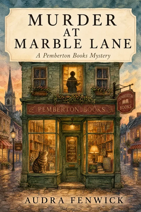
The exception inside that umbrella category is cozy mystery, which inverts almost every convention — illustrated rather than photographic, warm bright palette rather than monochrome dark, whimsical animal or village scene rather than a lone silhouette, friendly serif rather than condensed sans. A cozy mystery cover designed against the dominant thriller grammar bombs in cozy; a psychological thriller cover designed against the cozy grammar bombs in psychological. Subgenre is not optional in this category — it is the whole conversation.
Every other article ranking for "thriller book cover ideas" or "mystery book cover design" gives you either a designer portfolio with no data, a generic "dark colors and bold fonts" listicle with no measurement, or a single-subgenre piece that treats the rest of the shelf as if it does not exist. This one does the opposite. We coded the Amazon US Thrillers & Mysteries Top 100 against five visual dimensions, then mapped the six subgenres against the dialect each one speaks. The rest of the piece walks through what the data says, where the AI-cover failure modes show up, and what to actually do with the data on your own book.
The Five Numbers Nobody Else Is Publishing
The chart below is drawn from a coded visual analysis of the Amazon US Best Sellers in Thrillers & Mysteries, Top 100, sampled in Q2 2026. Each cover was scored against five visual dimensions; the results below are the bestseller conventions, with cozy mystery treated as a separate subset (handled in the dialect table further down).
Read the chart top to bottom as a hierarchy. The highest-hit conventions are the least negotiable — a thriller cover that fails the top three (title-led, near-monochrome, single focal element) reads as off-shelf the moment a thriller reader scans past it.
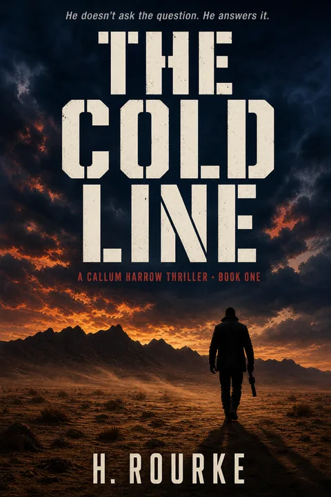
Title-led (79%) — typography is the hero of the composition, not a label on it. The title is visually heavier than any silhouette or focal element on the cover — the indie design rule of thumb is to size the title large enough that it remains the dominant element when the cover compresses to a thumbnail. This is the thumbnail-survival move in numeric form — heavy condensed type compresses to a 160-pixel Amazon thumbnail far better than a detailed scene does. Lisa Jewell, Riley Sager, Freida McFadden, and Ruth Ware all run title-dominant covers in this grammar; the imagery exists to set the mood but the title carries the click.
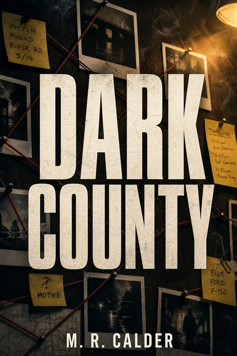
Near-monochrome palette (71%) — over seven in ten bestsellers run a single deep ground (black, navy, charcoal, midnight blue) with exactly one accent (blood red, warning yellow, sodium-vapor orange, occasionally bone-white). The accent is small, often confined to a single element — a window's light, a thin title underscore, a single object in colour against a desaturated scene. Multi-colour palettes are the fastest amateur tell in the genre; the discipline is in subtraction, not addition. The concrete palette indie authors land on most often is #0A0A0A near-black, #1B2438 deep navy, #2A4A6A steel blue, #8B0000 blood red, #D4A017 warning yellow, #F5F5F5 bone-white — pick one dark base and one accent, no more.
Single silhouette, doorway, or window (64%) — the cover anchors on one tense focal element. A figure walking away in the rain, a lit window in an otherwise dark house, an open doorway with light spilling through, a lone silhouette against fog. The focal element implies the threat — it does not depict it. Showing the killer's face is almost universally a sign of a non-bestseller cover; implying the watcher is the bestseller grammar.
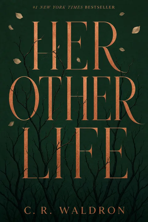
Heavy condensed sans or slab title (58%) — Impact, Bebas Neue, Trade Gothic Condensed, DIN Condensed, Rockwell. The remainder of the shelf outside this 58% cluster is largely cozy mystery and a small literary-suspense subset, where soft serifs and decorative scripts appear. If your thriller cover sets the title in a soft elegant serif (Garamond, Caslon) or a high-contrast Didone (Didot, Bodoni) or a script face, it codes as literary fiction or memoir to a thriller reader — the cover-typography mismatch is one of the highest-impact failures in the data.
Off-center text block (43%) — almost half of bestsellers deliberately break classical symmetry. The title pushes to one edge, the author name to the opposite corner, a crop drives the focal element to a third of the frame. This is the genre's specific visual unease signal — a centered, evenly-balanced composition reads as literary fiction or non-fiction memoir, where formal calm is the right code. Thriller wants formal tension; off-center placement gives it almost for free.
What the Data Looks Like on Real Covers
The five conventions feel abstract until you see them stacked on a single cover. Four current bestsellers — one per major dialect — show what hitting three or four conventions at once produces. Open Amazon and pull the covers up alongside this read.
Freida McFadden, The Housemaid (psychological / domestic crossover) — near-monochrome navy ground with a small warm-yellow upstairs-window accent, a single suburban-house silhouette as the focal element, oversized condensed-sans title in red that takes roughly forty percent of vertical space, author name in a thin all-caps strip across the bottom. Five conventions hit on one cover. This is the bestseller grammar at its most distilled and explains why the series has stayed in the top ten for two years.
Lisa Jewell, None of This Is True (domestic suspense) — near-monochrome charcoal, no figure on the cover at all, a single open doorway with light spilling through as the focal element. Title in a heavy condensed sans, off-center pushed left, author name in a contrasting weight at the top. The cover does not depict the watcher; it depicts the doorway the watcher will walk through. Implication over depiction is the entire genre.
Richard Osman, The Thursday Murder Club (cozy mystery, type-led tier) — bright minimalist ground (no illustrated scene), bold color blocks, a single symbolic object (a teacup, a key, depending on the cover edition), large friendly chunky-serif title taking the centre of the cover. This is the second cozy-mystery tier — the dominant illustrated-village-and-cat grammar is one path, but the type-led-with-object minimalist look is what propelled Osman into the global hardback bestseller list.
Carlene O'Connor, Murder in an Irish Village (cozy mystery, illustrated tier) — fully illustrated scene of a Carlene-O'Connor's-trademark Irish village street with warm autumn palette, multiple soft accents (no near-monochrome), a friendly chunky serif title, no off-center tension. This cover breaks four out of five dominant thriller conventions on purpose — and that is exactly correct for cozy mystery. Designing this cover against the dominant grammar would empty the cozy reader from the audience and pull in the wrong reader entirely.
The pattern reads cleanly across the four — three out of four sit deep inside the dominant grammar, and the cozy illustrated tier sits decisively outside it. Subgenre choice does almost half the cover design work before the designer opens a tool.
The Six-Subgenre Crosswalk — Where the Dialect Lives
The five conventions above describe the thriller shelf as a whole. But like romance, the category is dialect-heavy at the subgenre layer, and the dialect is what decides whether your cover lands with the right reader. The decoder table below maps the bestseller conventions onto each major subgenre — cozy through action — with a one-sentence amateur tell for each row so you can self-check.
| Subgenre | Focal element | Palette | Title typeface | Reader signal | Amateur tell |
|---|---|---|---|---|---|
| Cozy mystery | Illustrated village, café, cottage, kitchen scene; often a cat, dog, or cup-of-tea object | Warm bright base — autumn, sage, butter, pastel — with multi-accent palette | Friendly chunky serif or hand-lettered display | Whimsical small-town puzzle, low violence, recurring sleuth | A near-monochrome dark cover with a silhouette — codes psychological thriller and bleeds the cozy reader |
| Murder mystery (traditional whodunit) | A weapon, a clue object, a stylised crime-scene element (knife, key, body outline) | Restrained near-monochrome — deep red, navy, sepia — single accent | Classical serif or restrained slab | Closed-room puzzle, period-appropriate tension, deductive payoff | A modern condensed sans codes police-procedural rather than whodunit |
| Domestic suspense | A quiet suburban house at dusk, an empty kitchen, a single lit upstairs window | Muted navy, slate, grey with a small warm accent | Heavy condensed sans, often Trade Gothic class | Marriage, family, home as menace, slow burn | A dark photographic figure with blood-red accent codes psychological thriller, not domestic |
| Psychological thriller | A fractured face, distorted mirror, water imagery, blurred-edge silhouette | True black or charcoal with blood-red, steel-blue, or warning-yellow accent | Heavy condensed sans, Impact-class | Unreliable narrator, twist, interior-mind menace | A literal weapon or visible villain face — reads as action thriller, not psychological |
| Crime / detective | An evidence board, urban silhouette, crime-scene tape, a lone detective | Utilitarian gray-blue or sodium-vapor amber on near-black | Heavy condensed sans, DIN-class | Procedural, investigative, urban grit | A soft serif title or an illustrated cozy-style scene — codes wrong subcategory entirely |
| Legal / medical thriller | A courtroom silhouette, a gavel, a stethoscope, a lone professional silhouette | Restrained navy or grey with a single warm accent | Heavy condensed sans or a severe slab | Institutional menace, procedural stakes, professional protagonist | An overly noir black-and-blood-red palette — reads as crime, not legal |
| Action / spy thriller | A figure running, a silhouette against an explosion, a vehicle in motion | Dark base with a saturated warm accent (orange, fire-red, gold) | Heavy condensed sans, often italicised, large | Fast pace, international stakes, kinetic plot | A static centered figure with no movement code — reads as literary thriller, not action |
| Nordic noir | Snow, fjord, single distant figure, cold winter light | Cold near-monochrome — ice blue, slate, near-black — with a small bone-white accent | Heavy condensed sans, often spaced wide | Bleak, atmospheric, slow procedural, harsh environment | A warm palette or a bright accent — Nordic noir is defined by its restraint |
The pattern jumps out — cozy mystery is the one row that breaks almost every dominant convention, and the other six rows agree on the title-led, near-monochrome, condensed-sans grammar with only subtle differences in palette and focal-element vocabulary. If you are designing cozy mystery, follow the cozy row exclusively. If you are designing anything else in the category, the dominant grammar is the floor and the subgenre row tells you which dialect to refine.
"I'm Stuck Between Two Subgenres" — A Five-Question Diagnostic
The single most common stuck-point in the indie author forums is the boundary case — is my book psychological thriller or domestic suspense? cozy mystery or traditional whodunit? legal thriller or crime? The decoder table tells you what each subgenre looks like, but it does not tell you which row your book belongs to. The five questions below are the diagnostic, in order. Answer them top to bottom; the row falls out.
- Whose head is the reader in for most of the book? A single unreliable first-person narrator → psychological thriller lane. A close-third focused on the protagonist's relationship → domestic suspense lane. An external investigator (detective, sleuth, lawyer, doctor) → crime / legal / cozy lane.
- Where does most of the action live? Inside one home, family, or marriage → domestic suspense. Inside one institution (precinct, courtroom, hospital) → crime / legal / medical thriller. Across a wider geography with travel → action / spy thriller. Inside one village or small community → cozy mystery.
- What pace promise does the prose make? Short propulsive chapters, twist-driven, twenty-second hook lines → psychological / action lane. Mid-length chapters, atmospheric, slow burn → domestic / Nordic noir / legal lane. Cosy and conversational, gentle pace → cozy mystery.
- What level of on-page violence does the book actually carry? Low or off-page → cozy or domestic. Mid, with the killer's logic explored → psychological or whodunit. High, explicit, kinetic → action or crime.
- Is the protagonist solving a puzzle, or surviving a threat? Solving → cozy / whodunit / crime / legal. Surviving → psychological / domestic / action.
If your answers cluster around one column, that is your row. If they split across two adjacent rows, your book is a hybrid — pick the row your prose tone hits hardest (the cover signals tone before plot) and use the secondary-row accents sparingly. The Housemaid is psychological-with-domestic accents and signals psychological visually because the prose tone is interior-paranoid; None of This Is True is domestic-with-psychological accents and signals domestic because the prose tone is suburban-relational. The cover follows the prose tone, not the plot.
The Thumbnail Test — Where Thriller Covers Live or Die
Thriller is the most thumbnail-punishing of the major fiction categories. The grammar — single focal element, near-monochrome palette, off-center title — is itself a thumbnail-optimisation. When a thriller cover fails, it almost always fails at the ninety-pixel Amazon thumbnail before it ever fails at full resolution.
The thumbnail-failure modes are predictable. A multi-element composition (figure plus weapon plus crime scene) compresses to indecipherable noise. A title in Garamond at thirty-percent height compresses to a smear. A pastel-accented palette compresses to a single soft colour wash that loses the entire focal-element silhouette. A centered classically-balanced composition compresses to "literary fiction," which is the wrong shelf signal entirely.
The test is simple — export your cover at full resolution, resize the file to roughly 160 × 256 pixels (the Amazon thumbnail size on retina mobile), and view it at screen size. Ask three questions in order:
- Is the title legible without squinting? If no, the type is too small, too thin, or the wrong typeface. Default to heavy condensed sans, set at thirty-to-fifty percent of cover height.
- Does the focal element still read as one thing? If the silhouette has fragmented into "shape soup," the composition is too busy. Subtract elements until one wins.
- Does the overall palette code "thriller" to a thriller reader? If the colour-pop dominates over the dark ground, the palette is wrong; if the cover reads as photographic noise instead of intentional darkness, the contrast hierarchy is wrong.
Every thriller cover that lands well at the thumbnail size has been designed at the thumbnail size first — full-resolution polish is a finishing pass, not the brief. This is opposite to a romance cover, where some thumbnail fidelity is sacrificed for full-resolution painterly detail; in thriller, the thumbnail is the whole cover.
How to Test a Cover Before You Commit — The Indie CTR Loop
A thumbnail test tells you whether a cover is technically legible; a CTR test tells you whether real readers click it. The indie-author workflow that has emerged in 2025–2026 layers four cheap checks before committing the cover to a launch.
- The two-cover head-to-head poll. PickFu polls cost roughly fifty dollars and return a hundred votes from a demographically matched audience inside hours. Set up A-vs-B with your two strongest concepts and read the qualitative comments more than the vote percentage — the "this cover makes me think it's a romance" type comment is the single most useful diagnostic in the workflow. Limit to two covers per poll; three-way comparisons dilute the signal.
- The author-Facebook-group sanity check. Post the two finalists in a thriller-author or cozy-mystery-author Facebook group ("does this look like a thriller / cozy mystery?") and ignore the design opinions — read only whether respondents correctly named your subgenre. If half of them guess "literary fiction" or "memoir," the cover is failing its primary job.
- The low-budget Amazon Ads CTR test. Run a five-dollar-per-day Sponsored Brands or Sponsored Products campaign for each cover against the same keywords for one week, and compare click-through rate. Indie community consensus treats anything above roughly 0.3% CTR for a thriller on a relevant keyword as a working cover; below 0.15% is a signal the cover is mismatched to either the genre or the keyword. Wait for at least five hundred impressions per cover before reading the result — earlier numbers are noise.
- The BookBub Ads validation step (optional, post-launch). Once a launch cover is chosen, a small BookBub Ads campaign targeting comparable-author audiences will surface CTR against a much more genre-trained reader pool than Amazon Ads. A cover that wins on Amazon and loses on BookBub is usually mis-coding the subgenre dialect; a cover that wins on both is solid.
The order matters — start cheap and qualitative, end with paid CTR data. Most indie thriller authors stop after step 2 and ship; the authors at the top of the genre run all four every launch.
How to Design a Cover That Hits the Conventions
The five conventions are not a creative ceiling — they are the code the reader is fluent in. Speaking the code makes your cover legible at thumbnail size, which is where the buy decision happens. The steps below convert the data into a practical sequence.
- 01
Lock in the subgenre — cozy and psychological are nearly opposite visual languages
Open Amazon to your exact subgenre — cozy mystery, psychological thriller, domestic suspense, crime/detective, legal thriller, or action thriller. Screenshot the top twenty covers. A cozy mystery cover and a psychological thriller cover share almost no visual conventions; designing 'thriller' generically is the single most common rework cause. The subgenre row in the decoder table above is your brief, not the dominant conventions in isolation.
- 02
Decide title-led versus image-led — title wins seventy-nine percent of the time
Default to title-led. Seventy-nine percent of Top-100 thriller covers lead with type rather than imagery — the title is visually heavier than any silhouette, doorway, or object on the cover. Image-led covers exist (Nordic noir landscapes, cozy illustrated scenes) but are the minority. Unless your subgenre is cozy or Nordic noir, set the title large enough to be the first thing a thumbnail scroller registers.
- 03
Pick a heavy condensed sans or slab — not a soft serif
Fifty-eight percent of bestsellers set the title in a heavy condensed sans (Impact, Bebas Neue, Trade Gothic Condensed, DIN Condensed) or a severe slab (Rockwell). Soft elegant serifs (Garamond, Caslon), high-contrast Didones (Didot, Bodoni), and decorative scripts are essentially absent outside cozy mystery and a small literary-suspense subset. The condensed-sans grammar codes 'tense, cinematic, urgent' the way a chunky-serif romance cover codes 'warm, swoony.'
- 04
Build a near-monochrome palette — one accent on deep navy or black
Seventy-one percent of bestsellers run a near-monochrome palette — a single deep ground (black, navy, charcoal, midnight blue) with exactly one accent (blood red, warning yellow, sodium-vapor orange, occasionally bone-white). Avoid multi-colour palettes; they read as noisy and amateur at the thumbnail. Cozy mystery is the major exception, inverting to bright base with multiple soft accents.
- 05
Anchor on one focal element — silhouette, doorway, or window
Sixty-four percent of covers feature a single silhouette, doorway, or window as the tense focal element. A figure walking away in the rain, a lit window in a dark house, an open door with light spilling through. The focal element should imply the threat, not depict it. Showing the killer's face is a non-bestseller tell; implying the watcher is the bestseller move. Multi-element compositions lose at thumbnail size.
- 06
Place an off-center text block to create deliberate visual unease
Forty-three percent of bestsellers use an off-center title or author block that breaks classical symmetry — a deliberate tilt, a crop that pushes the title to one edge, an extreme weight imbalance. Centered, balanced compositions read as literary fiction or memoir. The off-center placement is one of the cheapest moves to add and one of the strongest genre-code signals in the data.
- 07
Export at KDP spec and proof at the ninety-pixel thumbnail
Export at 1600 × 2560 pixels for ebook (1:1.6 ratio) or 300 DPI at your print trim for paperback (6×9 is the indie thriller default). Before uploading, resize the exported file to roughly 160 × 256 pixels and view it at screen size — this is the Amazon thumbnail. Ask whether the title is legible, whether the focal element still reads as one thing, and whether the palette codes the right subgenre. Most thriller cover failures are visible only at this size.
Should You Show a Face, a Silhouette, an Object, or Nothing?
The single most-asked composition question in indie thriller cover threads is the figure question — do I put a person on the cover, and if so, how much of them? The decision matrix below collapses the bestseller patterns into four choices.
| Composition | When it works | When it backfires | Bestseller examples |
|---|---|---|---|
| Full face shown | Romantasy / dark academia crossover, historical mystery with a strong period costume, celebrity-author with face equity | Standard psychological / domestic / cozy / legal / Nordic — full faces almost universally fail at thumbnail and date a cover instantly | Vanishingly rare on the Top-100; reserve for known-name covers |
| Silhouette or back-of-head | Psychological, domestic, action, spy — the safe default for the dominant grammar | Cozy mystery (cozy wants warmth and recognition, not menace) | The Tana French Dublin Murder Squad lineage; Riley Sager protagonist back-of-head covers |
| Single object | Whodunit, legal, medical, type-led cozy, action where one item carries plot weight | When the object is generic (a knife, a key on a black ground without context) — risks reading premade-template | Richard Osman Thursday Murder Club (teacup/key); The Maid (single feather duster); The Silent Patient (the brushstroke) |
| Type-only, no figure or object | When the title itself is short, punchy, and high-concept (one or two words); when the author name carries equity | Standard mid-list — needs strong title and tight typography to hold the cover alone | Gone Girl original mass-market editions; We Need to Talk About Kevin; The Wife Between Us in some printings |
The safest default for indie psychological, domestic, crime, legal, action thrillers is the silhouette or back-of-head, paired with one secondary object (a doorway, a window, a chair). Full-face covers are not "different and original" — they are statistically the lowest-performing composition in the genre and signal an author who has not studied the shelf.
Thriller Cover Styles You Can Generate Now
The archetype gallery below shows thriller and mystery cover styles already published in the wizard. Each was built against the conventions above — title-led typography, near-monochrome palette, single focal element (silhouette, doorway, evidence board, or cozy bookshop scene for the cozy lane), heavy condensed sans titles for the dominant grammar, and the friendly chunky serif for cozy. Click any cover to open the wizard locked to that style.

The styles cover the full subgenre spread documented in the decoder table — psychological, domestic, crime/detective, legal, action, and cozy mystery. Pick the row that matches your book and the wizard handles the conventions; you keep control over title, author name, accent color, and the specific focal-element motif.
For a deeper walkthrough of the genre's full conventions and a tool-direct cover flow, the thriller and mystery book cover design landing page extends this data into a per-subgenre cover-building experience.
The Mistakes That Cost You the Right Reader
- ✕01
Designing 'thriller' as a single category
The single largest design failure on indie thriller covers is treating cozy mystery and psychological thriller as variants of the same brief. They are nearly opposite visual languages — illustrated bright versus photographic dark, multi-accent versus near-monochrome, friendly serif versus heavy condensed sans, whimsical scene versus tense doorway. The subgenre decoder table earlier in this article is the practical fix — pick the row first, then apply the dominant conventions only if the row points to them.
- ✕02
A soft serif title on a busy multi-element composition
Two failures compound. Only forty-two percent of bestsellers use anything other than a heavy condensed sans or slab, and sixty-four percent anchor on one focal element. A cover that pairs a soft elegant serif with a scene full of figure-plus-weapon-plus-blood reads as a literary-fiction cover or a self-published amateur cover to a thriller reader. Both kill click-through rate. Pick one focal element and set the title in a heavy condensed sans.
- ✕03
Showing the killer's face or the literal violent moment
Bestseller covers imply the watcher; amateur covers show the watcher's face. Bestseller covers show the doorway with light spilling through; amateur covers show the body on the floor. Implication is the entire genre's grammar — readers are paying for the dread of what they cannot see, and a cover that does the work the prose is supposed to do removes the appeal. Lean toward silhouette, doorway, window, blurred edges; lean away from explicit depiction.
- ✕04
A multi-color palette where every accent fights every other accent
Seventy-one percent of bestsellers run near-monochrome with exactly one accent. The discipline is subtraction. A cover with deep navy plus blood-red plus warning-yellow plus sodium-vapor orange has four colors competing for the eye and codes as visual noise at the thumbnail. Pick one accent and use it everywhere — the title, the focal element, both — and let everything else drop into the dark base.
- ✕05
An AI-generated cozy mystery cover with off-anatomy animals
Cozy mystery is the one subgenre where AI generation fails more often than it succeeds for indie authors. The reader has been trained on a decade of hand-illustrated covers and detects AI tells — warped cat faces, inconsistent line weight, off-anatomy human figures, broken kitchen-implement details — faster than the psychological-thriller reader does. For a cozy mystery series specifically, either invest in a consistent illustrated style (custom or premade) or accept that an AI-only path will require careful prompt and reference-image discipline that most indie workflows do not yet have.
- ✕06
A centered, classically-balanced composition
Centered, evenly-balanced compositions code 'literary fiction' or 'non-fiction memoir' — both calm, formal, considered. Thriller wants tension, and tension lives in asymmetry. Forty-three percent of bestsellers deliberately break balance — an off-center title, a crop that pushes the focal element to a third of the frame, a weight imbalance between title and author block. The off-center placement is cheap to add and one of the strongest genre-code signals available.
What a Thriller Cover Actually Costs
The cost of a thriller cover varies across an order of magnitude depending on route. The numbers below are drawn from indie community consensus across r/selfpublish threads, KBoards-era cover threads, and direct author reports surfaced in 2025–2026 designer roundups.
| Route | Typical cost | Typical timeline | Best for |
|---|---|---|---|
| Premade thriller cover | $50–$350 | Hours (search + customisation) | First book or testing a series concept; genre-tight art at low risk |
| Custom indie thriller cover | $300–$700 | 2–4 weeks | Solid mid-range — ebook through full print wrap |
| Boutique designer with thriller bestseller track record | $700–$1,500 | 4–12+ weeks (often waitlisted) | Established authors with growing readership |
| Custom cozy-mystery illustrated commission | $400–$1,500 | 4–10 weeks | Cozy series — illustration continuity across multiple books |
| Asking-price outliers (top-tier psychological thriller designers) | $2,000–$5,000+ | Months | Top of the market; mostly traditionally-published or major-launch indie |
| AI-configured thriller cover | $0–$30 per cover | Minutes | Concept testing, debut books, tight budgets; works well for psychological / domestic / crime / legal / action; caution for cozy mystery |
No route is inherently amateur. A $200 thriller premade that hits the title-led, near-monochrome, single-silhouette conventions outperforms a $1,200 custom that loads the cover with five elements. The question is not "how much should I pay" but "does the cover at the ninety-pixel thumbnail code the right subgenre for my book." Most indie thriller authors land in the $200–$700 range; the high-end asks reported by working designers represent the top of the market, not the working market.
For AI-configured covers, the rule is asymmetric across the subgenres. The dominant thriller grammar — title-led, near-monochrome, single silhouette, heavy condensed sans, off-center balance — is conventional enough that a well-configured AI generation hits the bestseller conventions at comparable signal quality to a mid-tier indie cover. Cozy mystery is the failure mode and benefits from a human illustrator or a strongly-reference-anchored AI workflow with consistent style across a series. A debut psychological thriller can ship an AI cover at indie-bestseller quality; a cozy mystery series will struggle without a stronger illustration discipline.
The specific AI tells that thriller and mystery readers have learned to spot fall into a small recurring set:
- Hand and finger anatomy. Multiple fingers melted together, an extra knuckle, a thumb where a pinky should be. A figure holding a key, gun, or phone is the highest-risk pose; a silhouette or back-of-head pose hides this almost entirely.
- Across-series face drift. Book one's protagonist face never reappears on book two — a cozy series with a recurring sleuth is the worst-affected case. The fix is either to remove the figure across the series or to commit to one human illustrator across all books.
- Impossible lighting. Shadows from two incompatible light sources, a moonlit scene with sunlit reflections, a single window casting shadows that point in three directions. Photographic-feel psychological thriller is where this fails most visibly.
- Hallucinated text and logos. Garbled words baked into a window sign, a poster on a wall, a book on a shelf, a license plate. Always crop out background text or paint over it; almost never trust the model to render it.
- Cozy-specific animal anatomy. Warped cat faces, dogs with mismatched ears, a tea cup with an impossible handle, a baking tray with floating utensils. Cozy readers detect these in under a second because the genre's hand-illustrated tradition has trained them to expect anatomical correctness.
The practical rule is that AI-driven thriller cover work benefits enormously from the "subtract the figure" discipline — silhouettes, doorways, windows, single objects, and type-only covers are all safer AI compositions than full-face photographic figures, and they also happen to be the bestseller conventions. The dominant grammar and the AI-safe grammar overlap by design.
Cover Consistency Across a Mystery Series
Mystery is the most series-heavy fiction category — cozy mystery in particular routinely sustains eight, fifteen, or twenty-book series with the same recurring sleuth — and the series-cover problem is the genre's quietest single largest cost driver. The cover for book one signals the genre; the cover for book five signals the series, and that signal has to remain legible even as your art style, illustrator, or budget shifts under you mid-run.
The bestseller pattern for mystery series is the rotating-image-fixed-frame approach. The series logo (often a small line of decorative type or a recurring icon — a key, a magnifying glass, a teacup) lives in the same spot across all books. The title typeface, weight, and position are locked. The palette runs through a controlled rotation — book one autumn, book two winter, book three spring — that signals series continuity while letting each cover feel new. The focal element rotates fully — a different illustrated scene per book in cozy, a different silhouette or doorway in psychological — but everything around it stays fixed.
The decisions that hurt mystery series most are reversing this — rotating the typography and logo while keeping the focal element fixed, or worse, redesigning the whole frame for book three because "the original look feels dated." Once a series has shipped three or more books, the cumulative visual equity in the locked frame is worth more than any aesthetic refresh; readers who have followed your sleuth for three books are tracking the title typeface and series logo as their primary identification cue.
The single biggest practical risk for an indie mystery series is illustrator churn — your book-one illustrator moves on, leaves the niche, or raises rates beyond your budget for book five. The fixes are ordered by cost: lock in a multi-book contract with the original illustrator at the start of the series (cheapest if you can predict the run length), commission a series-bible style guide that any subsequent illustrator can match (palette swatches, line-weight rules, focal-element grid, character reference sheets), or build the series on a typographic-and-object frame that does not require character illustration in the first place (the Osman tier). Either of the second two scales across a long run more reliably than the first.
For AI-assisted series specifically, the failure mode is across-series consistency — book one and book two end up with different art styles because the prompt drifted or the model upgraded. The fix is to anchor every prompt with the same handful of reference images from book one and to refuse to ship book two until the visual continuity passes a side-by-side comparison. A cozy series where book three's cat looks different from book one's cat will lose the cozy reader's trust faster than almost any other failure in the data.
What's Changing in Thriller Covers Right Now
The five conventions in the chart above describe the shelf in Q2 2026 — but the shelf moves. Three shifts are visibly underway in the Top 100 and the indie marketplaces, and they will likely strengthen through the rest of 2026.
Domestic suspense is bleeding visually into psychological thriller. The muted-navy domestic-suspense look (suburban house at dusk, small warm accent) is darkening toward the psychological-thriller true-black-plus-blood-red grammar. Authors writing on the boundary between the two — the morally grey female narrator with a domestic setting and an interior unreliable voice — are increasingly going to the darker visual lane. Expect the domestic-suspense row in the decoder table to continue migrating toward the psychological-thriller row as Alice Feeney, Lisa Jewell, and the Liv Constantine class set the visual pace.
Cozy mystery is splitting into two visual tiers. The classic Carlene O'Connor / Vivien Chien / Cleo Coyle illustrated-village-and-cat grammar remains dominant, but a second cozy tier is emerging — Richard Osman–class minimalist type-led covers with bold color blocks and a single symbolic object (a teacup, a key, a pair of glasses) replacing the illustrated scene. The two tiers code differently — illustrated-scene codes "warm cozy with detailed world," type-led-with-object codes "smart cozy with a puzzle hook." Both are working in 2026 and an indie cozy author can pick either lane.
The off-center placement convention is doing more genre-signalling work than it used to. The off-center share is one of the genre's most distinctive composition signals — broader commercial fiction has normalised around centered balance, and thriller increasingly uses asymmetry to differentiate visually from literary fiction and memoir, both of which have moved toward formal centered restraint. Lean into the off-center grammar; it is one of the cheapest and strongest signals you can build into a cover.
The practical implication: if you are designing a thriller cover right now and want it to age past 2026, lean harder into the title-led, near-monochrome, single-silhouette, off-center composition. The two real exception lanes are cozy mystery (where the illustrated or minimalist-type grammar both work and the dominant thriller conventions actively hurt) and Nordic noir (where atmospheric landscape can carry the cover image-led without losing the genre code).
Making Your Thriller or Mystery Cover
The five conventions in this article are not opinions — they are the measured shape of what is currently selling on Amazon. Speaking that visual language puts your cover in the conversation; missing it costs you the reader whose attention you most need. The subgenre decoder table is the second decision, and on this shelf it matters as much as the conventions themselves — cozy mystery and psychological thriller are nearly opposite languages inside the same Amazon umbrella.
For a tool-direct flow with the thriller conventions configured by default — title-led typography, near-monochrome palette, single focal element, subgenre-matched palette — the thriller and mystery book cover design page is the entry point. Or jump straight into the thriller wizard and pick a subgenre style.
Three covers free, no card required.
01What do bestselling thriller and mystery book covers have in common in 2026?
Five measurable conventions dominate Amazon's Thrillers & Mysteries Top 100. Seventy-nine percent are title-led — the title outweighs the imagery in the composition. Seventy-one percent run a near-monochrome palette of deep navy or black with one accent. Sixty-four percent feature a single silhouette, doorway, or window as the tense focal element. Fifty-eight percent set the title in a heavy condensed sans or slab — never a soft serif. Forty-three percent place the title or author block off-center to create deliberate visual unease. These are the conventions the broader thriller shelf follows; cozy mystery is a major exception that inverts most of them, and the six-subgenre decoder table later in this article handles the dialects.
02Is a cozy mystery cover really a thriller cover at all?
Mechanically it is filed under the same Amazon umbrella ("Mystery, Thriller & Suspense"), but visually a cozy mystery cover is almost the inverse of a psychological thriller cover. Cozy mystery is illustrated rather than photographic, runs a warm and bright palette rather than near-monochrome dark, often features a cute animal or a whimsical village scene rather than a lone silhouette, and uses a friendly chunky serif or lettered display rather than a heavy condensed sans. Reedsy and most cover designers treat them as distinct sub-disciplines. If you write cozy mystery, follow the cozy dialect — not the psychological-thriller dominant grammar described in the data above.
03What's the difference between a domestic suspense cover and a psychological thriller cover?
They sit close on the shelf but signal slightly different reader expectations. Domestic suspense covers center on the home as the site of menace — a quiet suburban house at dusk, an empty kitchen, a doorway, an upstairs window with a single light. Palette is muted navy, slate, or grey with a small warm accent. Psychological thriller covers shade darker and more interior — a fractured face, a distorted mirror, water imagery, a single figure walking away with blurred edges. Palette pushes to true black or charcoal with blood-red or steel-blue accents. Both follow the title-led, heavy condensed sans, off-center grammar; the difference is the domesticity of the focal element. Lisa Jewell and Liane Moriarty's covers code domestic; Alice Feeney and Ruth Ware code psychological.
04Can I use AI to generate a thriller book cover in 2026?
Yes for psychological thriller, domestic suspense, crime, legal, and action thriller; with significant caution for cozy mystery. The dominant thriller grammar — title-led, near-monochrome, single silhouette or doorway, heavy condensed sans, off-center balance — is conventional enough that a well-configured AI generation hits the bestseller conventions at a comparable signal quality to a mid-tier indie cover. Cozy mystery is the failure mode — AI struggles to produce the consistent illustrated style readers expect, especially across a multi-book series where art continuity matters more than on any single cover. The cozy mystery reader has been trained on a decade of hand-illustrated covers and detects AI tells (warped cat faces, inconsistent line weight, off-anatomy human figures) faster than the psychological-thriller reader does, because the dark photographic-feel grammar of psychological thriller hides AI artefacts that bright flat illustration exposes.
05What's the single biggest mistake indie authors make on a thriller cover?
A soft serif title on a busy multi-element composition. Two failures compound — only forty-two percent of bestsellers use anything other than a heavy condensed sans or slab, and sixty-four percent anchor on one focal element. A cover that pairs a soft elegant serif (Garamond, Caslon) or a high-contrast Didone (Didot, Bodoni) with a scene full of figure-plus-weapon-plus-blood reads as a literary-fiction cover or a self-published amateur cover to a thriller reader — both kill click-through rate. The fix is the hardest part of the genre to internalise — pick one element, set the title in a heavy condensed sans, and let everything else fall away.
06What KDP trim size should I use for a thriller paperback?
Six-by-nine inches is the indie thriller paperback standard — it matches the trim that traditionally-published commercial thrillers use, and it shelves naturally next to them at retail. Five-by-eight and 5.5-by-8.5 work for shorter thriller novellas or cozy mystery where a slightly more "approachable" trim is acceptable. The ebook size is 1600 × 2560 pixels at a 1:1.6 ratio; the print export is 300 DPI with a 0.125-inch bleed on all four sides and live text kept 0.25 inch inside the trim. Use KDP's print cover calculator for the exact wrap dimensions — spine width changes with page count, and thriller word counts vary widely (80,000 for a tight psychological thriller through 130,000+ for an epic legal thriller).
07How much should I expect to pay for a custom thriller book cover?
Indie community consensus reports a custom indie thriller cover landing in the $300–$700 range, with anything significantly below that often being premade-with-customisation work rather than a ground-up design. Boutique designers with a thriller bestseller track record sit at $700–$1,500 and frequently waitlist by weeks or months. Premades from thriller-focused marketplaces (The Book Cover Designer, GoOnWrite) run $50–$350 and are often genre-tight enough to outperform a mediocre custom job. The decision rule is the same as any subgenre — does the cover at thumbnail size hit the conventions for your subgenre? A $200 premade that nails the title-led, near-monochrome, single-silhouette composition beats a $1,200 custom that loads the cover with five elements.
Evan Kane is the founder of MakeMyBookCover and runs the cover-archetype research program behind the product — auditing the Amazon US Top-50 covers across romance, thriller, fantasy, children, and nonfiction every quarter to keep the genre-signal models honest.