Why Most Fantasy Covers Fail Before Anyone Clicks
A fantasy book cover has one job: communicate genre in under two seconds at 160 pixels wide.
That is the size of a thumbnail on Amazon's search results page. Two seconds is how long a reader takes before scrolling past. And "genre" is the only question the cover needs to answer at that moment — not plot, not character, not themes. Just: is this the kind of book I'm looking for?
Most indie fantasy covers fail this test because they were designed at full resolution, on a large screen, thinking about what looks beautiful at 2000×3200 pixels. The author or designer makes a thousand thoughtful choices — color harmony, detailed illustration, elegant typography — and none of it survives the compression to thumbnail scale.
The commercial fantasy market has, over decades, converged on a set of visual conventions that communicate "fantasy" reliably at thumbnail size. These conventions are not arbitrary. They exist because they work — because readers trained on thousands of fantasy covers have learned to read them as genre signals. When your cover breaks these conventions, it doesn't look different or original. It looks wrong.
The good news: these conventions are learnable, replicable, and increasingly achievable without a $1,000 commission. The rest of this guide breaks them down from actual bestseller data, then walks you through applying them to your book.
What Actually Sells — The Data
Before prescribing anything, it is worth establishing what top-selling fantasy covers actually look like. The following chart is drawn from a coded analysis of the Amazon Fantasy Top 30 plus eight canonical epic fantasy titles from Goodreads' Best Epic Fantasy list — 38 covers total, examined in May 2026.
Six conventions dominate the bestseller shelf. Read them as a checklist, not as rules — but note that every convention you break is a genre signal you are not sending.
Dark backgrounds (68%) are the single most reliable marker. If your cover has a white, cream, or light background, it is immediately visually isolated from the context it will appear in — surrounded by dark covers in search results, its genre signal is absent.
Illustrated or digital-painting art (73%) distinguishes fantasy from thriller (which can use photography) and literary fiction (which often uses abstract design). Photography-based fantasy covers exist but they are a small minority. The painted-art convention signals "this world is not the real world."
Single iconic focal element (61%) — a wing, sword, snake, silhouette, or symbolic object — is the thumbnail optimization that so many indie covers miss. A full narrative scene with multiple characters, architectural detail, and spatial depth looks spectacular at full resolution and reads as noise at 160px. A single icon on a dark field reads clearly at any size.
Series labelling (66%) is a commercial convention that doubles as a design element. Two-thirds of bestsellers carry visible series name and book number. If you are writing a series, this is not optional — readers browsing a series need to track their position.
Serif or decorative display title type (57%) is the typographic signal. Thin geometric sans-serifs are essentially absent from the bestseller list. This matters because type is one of the few design elements that is still readable at thumbnail scale.
Warm metallic accent (53%) — gold, fire-orange, or burnished metallic against a dark ground — is the visual hook that draws the eye at distance. The warm-on-dark contrast is genre-specific: it signals "epic stakes" and separates fantasy from thriller (which skews cool/monochrome) and science fiction (which skews blue/cyan).
Fantasy Subgenre Cover Conventions — A Field Guide
The six conventions above describe the whole genre's baseline. But readers don't browse "fantasy" — they browse their subgenre, and each subgenre speaks its own visual dialect. Notably, the Amazon Fantasy bestseller chart at the time of our sample was heavily populated by LitRPG, GameLit, and progression titles, which reflects where current published volume is concentrated; other subgenres have their own distinct visual grammars. The table below is a practitioner's field guide drawn from established cover conventions — not a statistical study — to help you calibrate before you design a single element.
| Subgenre | Focal element | Palette | Typography | Character treatment | Darkness |
|---|---|---|---|---|---|
| Epic / High fantasy | Sword, wing, crown, or symbolic artifact | Deep crimson, navy, charcoal, or black | Large classic or calligraphic serif | Silhouette or absent; figure secondary to symbol | Dark ground dominant |
| Grimdark | Skull, weapon, blood motif, or broken armor | Desaturated near-black with muted earth tones | Heavy condensed serif or distressed face | Scarred or armored figure; close-cropped or obscured | Heaviest darkness; near monochrome |
| Romantasy | Entwined figures, flowers, ornate filigree, or crown | Jewel tones — sapphire, wine, gold — or blush-rose accents | Elegant tall serif with flourishes | Visible faces; feminine or couple figure prominent | Dark but with warm luminous bloom |
| Cozy fantasy | Cottage, lantern, animal familiar, or botanicals | Warm amber, sage, dusty rose, or ochre | Rounded or playful serif; hand-lettered feel | Friendly figure or no character; soft expression | Medium-light; warm not cold |
| Urban fantasy | City skyline, neon sigil, or weapon in foreground | Cool teal, purple, or grey with electric accent | Bold sans or condensed slab; modern edge | Female or male protagonist front-facing; attitude pose | Mixed; nighttime urban glow |
| LitRPG & Progression | Character in battle stance; stat bars or UI elements | Hyper-saturated — electric blue, hot orange, vivid green | Heavy slab or display sans; chunky weight | Large central character portrait in action | Dark with high-saturation neon pop |
| YA fantasy | Symbolic object, elemental magic, or silhouette figure | Gradient skies, jewel tones, or dusty pastels | Bold decorative serif; slightly playful weight | Protagonist figure often central and visible | Medium-dark; dramatic but approachable |
| Dark academia | Books, candles, ink, or architectural motif | Sepia, deep burgundy, aged parchment, and black | Old-style serif; scholarly and refined | Absent or small background figure | Warmly dark; candlelit quality |
Match your subgenre's visual dialect before optimizing anything else. A cover that follows the whole-genre conventions perfectly but misreads its subgenre's specific signals will still look out of place next to its closest competitors.
How to Make a Fantasy Book Cover — Step by Step
- 01
Identify your subgenre's specific conventions
Epic fantasy, LitRPG, cozy fantasy, and romantic fantasy each have distinct visual sub-languages. Before you design anything, search your subgenre on Amazon and scan the top 20 covers. Screenshot them. Look for the background palette, the focal element type, and the title typeface. Your cover should look like it belongs in that group — originality at the genre-signal level is a liability, not an asset.
- 02
Lock in a dark background
For mainstream epic and commercial fantasy, this is nearly non-negotiable. The background does not have to be pure black — deep crimson, navy, dark teal, and near-black charcoal all work. What matters is high contrast between the background and your focal element. If you are writing cozy fantasy, warm amber or dusty sage backgrounds are permitted, but avoid light values above roughly 40% brightness.
- 03
Choose one iconic focal element
Resist the urge to put everything on the cover. Pick the one object, creature, or silhouette that most immediately signals your book's world: a dragon wing for epic dragon fantasy, a glowing sword for traditional epic, a wolf silhouette for shifter fantasy, an anatomical heart for dark or villain-focused stories. This element should fill roughly 40–60% of the cover's vertical space and read clearly at 160px wide.
- 04
Set a serif or decorative display title
The title typeface is the second most legible element at thumbnail scale. Choose a classic serif, calligraphic serif, or heavily stylised decorative face. Avoid thin weights entirely — thin type disappears at small sizes. The title should be large enough to read in the thumbnail, placed either at the top or bottom third, and should contrast strongly with the background (white, cream, or gold on dark backgrounds all work).
- 05
Add a warm metallic accent
Introduce at least one element in gold, fire-orange, or warm metallic — either as a color in the focal element itself, as a title color, or as a decorative accent (gold filigree, ember particles, a glowing edge). This warm-on-dark pop is what makes fantasy covers visually distinctive on a search results page that also contains thriller, sci-fi, and romance covers.
- 06
Add series name and book number if applicable
If this is part of a series, add a series name band (usually smaller type, positioned at the top or bottom, separate from the main title). Use a consistent treatment across all books in the series — same typeface, same position. At KDP thumbnail scale this secondary text does not need to be readable; it signals 'this is a series entry' through its presence as a visual element.
- 07
Export at KDP spec and proof at thumbnail size
Export at minimum 1800×2880 pixels (300 DPI, 6×9 inches) for print, or 1600×2560 for ebook. Before uploading, resize your exported file to 160×256 pixels and view it at screen resolution. This is the Amazon thumbnail. Ask yourself: does this read as fantasy? Does the focal element read clearly? Is the title legible? If the answer to any of these is no, the cover needs revision — not the thumbnail.
DIY, AI, Premade, or Commission — Which Route?
Every indie author making a fantasy cover faces the same decision: build it yourself, generate it with AI, buy a premade, or commission original art. There is no universally correct answer — the right route depends on your budget, timeline, and series plans. The table below lays out the realistic options based on indie community and market consensus.
| Route | Typical time | Typical cost | Best for |
|---|---|---|---|
| DIY in a design tool | Days to weeks (learning curve) | ~$0–$20/mo tool subscription | Authors with design background or on minimal budget |
| AI-generated (configured) | Minutes to hours | ~$0–$30 per cover | First books, testing concepts, tight budgets |
| Premade cover | Hours (searching + customisation) | ~$50–$150 (indie community consensus) | Authors who want a polished result without starting from scratch |
| Custom freelance (mid-tier) | 2–6 weeks | ~$300–$750 (indie community consensus) | Series with growing readership and marketing budget |
| Custom top-tier / illustrated | 3–6+ months (often booked out) | ~$2,000+ up to $10,000+ for name illustrators | Established authors with major series investment |
No route is inherently "amateur." AI-generated covers configured with accurate genre parameters — dark background, illustrated art style, single focal element, serif display type — reach a quality threshold that is indistinguishable from mid-tier custom art at thumbnail scale. Top-tier illustrated commissions remain the gold standard for high-profile launches and long series, but they are neither necessary nor accessible for most first-time indie authors.
Fantasy Styles You Can Generate Now
The archetype gallery below shows published fantasy cover styles available in the wizard. Each is built on the conventions above — dark backgrounds, illustrated art direction, iconic focal elements, warm accent treatments. Click any cover to open the wizard locked to that style.
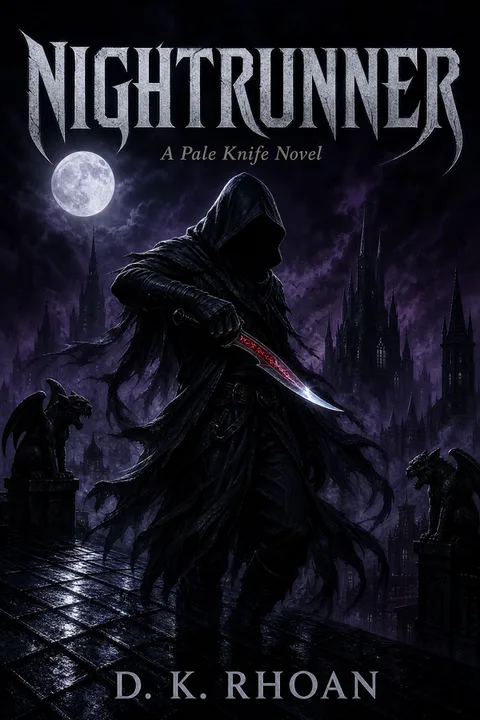
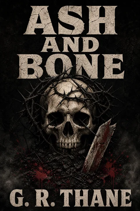
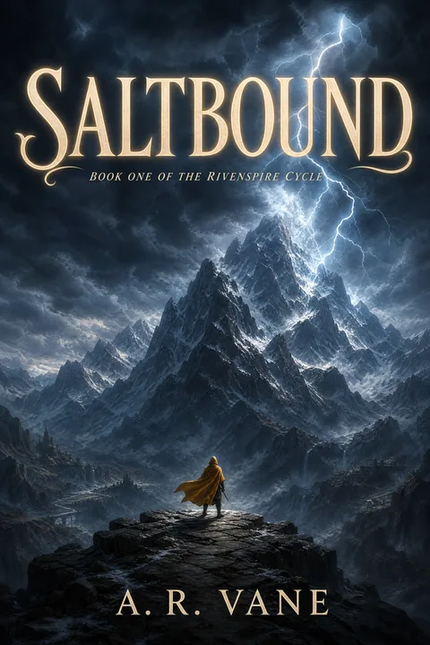
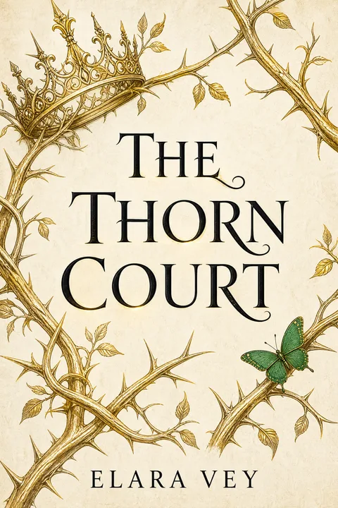
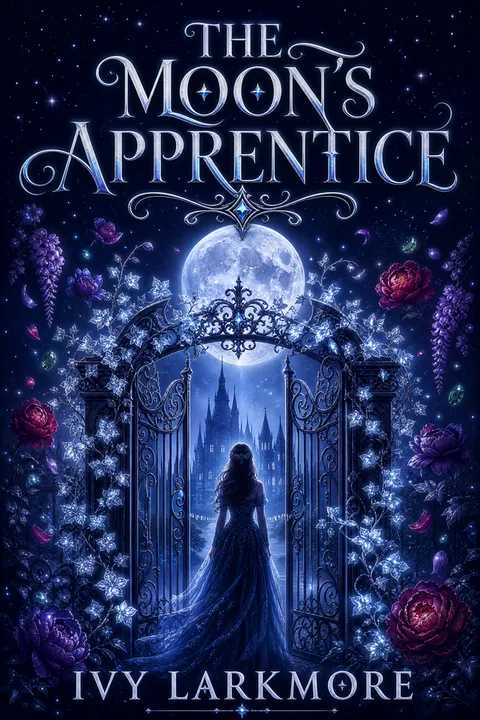
If none of the styles shown exactly match your book's subgenre, the wizard also accepts open-ended style descriptions. Use the archetype as a starting point and adjust from there.
The Most Common Mistakes — and Why They Break Genre Signal
- ✕01
Light or white background
68% of Amazon Fantasy Top 30 covers use a dark background. A light background on a fantasy cover does not read as 'different' — it reads as 'not fantasy.' It will be visually isolated in search results and may be categorised mentally by browsing readers as literary fiction or nonfiction before they read the title.
- ✕02
Too many focal elements competing for attention
A scene with three characters, a castle, a dragon, and a magical artifact is a rich illustration — and unreadable noise at thumbnail scale. 61% of top sellers anchor on one iconic element. The artwork beneath the focal element can be as detailed as you like; what matters is that one element dominates at small sizes.
- ✕03
Thin or geometric sans-serif title type
Thin, modern, or minimalist title typography is a direct genre-mismatch signal in fantasy. Bestselling fantasy titles use bold serifs, calligraphic serifs, or heavy decorative faces. A thin Helvetica or Futura title is the typographic equivalent of a white background — it signals a different genre entirely.
- ✕04
Skipping series labelling on a series book
66% of top sellers carry visible series name and book number. Readers browsing Amazon rely on this labelling to track series position. Omitting it is not a design choice — it is a discoverability handicap, especially for books two and beyond where series readership is the primary audience.
- ✕05
Designing only at full resolution
Every design decision should be proofed at 160×256 pixels before finalising. Title legibility, focal element clarity, and background contrast all look different at thumbnail scale. A cover that is beautiful at full resolution and unreadable at thumbnail scale has failed at its primary job.
Where Fantasy Cover Art Comes From — and the KDP Account Risk
One topic that rarely appears in cover-design guides — but generates significant anxiety in KDP author forums — is the legal provenance of cover art and the account suspension risk that comes from getting it wrong. Here is a neutral, accurate summary of what the indie author community reports and what Amazon's official guidance says.
Canva and similar platform stock images. Many indie authors design covers in Canva using the platform's built-in stock library. The risk, widely reported in KDP forums and author communities, is that Canva's stock image licensing terms may not be compatible with Amazon's resale context — specifically, some Canva stock images are licensed for "end use" but not for use as cover art on a product sold at scale. Amazon's KDP content guidelines specify that you must hold rights to every element you upload. Authors who have received account warnings or suspensions citing Canva-sourced imagery typically discover they were using stock images with licensing terms that did not cover commercial resale. The community guidance is to verify the license for every asset before exporting to KDP — not all Canva content is equal.
Free stock sites and "found" art. The risk profile here varies significantly by source. Unsplash does grant royalty-free commercial use, so landscapes and objects are generally fine — but any photo of an identifiable person requires a model release before you can use it on a sales cover, and Unsplash images do not automatically include one. Images found via Pinterest or Google Images search carry no license at all; search engines index images, they do not license them, and using search-found art creates direct takedown and account risk. The governing rule is simple: stock must carry an explicit commercial license permitting use on a for-sale product; "free for personal use" or images without a traceable license do not meet this bar.
AI-generated art. Amazon does not blanket-ban AI-generated covers. The current KDP guidance requires that you hold rights to the output, that the cover meet their quality standards, and that authors self-identify AI-generated content during the title-setup process on KDP. Some authors use AI covers without issue; others avoid them due to reader-perception concerns in certain subgenres (particularly romantasy and literary fantasy, where the audience expectation for hand-crafted art is higher). The honest position is that AI-generated covers are a legitimate and widely-used tool — the question is execution quality and rights, not the technology itself.
The table below summarises the key sources and their risk profile.
| Source | KDP risk | Safe practice |
|---|---|---|
| Canva free / platform stock | Moderate — licensing terms may not cover resale; community-reported suspensions | Verify each asset's license explicitly; prefer Canva Pro commercial-use assets |
| Free stock with a commercial license (e.g. Unsplash) | Low–Moderate — commercial use is granted, but photos of identifiable people still need a model release for a sales cover | Fine for landscapes/objects; for any identifiable person, confirm a model release exists |
| Images found via Pinterest / Google Images | High — no license is granted; search indexes images, it does not license them | Never use; there is no commercial license for search-found images |
| Licensed stock (Depositphotos, Adobe Stock, Shutterstock) | Low — commercial license included | Confirm extended/commercial license tier; read the platform's resale terms |
| Commissioned original art | Lowest — you own rights by contract | Include a work-for-hire or rights-transfer clause in your contract |
| AI-generated (rights-holding configuration) | Low — provided you hold output rights and meet KDP quality bar | Confirm your tool's terms grant you commercial rights to outputs |
Making Your Fantasy Cover
The conventions documented here are not a creativity constraint — they are a genre language. Readers who are looking for fantasy already know how to read these signals. When your cover speaks that language, it enters the conversation. When it doesn't, no amount of interior quality saves it from the browse.
For a deeper look at the commercial fantasy cover market, the fantasy book cover design page extends these conventions into style-by-style comparisons for each major subgenre.
When you're ready to generate, the fantasy wizard applies these patterns directly: dark background, illustrated art direction, single iconic focal element, serif display type, warm metallic accent — configured by default, adjustable by you.
Three covers free, no card required.
01Do I need to hire an illustrator to make a professional fantasy book cover?
Not necessarily. While top-tier illustrated art can cost $300–$1,500 from a professional, AI-generated covers using tools trained on fantasy aesthetics — dark backgrounds, single iconic elements, warm metallic accents — can reach a comparable signal quality for KDP self-publishing. The critical factor is not who drew the art but whether the cover communicates genre conventions at thumbnail scale (160×250 px on Amazon). If you plan a long series with a large marketing budget, a human illustrator's original art is still the gold standard. For a first book or short series, a well-configured AI generation workflow closes most of the gap.
02What is the single biggest mistake indie authors make on fantasy covers?
Using a light or white background. Our analysis of the Amazon Fantasy Top 30 found that 68% of bestselling covers use a dark or near-black background. A light background is the fastest way to signal "amateur" to a genre-trained reader's eye, because it clashes with two decades of commercial fantasy cover conventions. The second most common mistake is choosing a thin geometric sans-serif for the title — the data shows that 57% of top sellers use a large serif or decorative display face, and thin sans-serifs are essentially absent from the bestseller list.
03Will an AI-generated fantasy cover look amateur?
It depends entirely on how you configure the generation. An AI cover generated with accurate genre parameters — illustrated/digital-painting art style, dark background, single iconic focal element, serif display type, warm gold or fire-orange accent — is indistinguishable from a mid-tier human-made fantasy cover at thumbnail size, which is where 90% of purchase decisions are made. Where AI-generated covers still fall short is hyper-detailed character portraiture and covers that need to carry a very specific licensed IP aesthetic. For the conventions that actually move copies on KDP, AI-generated covers close the gap dramatically.
04What size should a KDP fantasy book cover be?
For an ebook, Amazon KDP requires a minimum of 1000×1600 px with a recommended size of 1600×2560 px (1:1.6 ratio). For print (paperback or hardcover), you submit a single wrap file — back cover + spine + front cover in one image — with ~0.125 inch bleed on all edges and critical text kept inside the safe margin. Spine width scales with page count, so the exact wrap dimensions change per book. Hardcover wraps are larger still and follow a slightly different spec. Amazon's official Cover Creator and the KDP print cover calculator at https://kdp.amazon.com/en_US/help/topic/G201953020 generate the correct template for your exact trim size and page count. Always export at a minimum of 300 DPI and proof against the KDP cover guidelines before uploading.
05How do I know which fantasy subgenre conventions to follow?
The safest starting point is to search your direct subgenre on Amazon (e.g., "epic fantasy," "LitRPG," "grimdark," "cozy fantasy") and scan the Top 20 covers. LitRPG and GameLit skews toward hyper-saturated illustrated characters with UI/game-screen elements. Cozy fantasy favors warm, illustration-style covers with soft lighting. Epic fantasy aligns closely with the data in this article — dark backgrounds, iconic single element, serif title, warm metallic accent. Romantic fantasy adds couple or feminine-figure elements with jewel-tone color palettes. Matching your subgenre's visual vocabulary is more important than being "original." For a detailed breakdown of each subgenre's specific conventions, see the Fantasy Subgenre Cover Conventions field guide later in this article.
Evan Kane is the founder of MakeMyBookCover and runs the cover-archetype research program behind the product — auditing the Amazon US Top-50 covers across romance, thriller, fantasy, children, and nonfiction every quarter to keep the genre-signal models honest.