The Romance Cover Has Stopped Being About the Couple
A romance reader scrolling Amazon spends roughly two seconds on each thumbnail before deciding whether to tap. In those two seconds the cover answers exactly one question — is this the kind of romance I'm looking for? — and the answer arrives through a visual code the reader has been training on for years.
That code has shifted hard in the last three years. Photographic clinch covers, illustrated cartoon couples, and Bridgerton-era painted figures all still exist on the shelf, but they no longer share equally in what the bestseller list looks like. The dominant grammar of the 2026 Romance Top 50 is something else — oversized type on a solid color ground with a single ornamental object as the focal point. It looks more like a luxury-goods ad than a 2015 paperback.
Every other article ranking for "romance book cover ideas" is a gallery — Pinterest boards, Canva templates, designer portfolios, generic "color and font matter" checklists. None of them measure anything. This article does the opposite. We coded the Amazon US Romance Top 50 against seven visual dimensions and surfaced six conventions that now dominate the shelf. The rest of the piece walks through what they mean, how the subgenres dialect them differently, and what to actually do with the data on your own book.
The Six Numbers Nobody Else Is Publishing
The chart below is drawn from a coded visual analysis of the Amazon US Best Sellers in Romance, Top 50, sampled in May 2026. Each cover was scored against seven dimensions; the six with the strongest signal are below.
Read the chart top to bottom as a hierarchy — the highest-hit conventions are the least negotiable. A cover that fails the top three (illustrated, title-dominant, chunky serif) reads as off-shelf the moment a romance reader scans past it.
Illustrated, not photographic (78%) — the photographic couple cover, which dominated romance from the early 2010s through about 2020, has collapsed into the sports-romance niche. Hockey, college, and small-town sports romance still use real-couple photography; everywhere else, the illustrated or painterly cover is now the bestseller default. If your cover is a stock-photo couple on a beach, it codes as pre-2018 — not different, not original, just dated.
Title-dominant (70%) — oversized type is the new lead. The title is visually heavier than any figure or object on the cover, often filling thirty to fifty percent of the cover's vertical space. This is the BookTok-thumbnail optimization in numeric form — typography survives compression to a phone-screen thumbnail in a way that a small-face illustration does not.
Chunky serif title (66%) — the typography winning in 2026 is bold, heavy, and serif. Geometric sans-serifs are essentially absent from the bestseller list — only four percent — and hand-script titles appear on about thirty percent of covers, usually as a secondary or accent layer. The chunky serif is unambiguous — if your romance cover uses Helvetica or a thin geometric face, it reads as a non-romance book to a romance reader.
Single-object focal element (64%) — the cover anchors on one ornamental object. Crowns, daggers, roses, dragons, skulls, hearts, envelopes, and stylized animals appear far more often than figures. Twenty-four percent of covers center on a couple, twelve percent on a solo figure, and the remaining sixty-four percent on one symbolic object. This is the single biggest break from the 2010s clinch-cover era.
Solid color background (56%) — over half of bestsellers use a flat, solid color block as the background rather than a textured scene. Of those, dark-solid (black or charcoal) is the single most common treatment, appearing on thirty-four percent of all covers. The solid background is the maximum thumbnail-readability move — it removes every distraction from the focal element and the title.
Dark palette overall (54%) — over half the shelf reads as dark. Warm palettes (red/gold/rose) sit at twenty percent, cool palettes (blue/purple) at eighteen percent, and light palettes (pastels) at only eight percent. The dark-palette dominance is partly the dark-romance/dark-romantasy wave bleeding into adjacent subgenres, partly the broader luxury-good aesthetic the chunky-serif-on-solid-ground composition pulls in by association.
The Tone-Mismatch Tax — Why Subgenre Signal Matters
The conventions above describe the whole genre. But romance readers do not browse "romance" — they browse their subgenre, and the subgenre dialects are different enough that a generic-bestseller cover can still fail by speaking the wrong dialect.
The pain this creates is one of the most consistent complaints on the romance reading subreddits. The cover signals one tone — bright pastels, friendly cartoon couple, soft script — and the book inside is enemies-to-lovers with morally grey heat. The reader who buys based on the cover bounces in the first chapter. The reader who would have loved the book never looks at it because the cover read as a closed-door rom-com. Both directions cost you readers; one direction also costs you reviews.
The decoder table below maps the bestseller conventions onto each major romance subgenre. Match the row that matches your book.
| Subgenre | Focal element | Background | Title typeface | Palette | Reader signal |
|---|---|---|---|---|---|
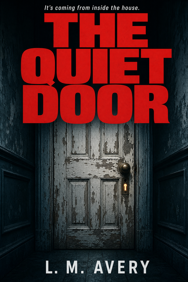
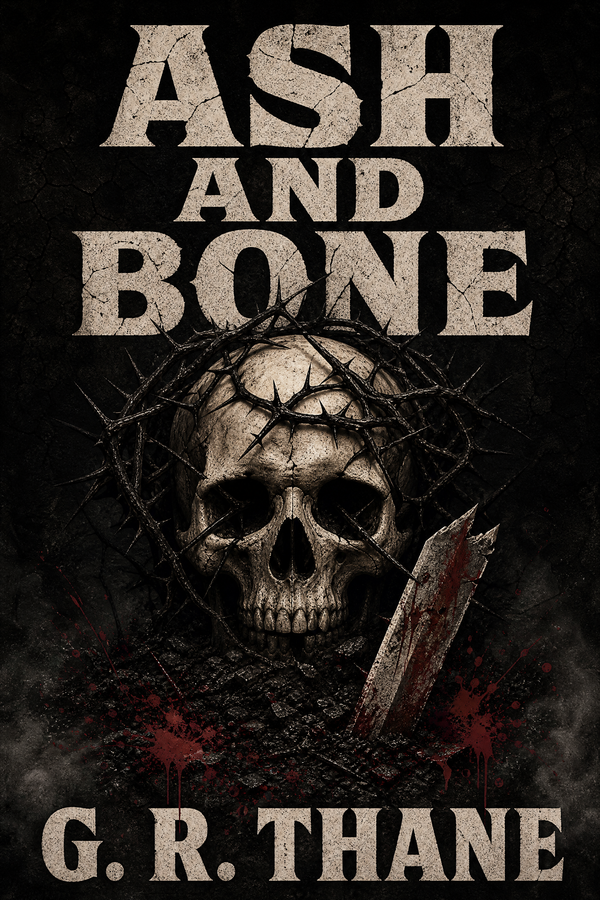
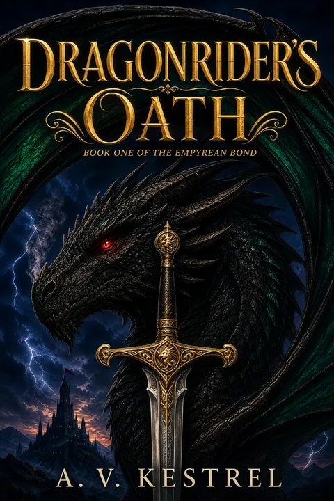
| Dark romance | Crown, dagger, apple, rose, skull, key — single ornamental object | Near-black or charcoal solid; occasional cream | Heavy gothic serif; sometimes Didone | Dark base with blood-red, metallic gold, or bone-cream accent | Possessive heat, morally grey, high stakes |
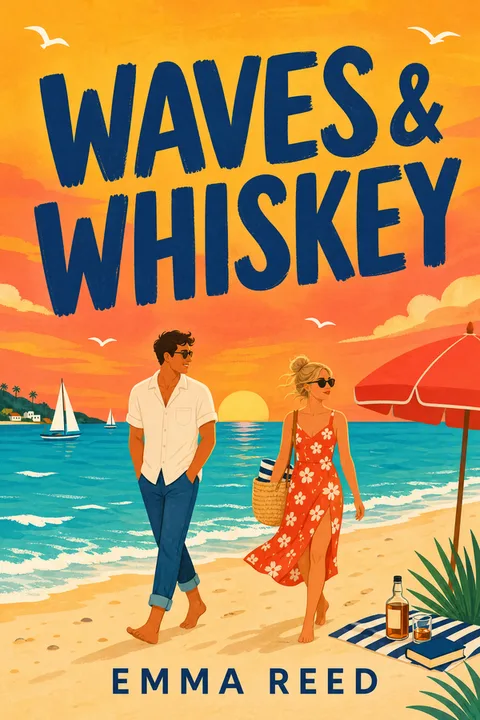
| Contemporary (illustrated couple) | Stylized cartoon couple, often on either side of an oversized title | Saturated pastel solid — coral, mint, sky blue | Chunky friendly serif; rounded weights | Bright saturated single-color ground | Warm wit, lower spice, low-stakes rom-com |
| Contemporary (single object) | Envelope, coffee cup, flowers, ring, sunglasses | Warm flat solid — peach, sage, butter | Chunky modern serif | Warm pastel-saturated | Slow-burn contemporary, slice-of-life heat |
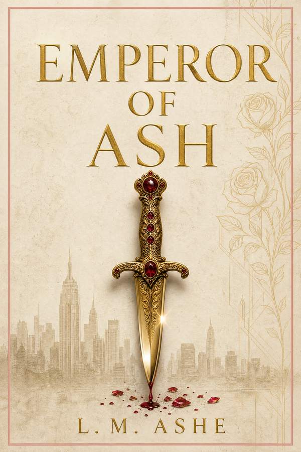
| Romantasy | Painted full-figure hero, usually with a heraldic creature or object (dragon, sparrow, crown) | Textured fantasy scene — moonlit, castle, forest | Tall ornate serif; sometimes decorative display | Dark base with metallic warm accent (gold/copper) | Empire, fated bond, war-college stakes |
| Dark romantasy | Single fantasy object (dragon, sword, throne) | Near-black solid or moonlit scene | Heavy gothic serif | Dark base with metallic gold or blood-red | High-fantasy obsession, court intrigue, deadly heat |
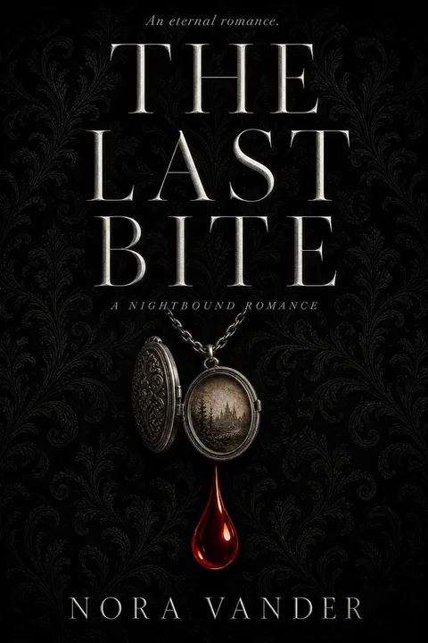
| Paranormal / vampire | Symbolic creature element — fang, wing, full moon, claw mark | Dark solid or moody scene | Sharp display serif | Dark base with jewel accent (sapphire, garnet) | Gothic eternal love, centuries of longing |
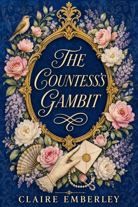
| Historical (Regency) | Period silhouette, ballroom or estate, dress detail | Painted scene with restrained backdrop | Classical serif; refined weight | Restrained jewel palette — wine, navy, gold | Bridgerton-era scandal, ballroom intrigue |
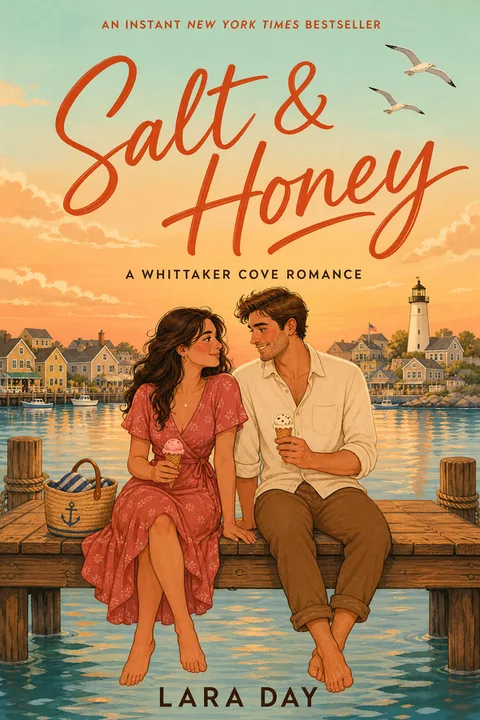
| Sports romance | Real-couple photograph, often a jersey or rink element | Photographic scene — sports venue | Bold sans or chunky serif overlay | Warm or cool driven by the sport | Grumpy athlete, hometown stakes, found-fame heat |
| Rom-com proper | Stylized cartoon couple or a comedic single object | Bright pastel solid | Playful chunky serif or hand-lettered display | Bright saturated pastel | Banter, low spice, low stakes |
Sports romance is the single notable exception to the illustrated-cover dominance — photographic covers still lead there because the audience reads the jersey, the rink, or the locker-room scene as the genre signal. Outside sports, photographic clinch covers are now a minority everywhere.
How to Design a Cover That Hits the Conventions
The conventions are not a creative constraint — they are a code the reader is fluent in. Speaking the code makes your cover legible at thumbnail size, which is where the buy decision happens. The steps below convert the data into a practical sequence.
- 01
Lock in your exact subgenre before designing anything
Open Amazon to your specific subgenre — not 'romance,' but 'dark romance,' 'romantasy,' 'contemporary,' 'paranormal,' or 'historical.' Scan the top twenty covers and screenshot them. Look at the focal element, the background treatment, the title typography, and the palette. Your cover should look like it belongs in that group of twenty — that is the brief. Originality at the genre-signal level is a liability.
- 02
Pick one ornamental object — the symbolic centerpiece
Resist the urge to put a couple, a setting, and an object all on the cover. Sixty-four percent of bestsellers center on a single symbolic object. Choose the one object that most immediately encodes your book's promise — a dagger for dark romance with violence, a crown for empire-stakes romantasy, a ring for marriage-of-convenience contemporary, a vintage envelope for slow-burn correspondence romance. This object should fill roughly thirty to fifty percent of the cover.
- 03
Set the title in a chunky serif — large
The title is the hero of the cover, not a label on it. Pick a heavy serif — chunky modern serif for contemporary, gothic serif for dark, ornate tall serif for romantasy, classical serif for historical. Set it large enough that it stays legible at the ninety-pixel Amazon thumbnail. Geometric sans-serifs are essentially absent from the bestseller list — do not use one.
- 04
Choose a solid color background that matches subgenre
Default to a flat solid color block — dark for dark romance / dark romantasy / paranormal, saturated pastel for contemporary / rom-com, warm flat for slow-burn contemporary, painted scene only for historical and romantasy. Solid backgrounds are the maximum thumbnail-readability move and appear on more than half of the bestseller shelf.
- 05
Add a single accent color, not a palette
Romance covers in 2026 are mostly two-color compositions — a dominant ground and one accent. Blood-red on near-black for dark romance, metallic gold for romantasy, ivory or bone on dark for paranormal, coral or mint on white for contemporary. Pick one accent and use it consistently — in the title, the object, or both. Five-color palettes read as noisy and amateur at thumbnail size.
- 06
Add series name and book number if applicable
Romance is a series-heavy genre — duets, trilogies, multi-book worlds. If your book is part of a series, include a small series-name label and book number, usually at the top or bottom in a smaller weight than the title. This is a discoverability signal more than a design element — readers tracking a series rely on it.
- 07
Export at KDP spec and proof at thumbnail size
Export at 1600 × 2560 pixels (1:1.6 ratio) for ebook, or 300 DPI at your chosen print trim for paperback. Before uploading, resize the exported file to 160 × 256 pixels and view it at screen size. This is the Amazon thumbnail. Ask — does the focal element read at this size? Is the title legible? Does the cover signal the right subgenre? If the answer to any is no, the cover needs revision.
Romance Styles You Can Generate Now
The archetype gallery below shows romance cover styles already published in the wizard. Each was built against the conventions above — illustrated or painterly art, single-object or single-figure focal element, chunky-serif title, subgenre-matched palette. Click any cover to open the wizard locked to that style.

The styles span the full romance subgenre spread — dark romance, contemporary, romantasy, paranormal, historical, sports. Pick the one that matches your subgenre and the wizard handles the conventions; you keep control over title, author name, accent color, and the specific object motif.
For a deeper walkthrough of the genre's full conventions and a tool-direct cover flow, the romance book cover design landing page extends this data into a per-subgenre cover-building experience.
The Mistakes That Cost You the Right Reader
- ✕01
A bright pastel cartoon-couple cover on a dark or high-spice book
Indie community discussions repeatedly surface the same complaint — a cover signals soft pastel rom-com, the book is enemies-to-lovers with morally grey heat, and the wrong reader buys and DNFs in the first chapter. The DNFs become bad reviews; the right readers never look at the cover because it codes as a different subgenre. Match your cover palette to your spice level and tone — bright codes 'low spice, warm,' dark codes 'high spice, possessive.'
- ✕02
A stock photographic couple cover outside sports romance
Photographic couple covers have collapsed to a sports-romance niche. Outside sports, a photographic cover codes as pre-2018 — not different, not original, just dated. Seventy-eight percent of the current bestseller list is illustrated or painterly. If you are not writing sports romance, default to an illustrated approach.
- ✕03
A thin or geometric sans-serif title
Only four percent of bestsellers use a geometric sans-serif. Sans-serif on a romance cover is a direct genre-mismatch signal — readers parse it as nonfiction, literary fiction, or thriller before they read the title. Default to a chunky serif; the specific weight and detail varies by subgenre but the serif-ness does not.
- ✕04
A busy multi-element composition
A cover with a couple, a setting, an object, and a magical artifact looks beautiful at full resolution and reads as visual noise at the ninety-pixel Amazon thumbnail. Sixty-four percent of bestsellers anchor on one symbolic object precisely because the thumbnail can carry one signal — not three. The artwork can be detailed; the focal hierarchy has to be ruthlessly singular.
- ✕05
Skipping subgenre signal — generic 'romance' aesthetic
Readers do not browse the romance category; they browse their subgenre. A cover that hits the whole-genre conventions but misses the subgenre dialect — a dark-romance dagger on a cozy contemporary book, a pastel illustrated couple on a dark romantasy — is a misfiled signal. The subgenre decoder table earlier in this article is the practical fix: pick the row, match the dialect, and the cover finds the right shelf.
What a Romance Cover Actually Costs
The cost of a romance cover ranges across two orders of magnitude depending on the route, and the indie author community has surfaced sharp pain points around the high end. The numbers below are drawn from indie community consensus across r/selfpublish, KBoards-era threads, and direct author reports.
| Route | Typical cost | Typical timeline | Best for |
|---|---|---|---|
| Premade romance cover | $50–$350 | Hours (search + customisation) | First book or testing a series concept; art is fixed and may be reused |
| Custom indie romance cover | $349–$549 | 2–4 weeks | Solid mid-range — ebook through full print wrap |
| Boutique BookTok-name designer | $700+ | 4–12+ weeks (often waitlisted) | Established authors with growing readership |
| Custom illustrated romantasy commission | $2,000–$5,000+ | 2–6 months | Major series launches; top-tier illustrator work |
| Asking-price outliers (high-end illustrators) | $7,000–$9,000+ | Months | Outside the working indie market; author-forum reports |
| AI-configured romance cover | $0–$30 per cover | Minutes | First books, concept testing, tight budgets |
No route is inherently "amateur." A $200 premade that hits the conventions for your subgenre beats a $2,000 custom that misses them. The question is not "how much should I pay" but "does the cover signal the right subgenre at thumbnail size." Most indie romance authors land in the $200–$700 range; the high-end asks reported in author forums are real but represent the top of the market, not the working market.
For AI-configured covers, the same rule applies — the technology is not the bottleneck, the conventions are. An AI cover configured for the wrong subgenre is amateur for the same reason a human-made one would be. A well-configured AI cover that hits the chunky-serif, single-object, solid-ground conventions is indistinguishable from a mid-tier custom cover at thumbnail size.
What's Changing in Romance Covers Right Now
The six conventions in the chart above are the shape of the shelf in May 2026 — but the shelf moves. Three shifts are visibly underway in the Top 50 and the indie marketplaces, and they will likely strengthen through the rest of 2026.
Single-object covers are eating the cartoon-couple subset. The illustrated cartoon-couple cover that dominated 2022–2024 contemporary romance is contracting. In our Top-50 sample the cartoon couple still appears at twenty-four percent of all covers, but the new releases in that contemporary slice are increasingly object-led — a single envelope, ring, or coffee cup on a saturated solid — borrowing the dark-romance visual grammar without the dark palette. Expect the cartoon-couple share to keep falling as the format starts to read as 2023-coded.
Dark palette dominance is bleeding outward. The fifty-four percent dark palette share is partly the dark-romance and dark-romantasy boom, but it has also pulled adjacent subgenres darker. Dark contemporary (morally grey contemporary heat) and dark academia–adjacent romance are growing categories with the same dark-base + ornament + chunky-serif grammar. The dark palette is no longer a dark-romance-only signal; it now reads as "high-stakes, high-spice" across romance broadly.
Romantasy is splitting into two visual tiers. The Sarah J. Maas / Rebecca Yarros grammar — painted full-figure hero with a heraldic creature, dark scene with metallic gold accent — remains dominant, but a second romantasy tier is emerging: object-led dark romantasy that drops the figure entirely (a single dragon, throne, or sword on near-black, gothic serif title), borrowing the dark-romance composition wholesale. If you are writing romantasy in 2026, the object-led tier is the faster-growing visual lane and is materially cheaper to produce — the figure-led tier still wins on perceived premium for big launches.
The practical implication: if you are designing a romance cover right now and want it to age past 2026, lean into the single-object + chunky-serif + dark-or-saturated-solid composition. The exception is the figure-led romantasy lane, which has enough commercial momentum to remain a viable tier through at least 2027.
Making Your Romance Cover
The six conventions in this article are not opinions — they are the measured shape of what is currently selling on Amazon. Speaking that visual language puts your cover in the conversation; missing it costs you the reader whose attention you most need.
For a tool-direct flow with the romance conventions configured by default — illustrated art, chunky-serif title, single-object focal element, solid color background, dark palette where appropriate — the romance book cover design page is the entry point. Or jump straight into the romance wizard and pick a subgenre style.
Three covers free, no card required.
01What do bestselling romance book covers have in common in 2026?
Six measurable conventions dominate Amazon's current Romance Top 50. Seventy-eight percent are illustrated or painterly rather than photographic. Seventy percent are title-dominant — oversized typography is the hero of the composition, not a figure. Sixty-six percent set the title in a chunky serif and only four percent in a geometric sans-serif. Sixty-four percent center on a single ornamental object — a crown, dagger, rose, dragon — rather than a couple or scene. Fifty-six percent use a solid flat color block as the background. Fifty-four percent sit in an overall dark palette. These are the bestseller conventions; the subgenre dialects beneath them are where the cover actually decides whether your book reads as dark, contemporary, or romantasy at thumbnail size.
02Is the BookTok illustrated-couple cover still working in 2026?
The illustrated cover style is dominant — but the illustrated-couple subset is no longer the default it was around 2022. Our sample shows single-object covers (dagger, crown, rose, dragon, skull) running at sixty-four percent versus couple covers at twenty-four percent and solo-figure covers at twelve percent. Illustrated cartoon-couple covers now cluster in contemporary and rom-com proper, while dark romance, romantasy, and dark contemporary have moved decisively to single-object compositions on dark or solid grounds. The risk with a cartoon-couple cover is tone mismatch — a bright pink cartoon-couple cover on an enemies-to-lovers or dark book draws the wrong reader and creates the DNF reviews that hurt long-term ranking on Amazon.
03What's the difference between a dark romance cover and a contemporary romance cover?
They are nearly opposite visual languages. Dark romance covers center on an ornamental object (ring, dagger, apple, crown, skull) over a near-black or charcoal ground, with a heavy gothic serif title and a single accent color — blood red or metallic gold being most common. Contemporary romance covers split between two looks — an illustrated cartoon couple on a saturated pastel solid, or a single soft object (envelope, coffee cup, flowers) on a warm flat ground — both with a chunky friendly serif. The palette darkness is the fastest reader signal — dark codes "high stakes, morally grey, possessive" and bright codes "warm, witty, low spice." Mismatch costs you the right reader.
04What's the most expensive part of a romance book cover — and is it worth it?
The illustration is the cost driver. Indie community reports range from roughly $300–$750 for a solid custom indie romance cover, around $700+ for boutique or name designers (often with multi-week wait lists), and $50–$350 for premades. Anecdotal asks of $7,000–$9,000 from high-end illustrators have surfaced in author forums but are well outside the working indie market — the indie community consensus is that you should not pay seven months of book royalties for a cover unless you are a top-tier seller with a multi-book series funding it. The question worth asking is not "is this designer worth $X" but "does the cover at thumbnail size match the bestseller conventions for my subgenre." A $200 premade that nails the conventions beats a $2,000 custom that misses them, every time.
05How big should the title be on a romance book cover?
Big enough that it stays legible when the cover is compressed to the ninety-pixel Amazon thumbnail — which in practice means the title should fill roughly thirty to fifty percent of the cover height. The Top-50 data makes the point sharply — seventy percent of bestsellers are title-dominant, meaning the title is visually heavier than any figure or object on the cover. If your title is set at twenty percent of cover height in a thin or condensed face, it disappears at the thumbnail, and your cover loses its primary identifying signal exactly where it is most needed.
06Should I put models or characters on my romance cover?
It depends on subgenre, and in most of romance the answer in 2026 is "not photographic." Photographic couple covers have collapsed to the sports-romance niche — Off-Campus, hockey romance, college romance. Elsewhere, painted or illustrated figures appear at twenty-four percent for couples and twelve percent for solo figures, both decisively behind single-object covers. Romantasy is the one place where a painted full-figure hero still leads — and even there the figure usually shares the cover with a heraldic object (dragon, crown, sparrow). Default to a single ornamental object unless your subgenre is sports romance or romantasy and you have a strong figure concept.
07What KDP trim size should I use for a romance paperback?
Five-by-eight inches and 5.25-by-eight inches are the indie-romance paperback standards — both sit naturally next to trade-published romance on a shelf, and the object-led art reproduces well at these tighter widths. Six-by-nine is also accepted and is common for romantasy and longer dark-romance epics. The ebook size is 1600 × 2560 pixels at a 1:1.6 ratio; the print export is 300 DPI with a 0.125-inch bleed on all four sides and live text kept 0.25 inch inside the trim. Use KDP's print cover calculator for the exact wrap dimensions — spine width changes with page count.
Evan Kane is the founder of MakeMyBookCover and runs the cover-archetype research program behind the product — auditing the Amazon US Top-50 covers across romance, thriller, fantasy, children, and nonfiction every quarter to keep the genre-signal models honest.